Opera unveils Opera One, an entirely redesigned browser
-
rick2 last edited by
I'm on Linux (Slackware64 -current, KDE Plasma 5.27.4, X11) and I installed Opera One.
Copied about 15 URLs from Opera Beta to open in One.I open One, open new tab, paste URL, go, then open clipboard to select another URL, Opera One steals keyboard focus and I can't select the URL (up and down arrows scroll the browser window).
Very annoying behaviour, should I report a bug about it?
-
leocg Moderator Volunteer last edited by
@ess-es-1868 It seems to me that the idea is to allow doing more customization in the future.
Maybe change the position of the components/modules, hide them, etc. -
johnston5129 last edited by
@simcard78: lol sorry it was the post above you ,i clicked on wrong one no worries
-
Generosus last edited by Generosus
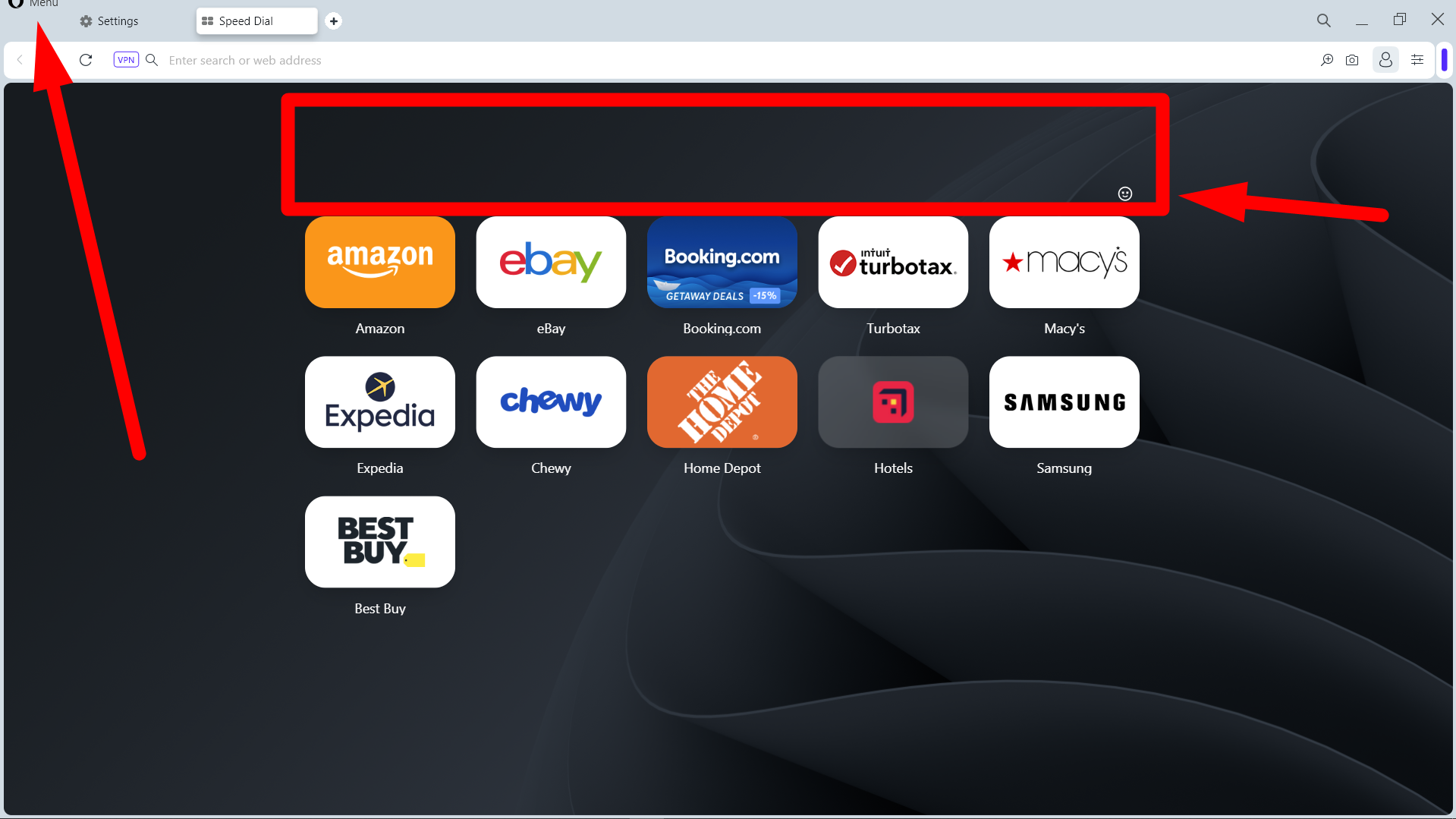
Ouch! Not happy about Opera One. The colors, modules, borders, etc. are nasty-looking.
Plus, the Opera Menu issue brought up with Opera 97, the huge gap above the Speed Dial tiles, and the cheap-looking Smiley
 are still present (see below).
What happened to Keep It Simple, Stupid (KISS) and listening to your customers? It's time to move on to Google Chrome or MS Edge.
So disappointed. And most likely, thousands of other Opera fans will be too when the stable version is released.
Ciao!

-
andrew84 last edited by
The rounded corner border around web pages should be removed. Left, right and bottom edges should look clean (excepting the cases when sidebar/autoshow sidebar is enabled).
-
DarthGTB last edited by
It's not possible to open a new window by dragging a tab anymore. I hope this is just a bug and not part of the new features
-
andrew84 last edited by
I noticed that there's a separate thread now on forum for Opera One.
https://forums.opera.com/category/54/opera-one -
DarthGTB last edited by
@weilan, I probably should have elaborated on my explanation. I've been using Yandex products for almost 10 years now. They are great and well made. They have about the same services Google has. I've been using Yandex Disk as a second backup from Google Photos, I've been using Yandex Browser for all the great features it delivers and I used Yandex Metro while visiting Moscow years ago and it's also great. Now with metro maps for many other places. Unfortunately Yandex Maps isn't great for my country, or else I would also use it. It used to have a less bright colour scheme than Google Maps.
The main reasons why I'm moving on back to Opera and uninstalled everything related to Yandex (and VK) is:
- I have a few issues with Yandex Browser UI starting to get a bit too bulky and the smallest size a window can get is over half a 1080p standard widescreen monitor
- Russia is currently under active war and countries under active war tend to ask private companies to join the war effort. Yandex software isn't key to my daily life and so isn't VK (or any social media for that matter), so I'm fine with not using it any more. I would get in trouble trying to get myself rid of Google or Microsoft, though.
My phone and my laptop are made by a Chinese company called Lenovo, although they are both built in my country (Brazil), which was the actual reason why I chose them. That would also be difficult for me to get rid myself of, because these items are expensive.
VK is much better made and more intuitive to use than the hell hole that Facebook is. VK was originally made by the same guys who made Telegram, so you get an idea. Telegram is hugely superior to WhatsApp in almost every way as well.
I tried several times to get into the Russian software development market because it looked like it has huge potential for being globally relevant in a market saturated by US American companies. But noooo, the strong man had to show how strong he is. Way to ruin decades of rebuilding a country and its reputation
So again, the main reason is the war itself and not "Russia bad".
-
JoannaCzajka Opera last edited by
@vladbabinets: Hi! Thanks for the info. To confirm: when you highlight a text on a page, you don't get the AI section in Search Tooltip with AI Prompts? Can you share the screenshot?
-
JoannaCzajka Opera last edited by
@kened: Thanks for the feedback. When you think having a tab bar on the left, do you still want tabs like they are today? Or bigger and visual?
-
JoannaCzajka Opera last edited by
@max1c: Thanks for the feedback.
 And yes - dragging a tab to open a new window is a bug, fix is coming!
 -
JoannaCzajka Opera last edited by
@brunnopleffken: Thanks for the feedback. We're still working on such details. Updates coming soon!
-
JoannaCzajka Opera last edited by
@op2: Thanks! In deed, redesign will gradually be continued in the next updates.