Opera unveils Opera One, an entirely redesigned browser
-
andrew84 last edited by andrew84
To be honest, I don't like modular design in current view.
Currently it looks too simple... Like bold rounded borders around the elements. More suitable for smart devices, which have display with rounded corners.

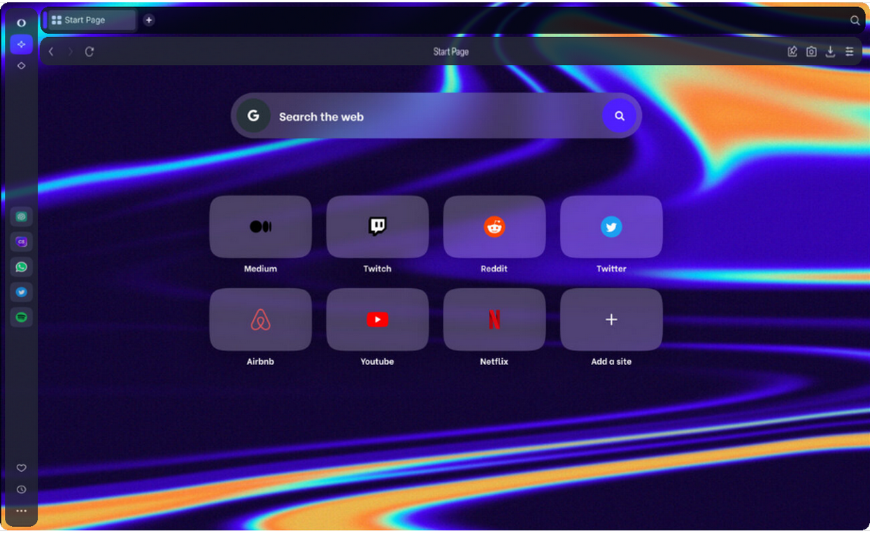
In my opinion, to separate the modules other methods should be used. For example, I'd prefer modules with semitransparent/blurred/frosted glass effect background on full screen wallpaper.
Smth. like this

-
johnston5129 last edited by
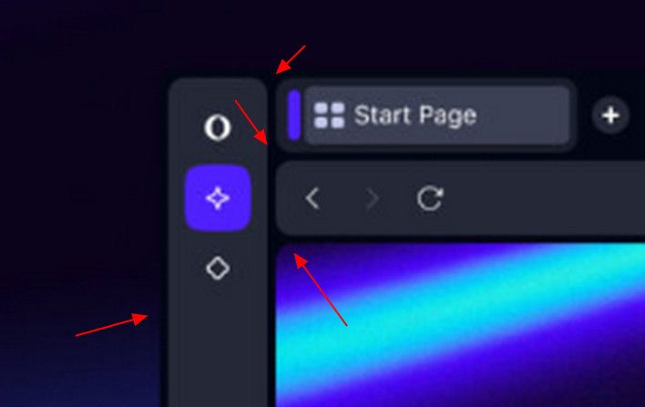
@simcard78: hey i agree with you, i dont have anything in my opera that looks like your photo?? that little purple bar next to the tab not on mine,the start page banner you have is not on mine and that little symbol in your sidebar not on mine this sucks ,and ive yet to see a tab strip or a tab island???maybe its in the bermuda triangle lol
-
skpy last edited by

New tabs area design looks awful. Now there is a mess when many tabs are opened.
Also why there is so much empty space above tabs? -
thelittlebrowserthatcould last edited by
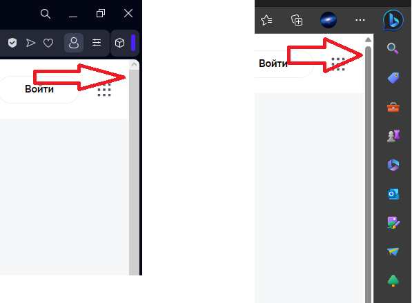
@skpy: tab scrolling has been missed out. I got the impression that 20 tabs was considered extreme...
-
DarthGTB last edited by
I've just tried it out. I couldn't find how to manage and move the modules around. I'd love to have tab bar at the bottom. Also, I was excited for sidebar possibly accepting unlimited custom pages, but nope, still limited to 5 and hidden under flags...
-
ghirahim last edited by leocg
OK, after a day of use. Tab islands. The fact that I have to hold CTRL, click on all the tabs and then right click and select "Create tab island", is terrible. Please, change that ASAP. We should drag and drop tabs like we used to when tab stacking was a thing. I hope the developers are reading this.
-
andrew84 last edited by andrew84
@firuz-u7 I don't know why they decided to separate modules too obviously.
The black rounded border around web page in dark mode looks weird to me(ugly, to be honest).
Personally, I prefer 'flat' design when visually all the UI's elements look solid. If I don't mistake, that was the main idea of Reborn 3 when sidebar, tabs strip, bookmarks bar look like a solid element.Modular design is most probably good from technical side, but visually I still support the 'square' and flat design. I'd like to see only menu/context menu and popups with rounded corners.
Like I stated above, I was waiting more advanced visual effects. And I hoped they'll fix high contrasting black/white items highlighting in dropdowns and menus in dark mode. -
koimark last edited by
Tab bar (with annoying scrolling disabled) look awful after upgrade and it's difficult to choose tabs when trying to arrange those to island. I agree with ghiramin wrote earlier too.
Those are my principles, and if you don't like them... well, I have others. ...
-
koimark last edited by
@thelittlebrowserthatcould: Tab scrolling is awful - I have it disabled. But large amount of tabs was not problem earlier. Now it is messed up and choosing tab is tricky.
Those are my principles, and if you don't like them... well, I have others. ...
-
thelittlebrowserthatcould last edited by
@koimark: I dumped about 500 tabs into the new browser, and gave up in trying to organise them into workspaces, which is easy enough, though time-consuming, with earlier versions.
I am happy to have the option of (working) tab scrolling, and use the Tab Slider or, more recently the Most Recent Used Tab Stack (Chrome) extensions, using the option to send the current tab to the right with Most Recent Used Tab Stack.
I've looked at Vivaldi again, and I think it will provide the useability I need, and appearance options I prefer, over the coming years.
-
skpy last edited by
@thelittlebrowserthatcould I agree with previous commenter that tab scrolling is not suitable. I have important tabs at the start of tab bar and new temporary tabs are at the end. It is convenient to access tabs at the end and at the start but is annoying to scroll from start to end and back each time. I have 2 workspaces with more than 100 tabs in each (unfortunately things that I have to take care or handle coming faster than I can resolve them. Using bookmarks instead will guarantee that I will never recall about them)
-
skpy last edited by

Now when there is sound playing in the background tab audio icon is not visible anymore -
thelittlebrowserthatcould last edited by
@skpy: if we had a session manager that allowed import/export respecting workspaces, and the tab count was kept down to 50 or 100 per workspace, then I would see less need for tab scrolling. But when several hundred tabs are in one workspace, before distributing to others, tab scrolling is vital -- at least to me. I would like to be able to set a fixed width, but the means available for locating tabs in older versions are acceptable, to me. As is using Ctrl+O to open local files because Google's geeks decided at an early stage that a menu option wasn't cool or whatever.
-
Nuiin last edited by
While I realise the AI feature brings novelty to Opera, to be honest I have no use for it at all as is and find it annoying. In the latest version of Linux version of Opera the button on Speed Dial tiles (top-right corner) doesn't display a context menu enabling users to delete or edit them and the browser still doesn't save its window geometry meaning that when you close and reopen the browser its size and position doesn't persist. To be honest I'm thinking about switching to Vivaldi.

