the search popup (redesigned) is still bad:
-
it's appearing collapsed (none of the buttons is preselected) but after hovering icon transforms to button immediately and such behavior looks choppy. Such design suits for the vertical menu like in Edge, not for the horizontal one.
-
while text is selected but after scrolling the search popup doesn't disappear and stay floating.

-
quite easily the cursor can be placed between the icons (because of the big padding) and is need to move cursor more to trigger the menu.

-
if redesigning like this, then the search popup should have light and dark mode (like in Edge).

-
the search/copy and converter separate bubbles + the bold dot at the bottom don't't look great imho.

*btw, if the upper bubble is not expanded, then there's a space between the two bubbles. But after expanding the space disappears.

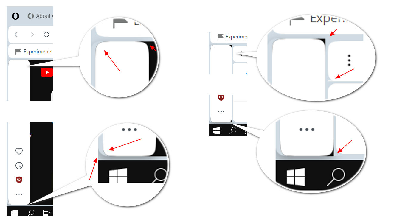
Also, the round corners as not as good decorated as in the old popup. There's too simple pixelated corners