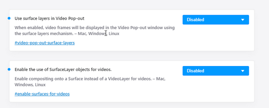
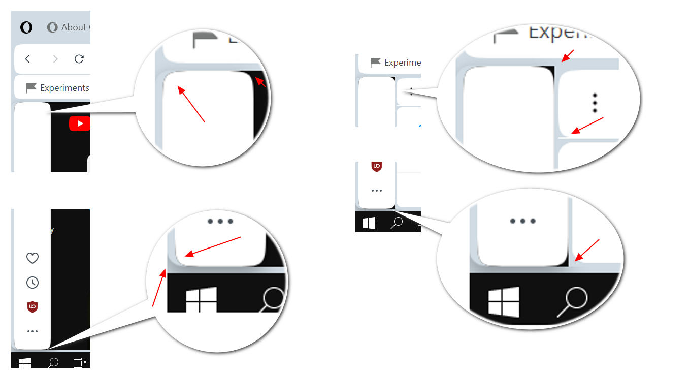
You have plans to improve how the modules visually are separated, especially web page content?
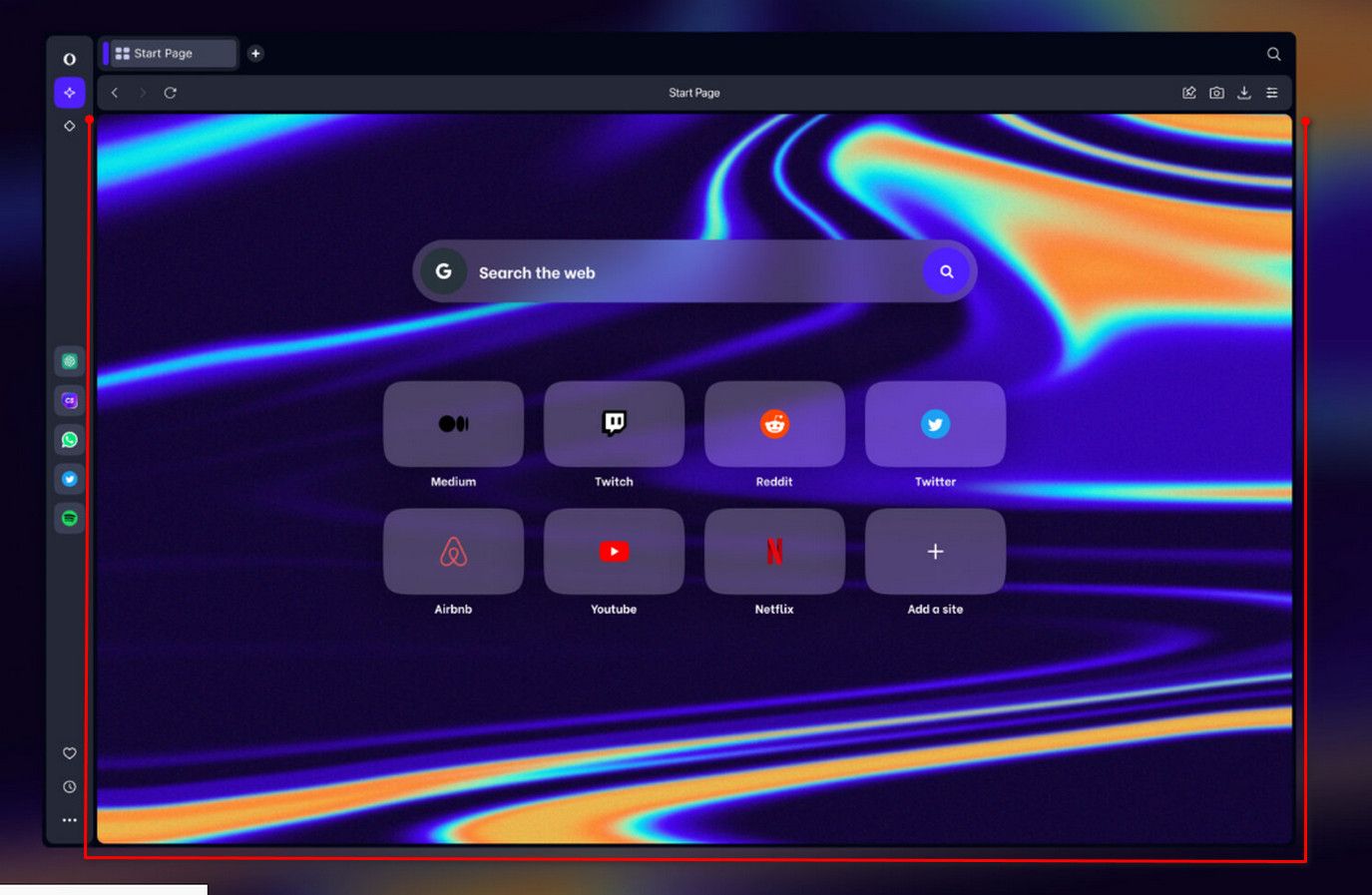
The border around web page content bothers me. I'd prefer no bold black (white in light theme) borders between web page and display's edges (including bottom). And no border between edge of the screen and sidebar or scrollbar.