@Richtendahl said in Video's do not play when opening NPO Start:
'General source error'.
The same here on Opera 95 + Win10.
But it works on Opera 114.
Do more on the web, with a fast and secure browser!
Download Opera browser with:
@Richtendahl said in Video's do not play when opening NPO Start:
'General source error'.
The same here on Opera 95 + Win10.
But it works on Opera 114.
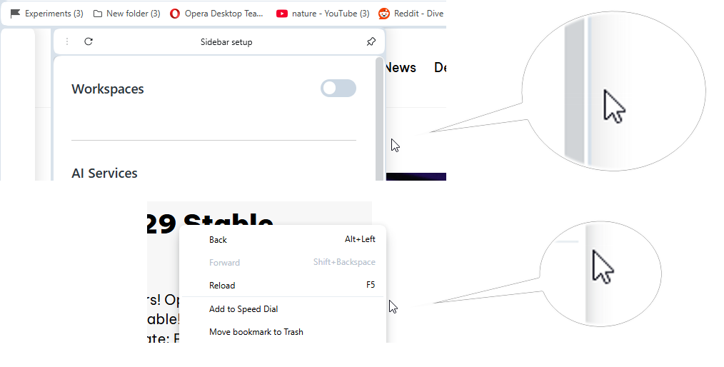
@burnout426 In case if it'll be removed, the toggle must be left in enabled state. Currently it affects whether tabs will be selected when cursor is on very top.
@daria19 said in Opera 116.0.5351.0 developer update:
The color of the Speed Dial tiles is designed to adapt based on both the selected wallpaper and theme
@daria19 As said I saw the different view of tiles on the same theme and on the same wallpaper after selecting other themes/wallpaper.
It'd better implementing some fixed variant which will look the same on different wallpapers but will be more reliable in terms of the random thumbnail's view.
@daria19 said in Opera 116.0.5351.0 developer update:
The additional space at the top and changes in MMB behavior are expected when tab scrolling is enabled.
Then the following option in Settings is loosing its sense.
@daria19 said in Opera 116.0.5351.0 developer update:
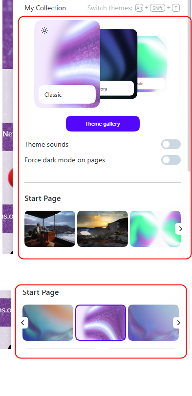
The "Force dark theme on pages" toggle is no longer in Easy Setup but can still be enabled in the browser's settings.
I guess that all the options which are in the EasySetup can be adjusted in the browser's settings but it makes things more complicated.
@indiqazzz same here in dark mode.
Also, here the icons for internal pages are barely visible in SearchTabs popup in dark mode.
@andre1980 maybe this is your case also https://forums.opera.com/post/363941
After switching themes and wallpapers in EasySetup I randomly managed to get 3 types of the SD tiles view for some reason (light semitransparent, white, and dark semitransparent ) on the same Classic theme and using the same wallpaper. I guess the 1st light semitransparent looks best (in light mode at least).
@daria19 The flag #address-bar-categories-customization was introduced after complaints and suggestions.
For example https://forums.opera.com/topic/58200/search-bar-calculator-on-off-switch how it looks on practice.
My post was about the same https://forums.opera.com/post/282544
But later the flag was removed for some reason and option was not implemented.
I don't know if it was an intended change but I'd prefer that icons in menu/context menu and text alignment were the same like in 'old' versions.
*And also the spaces between menu items should reduced. Especially affects small screens and also increases scrolling for bookmarks bar expanded bookmarks dropdowns.
Return the 'Categories' options for the address bar suggestions dropdown.
DNA-119466 Unable to open easy setup page when color-theme flag is disabled
I don't see the flag here.
DNA-119457 Create ‘Themes’ section in opera://settings
I was so optimistic to see the setting to enable/disable color themes but actually 'Wallpapers' section was renamed to 'Themes' and the 'theme' toggle was moved from 'Appearance' section.
@daria19 said in Opera launches Opera One R2 – the best Opera Browser to date:
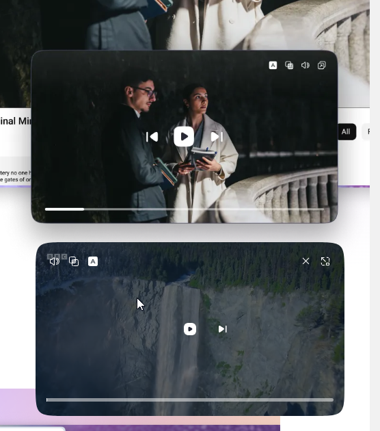
The changes to the PIP interface are in line with the current design
Why the new design should mean worse user experience?
the radius of rounded corners is too big (it looks ok only if the PiP is stretched to be big enough). So the radius should be proportionally changed when increasing/decreasing the PiP. Currently I can't normally position the PiP in the bottom right corner without seeing the hole in the corner.
The dimmed area should be only on top and bottom (like previously) and the centered control should be moved to bottom.
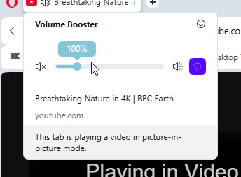
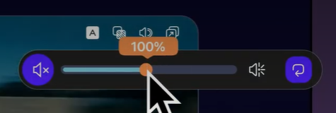
Still unclear the reversed logic for the volume control (increasing from top to bottom). And even tooltip is reversed-shows 'mute' when already muted and 'unmute' when already unmuted. And the volume control should be on the same level as play/stop/next button.
*And the multiple times mentioned removed timing.
And previously many times suggested video title. Instead of to be more advanced and handy the PiP degradated.
I wonder was it so hard fixing the invisible expanded parent menu item before Stable release? And this is still not fixed even in Dev version.
*And I still think the two leveled highlighting in menus was not the best idea.
Like Dev version Stable version also has the buggy text selection in bookmarks adding dialog.
@mixchild said in Opera launches Opera One R2 – the best Opera Browser to date:
Pip interface change could at least have left the option to reverse to previous PIP player
As a temporary solution you can disable the #video-popout-redesign flag.
@leocg for some reason I see it now in Settings without smth. editing.
Edit: I was able to reproduce the glitch. Enable Classic theme and select light mode in EasySetup, then open Settings page and select dark in 'Apereance' section so no 'force dark theme' toggle visible. After refreshing the Settings page the toggle appears.
@ddvddv it's strange. Today I was complaining in Dev thread https://forums.opera.com/post/362948that there's no toggle in Settings (see screenshot). But now I see the switch.