Opera 122 developer
-
 Opera Comments Bot last edited by
Hello! Opera 122 is here! Key highlights: For a full list of changes check out our changelog. Happy browsing! Installation links:
Read full blog post: Opera 122 developer
-
andrew84 last edited by andrew84
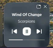
Are you ever going to improve the PiP? And why you removed the 'redesigned PiP' flag?
The controls are still poor (especially the volume control and the horrible full dimming video on hover).
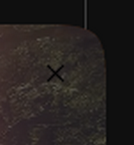
Additionally the closing cross is black.
Another one issue I noticed is that the reduced PiP produce oversharpened video look.
Compare normal Opera vs One.
*I can predict a question regarding the Lucid mode. But as I mentioned above video becomes overasharpened while reducing it (the smaller is size the bigger is sharpness), lucid is off. I use h264 extension for yotube if that matters.
**It seems more related to Chromium because in Edge there's the same effect.
-
daria19 Opera last edited by
@andrew84: To address your point about the black close (x) icon: you're absolutely right that on darker backgrounds it can be harder to see. At the moment, we use a black icon to ensure visibility on lighter backgrounds, where a white one would effectively disappear. It's a bit of a trade-off, there's unfortunately no perfect color that works well across all content and themes, but we’re continuing to explore better solutions. As for the removal of the "redesigned PiP" flag and your concerns about the current experience, including volume controls, dimming on hover, and the oversharpened video effect - we appreciate you pointing these out and will be looking into them.
-
andrew84 last edited by
@daria19 said in Opera 122 developer:
on darker backgrounds it can be harder to see. At the moment, we use a black icon to ensure visibility on lighter backgrounds, where a white one would effectively disappear
Sorry, but I absolutely didn't understand ( I suspect the reason is AI) your point(taking into account that other buttons are white as well).
This is what the dimming area meant for, isn't it? To unify the controls view on all backgrounds.
white icons on the light (but dimmed) background
In normal Opera
-
andrew84 last edited by andrew84
The mess with tabs on the tab strip continues. The older Opera's functionality is still not fully restored and still works a way smoother in 'old' Opera.
Now I noticed additional bug (if I don't mistake the similar bug already used to be recently). After tab detaching, a newly created tab overlaps other tabs (keeping the empty space) while sliding it, after mouse button release.

Edit: there's no need to create new tab, the bug happens simply when sliding and dropping tabs,
The same was in 2023 https://forums.opera.com/post/333280 -
daria19 Opera last edited by
@andrew84: We're sorry to hear that you think our response was generated by AI, it's not. All replies are written by real people on the team, though we do follow certain communication standards that can sometimes come across as formal. We'll definitely look into the issue you've pointed out. Thanks for bringing it to our attention.
-

-

-
-
Opera-QA-Team Opera last edited by
@andrew84: Thanks for the detailed feedback. We’re aware of the tab detaching issue you mentioned, and it’s currently being addressed under RNA-225.
-
-

-
Locked by
 leocg
leocg