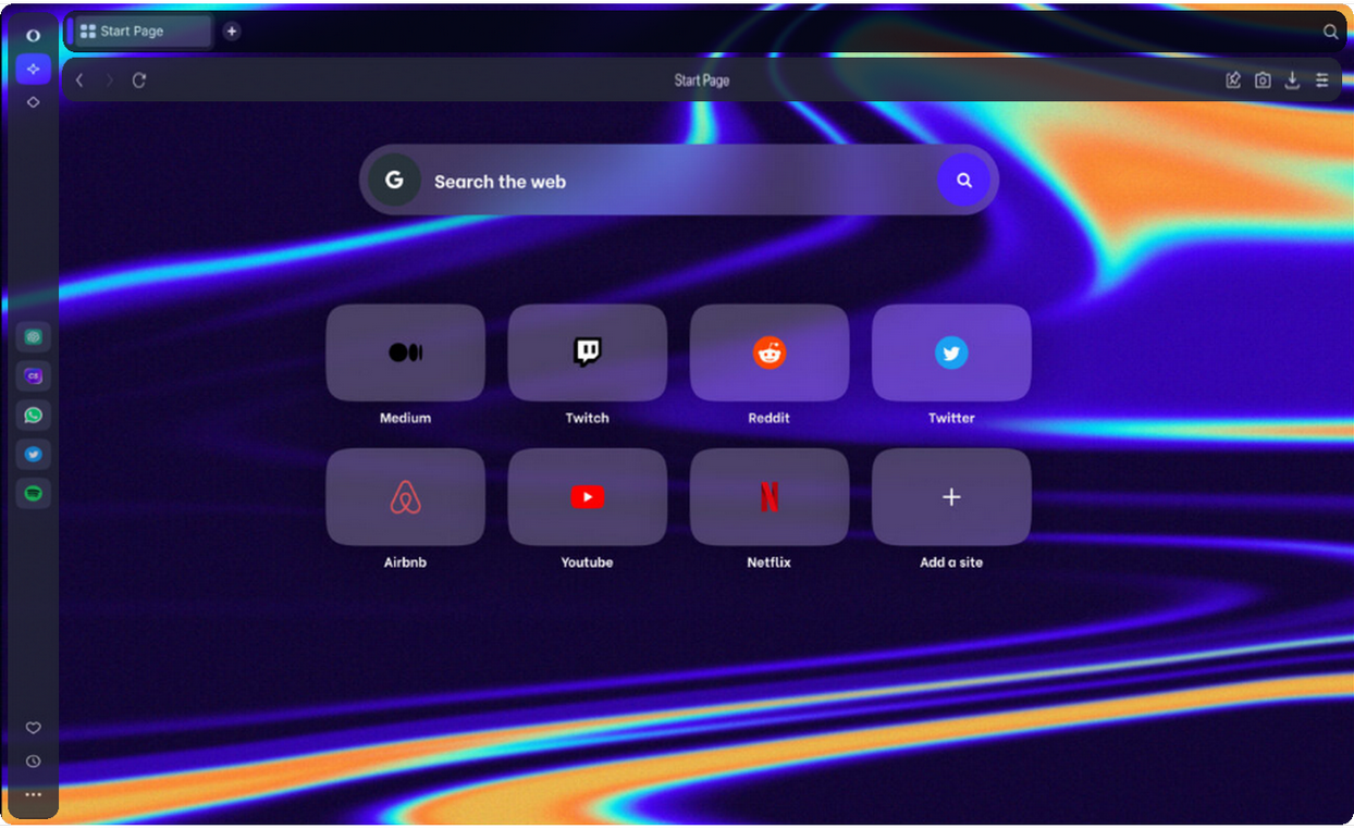
Opera unveils Opera One, an entirely redesigned browser
-
arturo182 last edited by
At first glance this looks awful, desktop apps are supposed to look like desktop apps. Also why are the tabs no longer tabs and are now buttons. Opera stopped being good with version 15, and yet is still the best out there, sad state of things

-
rick2 last edited by
@max1c said:
@ghirahim: Not sure where you are getting this but I doubt this will ever make it to the main Opera.
From https://www.opera.com/one
Opera One (currently early-access developer version) is a completely redesigned browser, planned to replace the flagship Opera Browser for Windows, macOS, and Linux later this year.
-
andrew84 last edited by
I can't check it right now because of win 8.
Does it have light mode also? Or just dark mode like on screenshots. -
andrew84 last edited by
Interesting.
Usually when there were requests regarding the tabs grouping/stacking, users were answered that workspaces are for these purposes. Now tabs grouping is presented as one of the main innovations. -
A Former User last edited by
Since Opera One is modular, would it be possible to make the address bar, sidebar and tab bar movable? I would like to be able to move the tab bar to the left, the address bar to the bottom and the sidebar to the right.
This suggestion is very specific. -
johnston5129 last edited by
cant find any tab island?? the tabs are normal side by side like any other browser and ive checked 6 keyboards now and not one single keyboard has a command button??? you have to press ctrl and command??? to make an island ,ill stick with gx for now and all opera browsers dont show any notifications at all whats with that?? i can pull up edge or chrome and get desktop notifications galore lol
-
SiMcarD78 last edited by
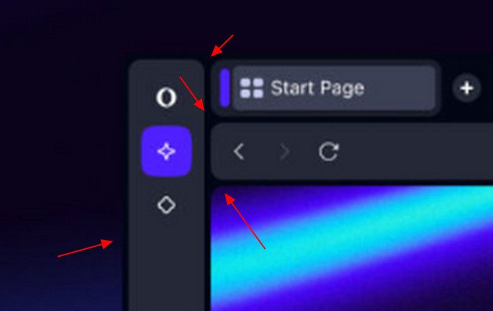
There's an empty space between tabs and the upper edge of the screen that is not clickable and it's annoying.
-
andrew84 last edited by andrew84
To be honest, I don't like modular design in current view.
Currently it looks too simple... Like bold rounded borders around the elements. More suitable for smart devices, which have display with rounded corners.

In my opinion, to separate the modules other methods should be used. For example, I'd prefer modules with semitransparent/blurred/frosted glass effect background on full screen wallpaper.
Smth. like this
