Opera unveils Opera One, an entirely redesigned browser
-
ESS-ES-1868 last edited by
I don't understand. What modules are we talking about? What is the modularity of the interface?
-
ESS-ES-1868 last edited by
Am I understanding the changes?
A new interface skin, a separate thread for rendering the interface and tab grouping? Nothing else?
-
andrew84 last edited by andrew84
@ess-es-1868 I guess these modules are tab strip, toolbar, address bar, sidebar, bookmarks bar. Each of the mentioned above also can contain own modules and so on if I understood it right.
-
leocg Moderator Volunteer last edited by
@ess-es-1868 By modules do you mean the components? If so, it's the sidebar, address bar, extensions bar, etc.
-
leocg Moderator Volunteer last edited by
@ess-es-1868 It's a lot for a build. More features will come.
-
ESS-ES-1868 last edited by
@leocg How is the new system different from previous versions? I thought that it was about the possibility of fully reconfiguring the interface, but I did not find such functions.
-
rick2 last edited by
I'm on Linux (Slackware64 -current, KDE Plasma 5.27.4, X11) and I installed Opera One.
Copied about 15 URLs from Opera Beta to open in One.I open One, open new tab, paste URL, go, then open clipboard to select another URL, Opera One steals keyboard focus and I can't select the URL (up and down arrows scroll the browser window).
Very annoying behaviour, should I report a bug about it?
-
leocg Moderator Volunteer last edited by
@ess-es-1868 It seems to me that the idea is to allow doing more customization in the future.
Maybe change the position of the components/modules, hide them, etc. -
johnston5129 last edited by
@simcard78: lol sorry it was the post above you ,i clicked on wrong one no worries
-
Generosus last edited by Generosus
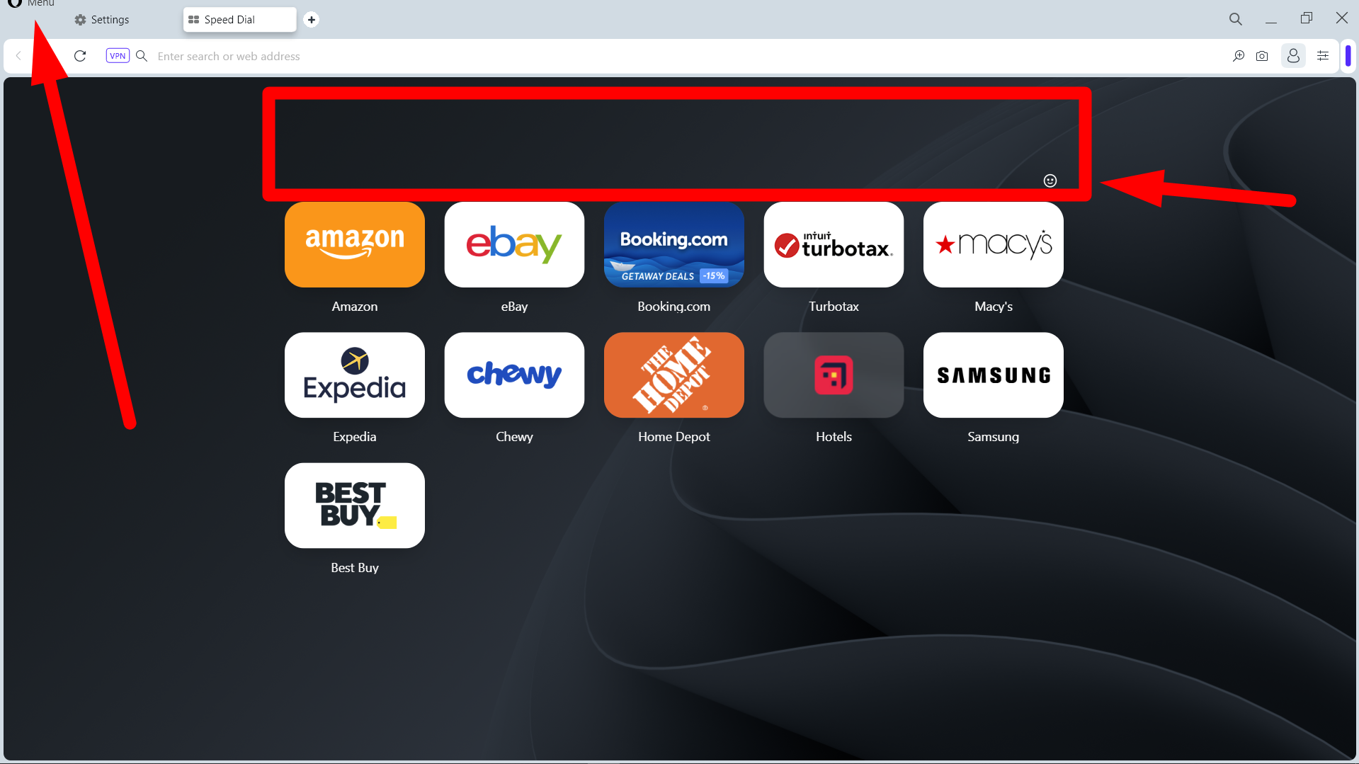
Ouch! Not happy about Opera One. The colors, modules, borders, etc. are nasty-looking.
Plus, the Opera Menu issue brought up with Opera 97, the huge gap above the Speed Dial tiles, and the cheap-looking Smiley
 are still present (see below).
What happened to Keep It Simple, Stupid (KISS) and listening to your customers? It's time to move on to Google Chrome or MS Edge.
So disappointed. And most likely, thousands of other Opera fans will be too when the stable version is released.
Ciao!

-
andrew84 last edited by
The rounded corner border around web pages should be removed. Left, right and bottom edges should look clean (excepting the cases when sidebar/autoshow sidebar is enabled).
-
DarthGTB last edited by
It's not possible to open a new window by dragging a tab anymore. I hope this is just a bug and not part of the new features
-
andrew84 last edited by
I noticed that there's a separate thread now on forum for Opera One.
https://forums.opera.com/category/54/opera-one