Opera launches Opera One R2 – the best Opera Browser to date
-
eharabien Opera last edited by
@andrew84 thank you for your feedback. Aurora and Midsommar comes with built-in wallpaper and that's why you cannot upload your own wallpaper. However, you have this possibility in Classic Theme and you can also adjust colors and browser mode.
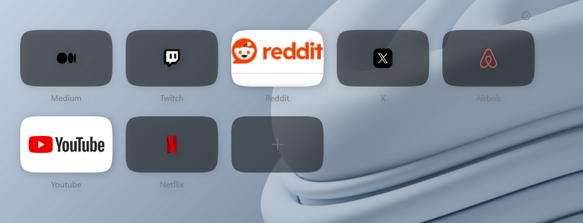
Regarding speed dials background - you're right, it should be semitransparent and this is a bug we're fixing as we speak, it should be done in several days. We really appreciate your feedback becasue it helps us improve our browser with every update.
-
eharabien Opera last edited by
@parduspars thank you for your message. Can you describe your problem with Twitter and Instagram video? This will help us to fix this issue for you. You can use this form to create your bug report: https://bugs.opera.com/wizard/
-
andrew84 last edited by andrew84
@eharabien said in Opera launches Opera One R2 – the best Opera Browser to date:
Aurora and Midsommar comes with built-in wallpaper
I understand this. It was just a notice regarding the design and why there's no possibility to upload own wallpaper and fit it to full screen under the UI modules
@eharabien said in Opera launches Opera One R2 – the best Opera Browser to date:
it should be semitransparent
Tiles are semitransparent but it's dark. Maybe it should be semitransparent white in light mode and semitransparent dark in dark theme.
Edit:
I'd also suggest also using semitransparent tiles if thumbnail has a full area picture. The thumbnail can be solid when hovered by cursor.

-
HealingCross last edited by
@eharabien You’re answer is appreciated as well. Maybe, I‘ll give the new Opera another week and see, if we‘re getting friends

But animated themes have not been on my wish list, actually. But maybe, I‘ll be convinced when there are more in the store. Otherwise to customize the classic one isn’t the worst option either. Maybe, it was almost my gallery flooded with themes, make me grumbling. -
mixchild last edited by
@eharabien why did you remove timer from the PIP player? also will we be able to add our pictures on live themes in future (i mean static picture with transparent background on top of the theme)
-
ThoGo last edited by
I still find it disappointing that Opera doesn’t adapt to the GNOME theme. Or that there’s no option to set it. For example, I’d prefer the minimize, maximize, etc. buttons on the left instead of the right.
-
tastodd last edited by
@eharabien And please make the classic theme the same as it was with all the previous shades and colors. It is clear that I can fine-tune it for myself in the future, but I would like the classic theme to be the classic one that we have become accustomed to since Opera 100
For example, the address bar in the classic theme used to be lighter and more harmonious

In subsequent versions, for some reason, you significantly darkened the same address bar in this same classic theme. The same as with selecting folders on the tab bar

-
daria19 Opera last edited by
@max1c: Thank you for your report! It seems the issue you're experiencing could be related to a known problem, DNA-119145, where the Aurora and Midsommar dynamic themes aren't working correctly with OpenGL or D3D9. This might explain why you're only seeing Classic themes and "Coming Soon" for the rest after the update. We appreciate your patience while we work on resolving this.
-
daria19 Opera last edited by
@keivms: Hello! As mentioned in the comment above, you can still set your desktop wallpaper as the background in Opera. Once you've selected the Classic Theme, you should see an option to pick your desktop wallpaper from a list of available wallpapers. Does that work for you or is the option missing entirely?
-
daria19 Opera last edited by
@andres85961234: We're sad to hear that the Midsommar and Aurora Themes aren’t displaying animations or backgrounds properly for you. Are you sure that the option in the Theme editor to show animations is enabled? Additionally, could you provide more details about your device and its specifications? This information might help in troubleshooting the issue further.
-
daria19 Opera last edited by
@tastodd: @HealingCross316: Thank you for sharing your thoughts! It's great to hear you’re willing to give the new Opera another chance, and we appreciate your feedback about the Classic theme; we’ll definitely take your suggestions regarding its colors and design into consideration to maintain the experience our users love.
-
daria19 Opera last edited by
@mixchild: Thank you for your questions! The removal of the timer from the PIP player was part of a design decision to streamline the interface, but we’re always open to feedback on usability. As for live themes, adding custom images with transparent backgrounds is not currently available, but it's an interesting idea. Regarding the red Opera "O" menu logo, it will remain red as it’s a core part of our branding.


