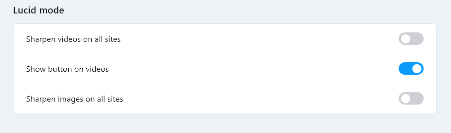
@graywoulf By the way, in the latest stable version 94.0.4606.38, there is already a menu item that allows you to hide the Lucid Mode button
Do more on the web, with a fast and secure browser!
Download Opera browser with:
@graywoulf By the way, in the latest stable version 94.0.4606.38, there is already a menu item that allows you to hide the Lucid Mode button
@kumagoro42
Until Opera Stable gets that flag, you can disable it on the command-line. For example, you can right-click on your desktop, goto "New", choose "Shortcut", point it to opera.exe in the install folder, name the shortcut what you want and click finish. Then, you can right-click on the shortcut, goto "properties", switch to the "Shortcut" tab and add a space and --with-feature:tab-art=off to the end of the target field value. Then, when you start Opera with that shortcut, the feature will be disabled.
For example:
"C:\Users\yourusername\AppData\Local\Programs\Opera\opera.exe" --with-feature:tab-art=off
У кого появляется заставка при запуске, удалите из директории c:\Program Files\Opera\101.0.4843.25 (или ваша версия) файл opera_gx_splash.exe и проблема должна исчезнуть
Хотя в новых версиях Оперы 102, 103 заставка уже не появляется
@leocg it's all good that you can choose your image. But why did they remove the switch to increase the size of the tiles in Opera One?
I confirm. Line spacing in the Opera context menu is terrible 
Return it to how it was in version 111
I would really like to see the ability to disable the Lucid Mode pop-up menu for those who do not need this feature
@richbich зайдите в Меню - Справка- О программе и посмотрите путь, по которому установлена ваша программа
@lehuspohus Unfortunately, there is no decision yet, but the Opera team has already been notified about this
Agree with the terrible new look.
Very annoying bright highlights in the context menu
@korol78 said in Opera 130 Stable:
Let the opera team get moving and search )))
The Opera team won't look for the problem specifically on your computer. Because this problem is unique to you
@korol78 said in Opera 130 Stable:
Log into your Google account and the button won't work!!!
Google account is active and everything works
Look for the problem in your profile.
@korol78 said in Opera 130 Stable:
doesn't work
Everything works for me. Check your extensions, maybe they're interfering.
When loading a page, sometimes a "pink flash" appears
This has already been discussed here
https://forums.opera.com/post/399037
@Opera-QA-Team A 1 year ago, I made a video showing the blue frame appearing. https://forums.opera.com/post/368908
I checked this again, and the problem persists.
System: Windows 11 25x2
CPU: Intel 14600K
Graphics: Intel UHD Graphics 770