Guys, seriously.. fire you new designer and bring back the old one..

And add the button to completely disable this UI\UX mess.

Do more on the web, with a fast and secure browser!
Download Opera browser with:
Guys, seriously.. fire you new designer and bring back the old one..

And add the button to completely disable this UI\UX mess.

This "island" update is ugliest I've ever seen. Just look at this designer's nightmare: lots of borders, lines and tones - useless waste of screen space.
Big paddings, rounded edges.. It looks like we've came back to 2000s.
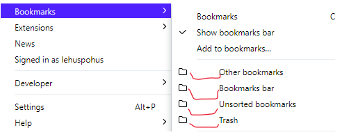
Just count the lines, shades and indents.. It is a complete mess:

Ok, you want to add your "islands" in tabs row. But but what kind of idiot thought about introducing a frame around the main content area with round edges? Why do we need this ugly islands in main content area and bookmark bar too, all with different margins and paddings?

It looks like the designer accidentally applied a wrong style to the all elements of browser window and accidentally clicked Commit.
This is absolutely inefficient use of screen space and looks just ugly - as a bad example of UI\UX.
And again - no way to disable this awful piece of.. UI.
@weirdtuned Totally agreed!
This "island" update is worst change since moving to Chromium engine.
Even Lucid mode fail has been quickly fixed after feedback..
I don't know what the Opera dev team was thinking when they added these "islands" to the main content area?
So my suggestion to Opera team: if you so thirsty and wanna add tab islands, add Tabs islands only. With option to completely disable this feature, not just to "automatically create tab islands".
Leave all other areas untouched.
We do not need content-island, bookmark-island or any other "island" on other places..
And what is is? Just ridicilous

OMG, another fail of the Opera UX designers.. If you're adding a new feature that shows up everywhere, make the button disable it completely!
Better work on performance, which drops down with each update..
@stolis at least, someone respond me that the Opera team has already been notified about this:
https://forums.opera.com/topic/59330/opera-introduces-lucid-mode-to-improve-video-quality/3
@lehuspohus Oh, and they've done it already with the latest update! Very nice of Opera team
@azdem said:
As a long term (20+ years) Opera user, for the first time I'm angry with a feature. Not because I don't like the idea, but because of the very bad, buggy, unintuitive implementation.
Completely agree. It looks and functions like a training project of some junior frontend developer
@timcus Спасибо, чувак!
Я бы еще добавил между п.4 и п.5 - отключить инет. Иначе не успеваешь закрывать Оперу - она уже успевает скачать автообновление до 70 версии.
@jstahliv83 yeah, it is possible, already, with the latest update )
@weirdtuned Totally agreed!
This "island" update is worst change since moving to Chromium engine.
Even Lucid mode fail has been quickly fixed after feedback..
I don't know what the Opera dev team was thinking when they added these "islands" to the main content area?
So my suggestion to Opera team: if you so thirsty and wanna add tab islands, add Tabs islands only. With option to completely disable this feature, not just to "automatically create tab islands".
Leave all other areas untouched.
We do not need content-island, bookmark-island or any other "island" on other places..
And what is is? Just ridicilous

Guys, seriously.. fire you new designer and bring back the old one..

And add the button to completely disable this UI\UX mess.

@azdem said:
As a long term (20+ years) Opera user, for the first time I'm angry with a feature. Not because I don't like the idea, but because of the very bad, buggy, unintuitive implementation.
Completely agree. It looks and functions like a training project of some junior frontend developer
This "island" update is ugliest I've ever seen. Just look at this designer's nightmare: lots of borders, lines and tones - useless waste of screen space.
Big paddings, rounded edges.. It looks like we've came back to 2000s.
Just count the lines, shades and indents.. It is a complete mess:

Ok, you want to add your "islands" in tabs row. But but what kind of idiot thought about introducing a frame around the main content area with round edges? Why do we need this ugly islands in main content area and bookmark bar too, all with different margins and paddings?

It looks like the designer accidentally applied a wrong style to the all elements of browser window and accidentally clicked Commit.
This is absolutely inefficient use of screen space and looks just ugly - as a bad example of UI\UX.
And again - no way to disable this awful piece of.. UI.
@jstahliv83 yeah, it is possible, already, with the latest update )
@lehuspohus Oh, and they've done it already with the latest update! Very nice of Opera team
@leocg: already added at last update, thanks for fast reaction
@stolis at least, someone respond me that the Opera team has already been notified about this:
https://forums.opera.com/topic/59330/opera-introduces-lucid-mode-to-improve-video-quality/3
@andrew84 I've tried to add lines with the ###detach-button-host and
###lucid-mode-button to txt-file and then add this file as a custom filter list, but it doesn't work.. Will try your solution, thx.