General Opera One Tabs, Tab Islands and Workspaces Feedback Topic
-
Vybo last edited by
I'd welcome the ability to change the workspace switching animation. Either to the option to turn it off completely or to specify the timing, because right now it seems like 300+ms, which is quite a big of a delay in comparison to 0, which it was previously.
-
Hexenschuss last edited by
The tabs are rendered in a completely illegible manner, with transparency and overlap, and without any cropping of favicons.
It completely ruined any remaining accessibility - please compare current version from Opera One vs. Opera GX. I admit I have a lot of tabs open, but they were distinguishable from each other previously, while right now it's a mess.


Why don't you test your soft on edge cases, instead you choose to go the safe path with only 3 tabs opened, with a full-screen window, and claim success afterwards?
Hope this cancer from O.O doesn't reach O.GX. If so, I honestly admit I will have to switch to Edge.
-
cirenjules last edited by
@mushin Yes the same happened to me! What a pain :-(. I just added them back in as/when/if I needed the Tab previously associated with a specific Workspace
-
cirenjules last edited by
@marqm I agree. Whoever did the Useability specification for Tab Islands? Whilst hovering over the Island shows the Tabs within it - and with a bit of luck you can select one without opening the Island itself - it's really not a great experience. What's essential is the ability to simply Name an Island. Come on Opera Devs let's make it happen asap!
-
rocendroll last edited by rocendroll
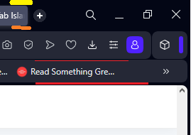
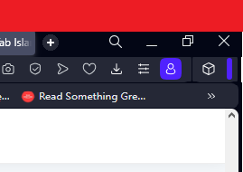
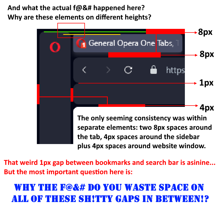
I feel that there could be "compact" theme where these gaps would be deleted, and bars tighten by couple of px?
Also, why there is shrinking option only for addons icon not the whole icon bar? Or to give user the ability to pin whichever icon he choose that he doesn't want to be hidden at a click on this blue separator

This is how much space is being freed

-
MarqM last edited by
@cirenjules In my opinion, naming the island only makes sense when the name stays visible when the island is collapsed. There is a reason when I establish a tab in the tab bar. I have searched for a content and I want to keep it to be able to look it up whenever I need it without having to search for it again. How reasonable is it to hide away the searched content completely in such a featureless dash so that you finally have to search for it again in your tab bar, when there are only lots of those meaningless dashes there. This is outright absurd.
-
cirenjules last edited by
@marqm I agree - the name needs to remain visible - even if it's vertical inside the Island. My current workaround is to just hover the mouse pointer over an Island; which then opens up a Tab List for that Island (from which you can select a specific Tab). It kinda works but a user defined, permanently display Name would be best imo.
-
MarqM last edited by
@cirenjules I would not call that a workaround. It is just one of the two possible methods to work with tab islands in the current state. The first one is to hover over all collapsed islands to see its content, the second method would be to expand the islands before starting to work with them. Both methods could be quite time consuming when the tab bar is clustered with those colorful dashes, not at all convenient when I want to find content quickly.
My "workaround" is not to use tab islands as long as they can not be configured that way, that they do not play hide and seek with me for my content.
This is just like having a library at home and then deliberately wiping out the labeling at the back of the books - how reasonable is that? -
lehuspohus last edited by
Guys, seriously.. fire you new designer and bring back the old one..

And add the button to completely disable this UI\UX mess.

-
PabTorre last edited by
Hey there!
I recently started using workspaces, and I must say, I was really excited to customize them with different logos and names. I grouped the tabs across three windows into three different workspaces, hoping to have a more organized browsing experience. However, I encountered an issue after closing the windows and restarting Opera – it seems like nothing was saved, and I'm a bit puzzled about it.
I have a couple of questions about workspaces, and I'm hoping someone could shed some light on the situation:
Are workspaces intended to be global across all windows? I'm curious to know if my customization should carry over to any Opera window I open.
Are workspaces persistent after a restart? It would be fantastic if the changes I made to each workspace would be saved and readily available when I relaunch Opera.
If workspaces are supposed to be persistent and customizable, then I might have missed a step or misunderstood something. In that case, could someone kindly point me in the right direction?
On the other hand, if workspaces aren't meant to be saved or customized across sessions, I'd like to understand the reasoning behind it, as it seems like a fantastic feature that could greatly enhance my browsing organization.
Lastly, is there a setting I need to adjust to ensure that my workspaces are saved and don't reset after restarting Opera?
I'm really looking forward to your valuable insights and suggestions. Thanks in advance for your help and understanding!
Best regards,
Pabtorre
-
weirdtuned last edited by
@lehuspohus 100 times this! Preposterous design inconsistency and ridiculous choice of abhorrent rounded corners!

-
Wild-Rabbit last edited by
hate
my tabs keep moving no matter what I do. I deselected cycle tabs in most recent order, I pinned them they still do it. i hate this update so much -
supasnoop last edited by
@leocg How do I completely disable Tab Islands? I don't want to see or use them at all. They're extremely disruptive and really annoying to look at. If there is no option to customize Opera how I actually use it (like before Opera One), I will uninstall it from all of my devices.
-
leocg Moderator Volunteer last edited by
@supasnoop Automatic tabs islands can be disabled in settings.
-
Hexenschuss last edited by
Seems like they read and listen this topic, not commonly seen nowadays... One bug fixed, zillions to go!

was:

is:

...although I would argue that favicons shouldn't overlap the separatorThe suggested piece of Opera One code may look like this:
faviconDisplayWindowSize = ...; // calculate the visible part of the favicon
faviconDisplayWindowSize--; // <-- my humble suggestion ;)
----8<----8<----8<----8<----8<----8<---
The tabs are rendered in a completely illegible manner, with transparency and overlap, and without any cropping of favicons.
It completely ruined any remaining accessibility - please compare current version from Opera One vs. Opera GX. I admit I have a lot of tabs open, but they were distinguishable from each other previously, while right now it's a mess.


Why don't you test your soft on edge cases, instead you choose to go the safe path with only 3 tabs opened, with a full-screen window, and claim success afterwards?
Hope this cancer from O.O doesn't reach O.GX. If so, I honestly admit I will have to switch to Edge.
-
wladthemlat last edited by
I want to be able to close the island with a middle click like a normal tab.
If I open a few new pages from a single source (thus creating an island) I often want to get rid of them after I am done with whatever lead to them being open. I don't want to focus on the context menu and search for the close button (which could at least have an X icon so I don't have to read the options as I don't see that good)..
I want to quickly middle click on the colored bar of the island and presto, tabs and island gone.
-
derapalne last edited by
@meeker-morgan
This!! The workspaces animation is awful. Completely Unnecesary, and it should be togglable. -
lehuspohus last edited by leocg
@weirdtuned Totally agreed!
This "island" update is worst change since moving to Chromium engine.
Even Lucid mode fail has been quickly fixed after feedback..
I don't know what the Opera dev team was thinking when they added these "islands" to the main content area?So my suggestion to Opera team: if you so thirsty and wanna add tab islands, add Tabs islands only. With option to completely disable this feature, not just to "automatically create tab islands".
Leave all other areas untouched.
We do not need content-island, bookmark-island or any other "island" on other places..And what is is? Just ridicilous

-
supasnoop last edited by
@lehuspohus That! All of it! The new design is terrible and difficult to read. Rounded corners make the tab titles hard to read. I ended up having to copy and paste tab urls to a different browser altogether.