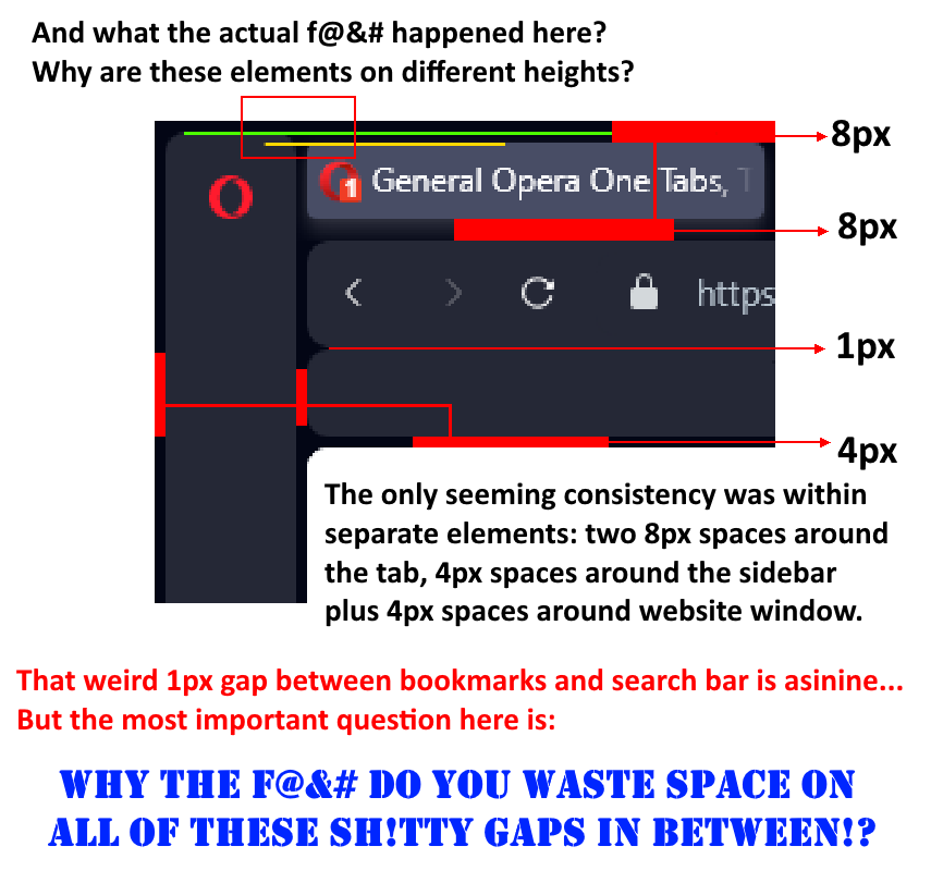
The new design of v.100 sucks a lot: too vibrant highlights, tacky and absolutely disgusting layout - the rounded outlines on search panel, bookmarks panel and extension panel make it all feel so unnecessary disjointed along with the weird "bundling" of tabs into separate outlines. All of this is annoying visual clutter. In other words, I don't want the excessive GX's style thrown into a cosy pristine browser that Opera pre-100 was. I hate these eye-popping acid purples thrown into my browser, and if you're going as far might as well give us the option to completely colour-correct our browser with custom colours for everything.

One more thing - Opera devs, hello, we aren't on mobile phones, we don't need to have stuff at the bottom of the sidebar when all of our tab interactions are happening upstairs, duh. The person who decided to move the sidebar icons down and not give an option to switch back needs to get their head bonked real hard. Hopefully, this is a bug, because I still have hope that some devs at Opera have figments of sense left inside.
weirdtuned
@weirdtuned
Opera 60 was the beginning of a downfall of software design... now Opera 100 takes the wretched cake to the extreme.
Best posts made by weirdtuned
-
RE: General Opera One Appearance Feedback TopicAppearance
-
RE: Side bar for only Speed Dial option | Opera 60Suggestions and feature requests
This update is the one of most annoying ones so far. I've always been kind of neutral about changes in Opera and addition or exclusion of various features, but this time it directly impacts the experience from using the browser. The first rule for any software that deals with visual content is "do not obstruct the view of the content".
Side Bar is a very useful thing and allows for easy access to the majority of settings, nice bookmarks page, extensions, etc., but having it intrusively sticking from the left of the screen takes up space and makes it look clunky overall. It creates half a frame for viewing any content and draws too much attention to it.
Using the Side Bar in the Speed Dial was a good alternative to using the convoluted drop-down menu from the Opera symbol in the top-right corner, but now you have only two options: either get a distracting half a frame of side bar and navigation bar, or deal with the absence of it and resort to using a rather inconvenient drop-down menu.
Whew, sorry for the abundance of words - had to spill it out. -
RE: Bookmark, settings, etc. now at the bottom of sidebar !Opera for Windows
@cmspencer Yeah, I 100% agree, this change is unbelievably stupid. Who in their right mind would ever come up with this!?
Opera devs, hello, we aren't on mobile phones, we don't need to have stuff at the bottom of the screen when all of our tab interactions are happening upstairs, duh. The person who decided to move the sidebar icons down and not give AN option to switch back needs to get their head bonked real hard. Hopefully, this is a bug, because I still have hope that some devs at Opera have figments of sense left inside.
And yeah, btw, the new design of v.100 sucks a lot: too vibrant, tacky and absolutely disgusting - the rounded outlines on search panel, bookmarks panel and extension panels make it all feel so unnecessary clustered. I don't want the excessive GX's style thrown into a cosy pristine browser that Opera pre-100 was.
-
RE: Opera One crash when open magnet linkGeneral
So when the f@$k are we getting a patch for this bug? I'm getting more and more annoyed at Opera for crashing all of my tabs and windows even if I'm opening a magnet link in an entirely new window! This is just stupid.
-
RE: Side bar for only Speed Dial option | Opera 60Suggestions and feature requests
Well, @anonan has been banned a few days ago, apparently. He's been making a lot of useful topics on the actual problems of the current versions of Opera starting from 60 and onwards. Mentioned lots of little and noticeable user-unfriendly details about newer version of Opera. Unfortunately, he wasn't very polite in regards to mentioning the competence of Opera staff lately, so this ban was only a matter of time.
I'm starting to think they aren't going to listen to us at all. I guess they're more concerned when someone finds a critical data or safety loophole, rather than caring about adjusting user experience while using the browser. I'll have to continue using the older version because all the new functions and defunctions aren't compelling enough to move on. This Side Bar thing is only one small part of the abundance of interface problems the newer versions bring to the table.
-
RE: General Opera One Tabs, Tab Islands and Workspaces Feedback TopicTab Islands, Tabs and Workspaces
@lehuspohus 100 times this! Preposterous design inconsistency and ridiculous choice of abhorrent rounded corners!

Latest posts made by weirdtuned
-
RE: Opera One crash when open magnet linkGeneral
So when the f@$k are we getting a patch for this bug? I'm getting more and more annoyed at Opera for crashing all of my tabs and windows even if I'm opening a magnet link in an entirely new window! This is just stupid.
-
RE: General Opera One Tabs, Tab Islands and Workspaces Feedback TopicTab Islands, Tabs and Workspaces
@lehuspohus 100 times this! Preposterous design inconsistency and ridiculous choice of abhorrent rounded corners!

-
RE: General Opera One Appearance Feedback TopicAppearance

The new design of v.100 sucks a lot: too vibrant highlights, tacky and absolutely disgusting layout - the rounded outlines on search panel, bookmarks panel and extension panel make it all feel so unnecessary disjointed along with the weird "bundling" of tabs into separate outlines. All of this is annoying visual clutter. In other words, I don't want the excessive GX's style thrown into a cosy pristine browser that Opera pre-100 was. I hate these eye-popping acid purples thrown into my browser, and if you're going as far might as well give us the option to completely colour-correct our browser with custom colours for everything.

One more thing - Opera devs, hello, we aren't on mobile phones, we don't need to have stuff at the bottom of the sidebar when all of our tab interactions are happening upstairs, duh. The person who decided to move the sidebar icons down and not give an option to switch back needs to get their head bonked real hard. Hopefully, this is a bug, because I still have hope that some devs at Opera have figments of sense left inside. -
RE: Bookmark, settings, etc. now at the bottom of sidebar !Opera for Windows
@cmspencer Yeah, I 100% agree, this change is unbelievably stupid. Who in their right mind would ever come up with this!?
Opera devs, hello, we aren't on mobile phones, we don't need to have stuff at the bottom of the screen when all of our tab interactions are happening upstairs, duh. The person who decided to move the sidebar icons down and not give AN option to switch back needs to get their head bonked real hard. Hopefully, this is a bug, because I still have hope that some devs at Opera have figments of sense left inside.
And yeah, btw, the new design of v.100 sucks a lot: too vibrant, tacky and absolutely disgusting - the rounded outlines on search panel, bookmarks panel and extension panels make it all feel so unnecessary clustered. I don't want the excessive GX's style thrown into a cosy pristine browser that Opera pre-100 was.
-
RE: Opera for Android 73Opera for Android
Hello, I'd like to thank the devs for the new "search bar at the bottom" option - magnificent! However...
...it all becomes useless the moment you begin working with actual tabs, because every other element of the UI stays on top of the screen

I've scribbled the basic issues with this on a screenshot.
Could be improved with more options to move the UI elements to the bottom, or an entire mode that basically "flips" the UI. -
RE: Side bar for only Speed Dial option | Opera 60Suggestions and feature requests
@leocg are you willing to dwell on the philosophical debate over the topic of whether the removal/change of a particular configuration of an existing feature is considered the removal of a feature, hahah
 ? Or maybe the debate over the topic of "what is the definition of a word -feature-", if it comes down to that?
On a side note... I'm somewhat surprised someone replies to this forum post - I'd thought this thing was long abandoned, but apparently some still don't want to accept the fact that Opera never went back on this interface change. Well, and I've never gone beyond version 58 as a conscious choice and maybe a bit of a protest, I guess. Anyway, I think this change was (and still is) stupid and unnecessary, but I don't have much hope they'll do anything about it since this topic is over a year old already.
-
RE: Side bar for only Speed Dial option | Opera 60Suggestions and feature requests
Well, @anonan has been banned a few days ago, apparently. He's been making a lot of useful topics on the actual problems of the current versions of Opera starting from 60 and onwards. Mentioned lots of little and noticeable user-unfriendly details about newer version of Opera. Unfortunately, he wasn't very polite in regards to mentioning the competence of Opera staff lately, so this ban was only a matter of time.
I'm starting to think they aren't going to listen to us at all. I guess they're more concerned when someone finds a critical data or safety loophole, rather than caring about adjusting user experience while using the browser. I'll have to continue using the older version because all the new functions and defunctions aren't compelling enough to move on. This Side Bar thing is only one small part of the abundance of interface problems the newer versions bring to the table.
-
RE: Side bar for only Speed Dial option | Opera 60Suggestions and feature requests
This update is the one of most annoying ones so far. I've always been kind of neutral about changes in Opera and addition or exclusion of various features, but this time it directly impacts the experience from using the browser. The first rule for any software that deals with visual content is "do not obstruct the view of the content".
Side Bar is a very useful thing and allows for easy access to the majority of settings, nice bookmarks page, extensions, etc., but having it intrusively sticking from the left of the screen takes up space and makes it look clunky overall. It creates half a frame for viewing any content and draws too much attention to it.
Using the Side Bar in the Speed Dial was a good alternative to using the convoluted drop-down menu from the Opera symbol in the top-right corner, but now you have only two options: either get a distracting half a frame of side bar and navigation bar, or deal with the absence of it and resort to using a rather inconvenient drop-down menu.
Whew, sorry for the abundance of words - had to spill it out.
