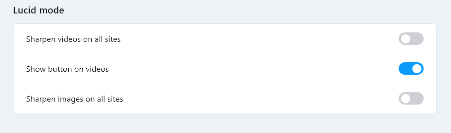
@graywoulf By the way, in the latest stable version 94.0.4606.38, there is already a menu item that allows you to hide the Lucid Mode button
Do more on the web, with a fast and secure browser!
Download Opera browser with:
@graywoulf By the way, in the latest stable version 94.0.4606.38, there is already a menu item that allows you to hide the Lucid Mode button
@kumagoro42
Until Opera Stable gets that flag, you can disable it on the command-line. For example, you can right-click on your desktop, goto "New", choose "Shortcut", point it to opera.exe in the install folder, name the shortcut what you want and click finish. Then, you can right-click on the shortcut, goto "properties", switch to the "Shortcut" tab and add a space and --with-feature:tab-art=off to the end of the target field value. Then, when you start Opera with that shortcut, the feature will be disabled.
For example:
"C:\Users\yourusername\AppData\Local\Programs\Opera\opera.exe" --with-feature:tab-art=off
У кого появляется заставка при запуске, удалите из директории c:\Program Files\Opera\101.0.4843.25 (или ваша версия) файл opera_gx_splash.exe и проблема должна исчезнуть
Хотя в новых версиях Оперы 102, 103 заставка уже не появляется
@leocg it's all good that you can choose your image. But why did they remove the switch to increase the size of the tiles in Opera One?
I confirm. Line spacing in the Opera context menu is terrible 
Return it to how it was in version 111
I would really like to see the ability to disable the Lucid Mode pop-up menu for those who do not need this feature
@richbich зайдите в Меню - Справка- О программе и посмотрите путь, по которому установлена ваша программа
@lehuspohus Unfortunately, there is no decision yet, but the Opera team has already been notified about this
Agree with the terrible new look.
Very annoying bright highlights in the context menu
@vegelund said in Opera 102.0.4864.0 developer update:
Is Opera serious with keeping the purple color?
That is ugly AF.
Perhaps they were listening to Prince while having design meetings.
Agree. This looks ugly. It is very strange that the Opera has gone from its usual form.
By the way, I created a separate topic on the forum about this, you can leave your opinions there
Terrible Opera update  . Not only did Opera freeze after the update and it didn’t load for a long time, but all passwords, tabs were deleted, speed dial was cleared. This is not allowed in the stable branch.
@theory65-0 said in Opera 102.0.4880.78 Stable update:
Not Resolved V2:
What going on with the favicon :
https://i.postimg.cc/25vnN5V6/Opera16-09-23.gif
I confirm. The problem with the icons has been going on for more than a month, and everything worked in earlier versions of Opera One.
I have already sent a bug report, but the problem is still not solved
Finally fixed this long-suffering bug with disappearing icons on the bookmarks bar.
DNA-111681 Disappearing icons of bookmarks bar folders elements
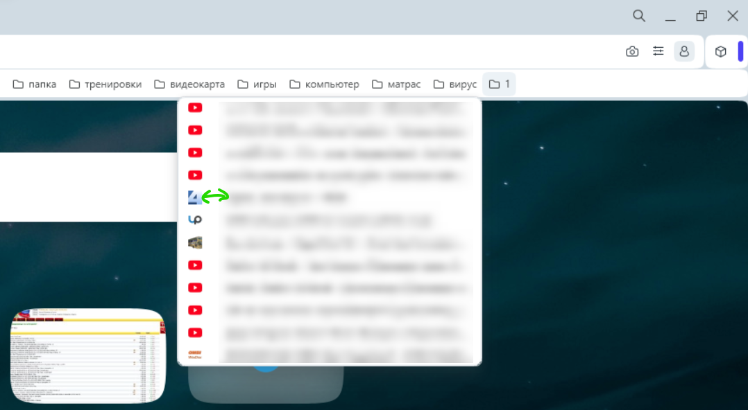
What happened to the express panel thumbnails?
The thumbnails itself looks clear. And if you hover your mouse over it, it becomes blurry

If you hover your mouse over

The distance between the icon and the file name on the bookmarks bar is very large
@cookie-drummer said in Opera 104 Stable:
Is height of bookmark items on macOS a joke? Or is a accessibility feature that you enabled for all by mistake? What's the reason of almost doubling the height of them? AGAIN: only macOS build is affected!!! Link: https://ibb.co/DwV1dh8
Yes, there is such a problem with height and indentation on Windows.
I hope this is some kind of mistake and they fix it
https://imgur.com/s6neXHi
@karen-arzumanyan Send them a bug report via the Opera browser. Maybe this way they will respond to the problem faster
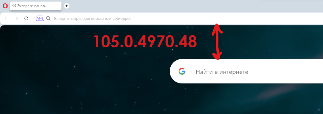
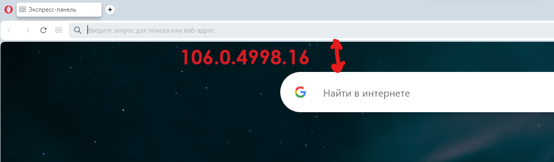
What is the reason for the decrease in padding at the top, where the search line is?
Why not return it as it was in version 105?
The Speed Dial looks much more aesthetically pleasing in version 105, when there are relatively few tiles