@cookie-drummer I agree. It was a very convenient feature. I used it often. This was an exclusive feature of the Opera. But now it's broken and doesn't function properly ((
Please bring back this feature.
Posts made by tastodd
-
BlogsRE: Opera 133.0.5932.60 Stable update

-
BlogsRE: Opera 135 developer
@andrew84 said in Opera 135 developer:
Restore the 2nd click for the ''scroll to top' feature
I agree. It was a very convenient feature. I used it often. But now it's broken and doesn't function properly.
- Blogs
-
BlogsRE: Opera 130 Stable
@korol78 said in Opera 130 Stable:
Let the opera team get moving and search )))
The Opera team won't look for the problem specifically on your computer. Because this problem is unique to you
-
BlogsRE: Opera 130 Stable
@korol78 said in Opera 130 Stable:
Log into your Google account and the button won't work!!!
Google account is active and everything works
Look for the problem in your profile. -
BlogsRE: Opera 130 Stable
@korol78 said in Opera 130 Stable:
doesn't work
Everything works for me. Check your extensions, maybe they're interfering.
- Blogs
- Blogs
- Blogs
-
BlogsRE: Opera 128 Stable
When loading a page, sometimes a "pink flash" appears
This has already been discussed here
https://forums.opera.com/post/399037 - Blogs
-
BlogsRE: Opera 127 developer
@Opera-QA-Team A 1 year ago, I made a video showing the blue frame appearing. https://forums.opera.com/post/368908
I checked this again, and the problem persists.
System: Windows 11 25x2
CPU: Intel 14600K
Graphics: Intel UHD Graphics 770
 -
BlogsRE: Opera 126.0.5742.0 developer update
@andrew84 said in Opera 126.0.5742.0 developer update:
The bar at the speed dial page's bottom is still not fixed (the bug reached Stable).
And while starting the browser the bar is red and I'm not alone who sees this > https://forums.opera.com/post/396831*additionally I see the full screen red flash when restoring minimized window.
Maybe it's related to the graphics adapter and driver?
I'm running Windows 11 25H2 (100% scaling) with an Intel 14600K processor and integrated Intel(R) UHD Graphics 770 without any issues. -
BlogsRE: Opera 125.0.5727.1 developer update
@Opera-QA-Team said in Opera 125.0.5727.1 developer update:
thanks for your valuable feedback about the new split screen. And, regarding 'the minimize button's blue border' - I coulnd't repeat it on Win11 nor Win10, but we will keep an eye on this.
I reported this problem almost a year ago and made a video demonstrating it.
https://forums.opera.com/post/368908 - Opera for Windows
-
BlogsRE: Opera 122.0.5643.24 Stable update
@steeveboy After installation, restart Opera. If the new design does not appear, then check that the flag
chrome://flags/#history-redesignis enabled - Blogs
-
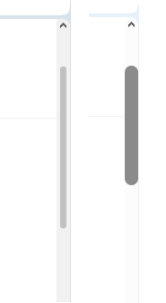
BlogsRE: Opera 119
@firuz-u7 Yes, in version 119 the scrollbar looks rougher and less pleasant. In version 118 the scrollbar was more modern and convenient
-
BlogsRE: Opera 120.0.5516.0 developer update
@andrew84 Yes, it would be good if they brought back the ability to turn off this animation for those who find it annoying or don't like it.