Opera launches Opera One R2 – the best Opera Browser to date
-
andrew84 last edited by andrew84
@burnout426 I edited theme and after selecting the cold blue (similar to the one used previously in preOne versions) it looks nice.

but the tabstrip's color (and tabs contrast) is not the best in this case (but acceptable).
-
tastodd last edited by
Opera team, but still, if you decide to make a classic theme, then it would be right to leave the entire color scheme as it was in previous versions. And if someone wants to change the colors for themselves, then they themselves manually build the color scheme that they like
-
daria19 Opera last edited by
@tastodd: Thank you all for your feedback! The color scheme in the Classic Theme is designed to align with the overall updated look and feel of the browser. However, we truly appreciate your insight and encourage you to explore the available customization options to find the color scheme that suits you best.
-
andrew84 last edited by andrew84
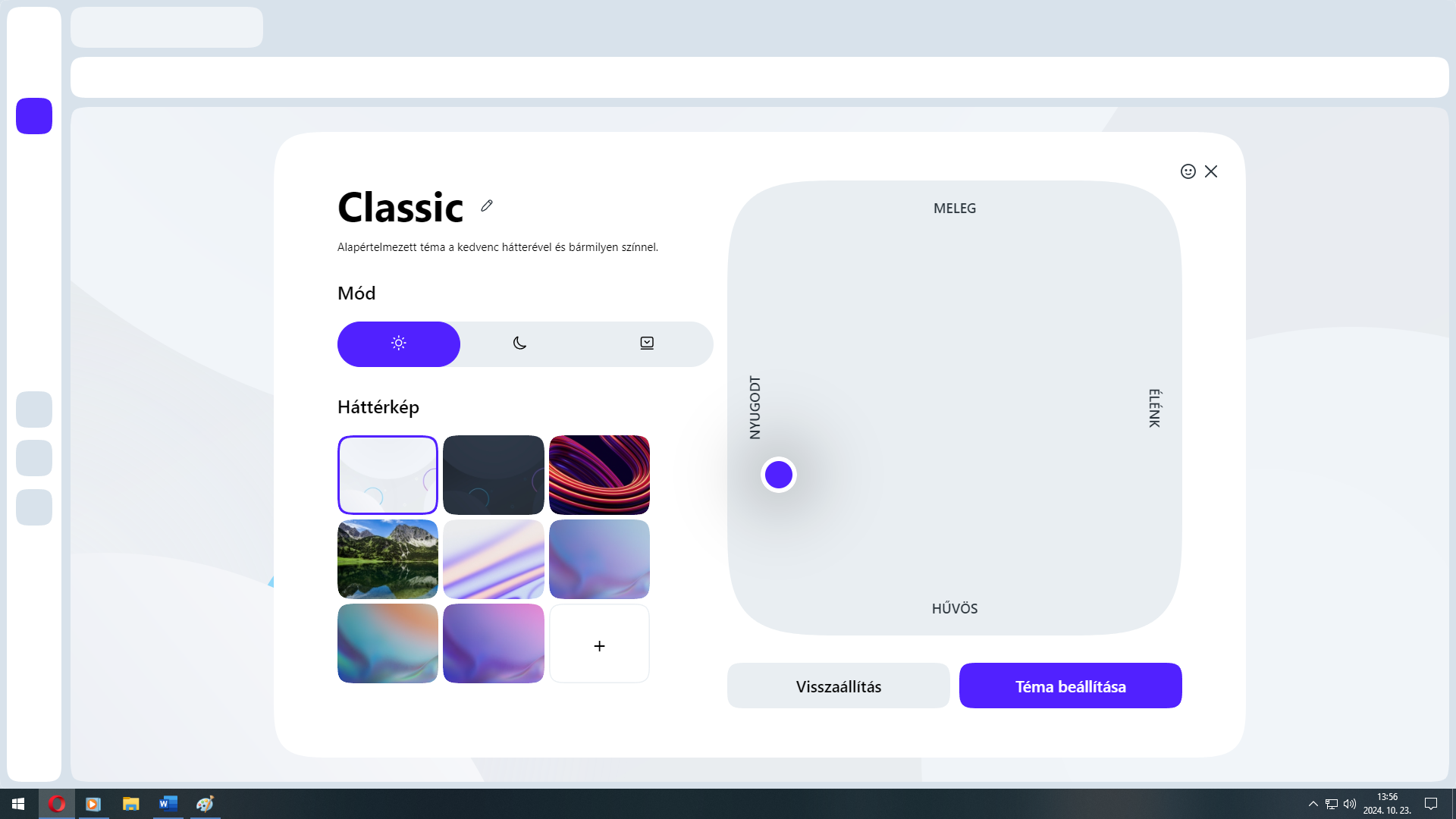
'Classic' theme sounds more like the theme used earlier (and I really like that theme, excepting the bright white hovered items in dark mode) before the 'One' version.
So I'd suggest renaming the current 'Classic theme' into 'Opera One' and offer another one predefined theme which will be really 'Classic' (or 'Opera legacy' or smth similar) -
sicu220 last edited by
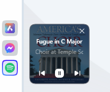
Why was the Mini Player broken? It has become small, I can't see where the number is right now. I can't pull it up to the right side as shown in the video. Why did the choice become more complicated? Dark and light theme?
-
daria19 Opera last edited by
@sicu220: Thank you so much for your feedback! We appreciate you taking the time to share your thoughts. Regarding the dragging issue with the Mini Player, it appears to be functioning well on our end. If you're experiencing difficulties, please let us know with a bit more detail, and we'll be happy to assist you further. The updated design of the Themes is intended to offer you more customization options for a more personalized experience. We genuinely appreciate your patience as you adjust to the new look, and we hope these additional features enhance your overall experience. If you have any further questions or concerns, please don’t hesitate to reach out.
-
sicu220 last edited by
The only problem I have with the mini player is that it's small and I can't see how many minutes the song is playing at the moment. Old design was good.
-
max1c last edited by
I'm confused by this release. It seems to suggest that dynamic themes are now available. However, after updating I can only select Classic themes and have Coming Soon for the rest.
-
max1c last edited by
@burnout426 Here's what I see:
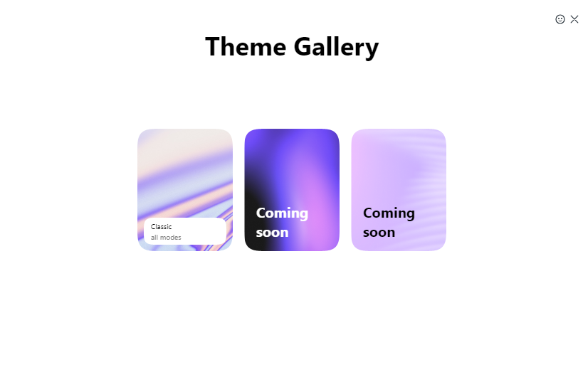
I installed the preview versions and I had Aurora and Midsommar before. But not in this release.
-
max1c last edited by
@burnout426: Ok, nevermind. It's because I disabled hw acceleration since I keep getting blinking black screens all the time.
-
max1c last edited by
@burnout426: I get a blinking screen sometimes and then the whole browser just turns white until I completely restart it. Happens on RTX 3080 and on a laptop without a dedicated GPU. Unfortunately, not exactly usable themes.
-
burnout426 Volunteer last edited by
@max1c Ah, makes sense. I assume you tried setting the "Choose ANGLE graphics backend" flag at the URL
opera://flags/#use-angleto "opengl" when hardware acceleration is on to see if that fixes your issue? -
KeivMS last edited by
In previous version i could set my daily changing desktop wallpaper as my background in opera.
Not seeing that anymore.Why was this feature removed?
If not removed, where is it now?
-
parduspars last edited by
After a long time, I wanted to update my Opera and give it another try, but my classic problem continues: I can't watch Twitter and Instagram videos. I don't have this problem in other chromium-based browsers on my system, but I can't figure out why I have it in Opera. It seems like I'll close Opera again now and wait for the next version.

-
andrew84 last edited by andrew84
*It's a bit strange that it's impossible to select wallpaper when predefined theme is selected. I think it should be possible after the 'Animated' toggle is disabled.
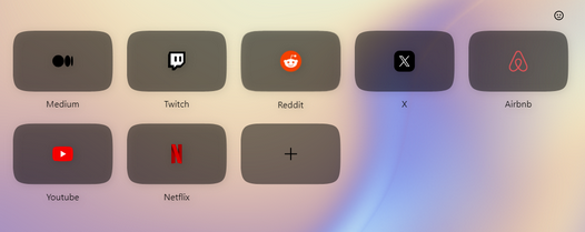
*Another one thing I noticed is that tiles on your screenshot have the semitransparent light background. But here it's dark background.
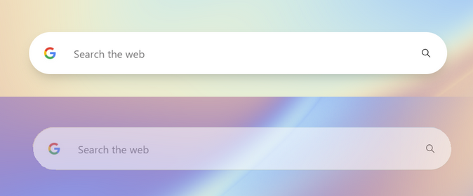
*and I think that the search box should be also semitransparent while not focused.
-
max1c last edited by
@burnout426: Yes, OpenGL fixes the blinking. But these themes don't work at all with OpenGL. Everything is just white.
