Opera unveils Opera One, an entirely redesigned browser
-
A Former User last edited by
@joannaczajka: Would it be possible to add some blur to Opera's interface, as we did in Opera Neon?
-
davidgould last edited by
@joannaczajka: Windows. https://prnt.sc/aD_5wCJTadXo
Whilst using less memory for the sleeping tabs (and I use Marvellous Suspender), Opera's main threads seem quite hungry and don't let go of memory quickly enough. I often find I can randomly kill threads in Task Manager (all but the top 2) to reclaim memory.
-
vladbabinets last edited by leocg
Today is Monday, but there is no new build. It looks like the lazy opera team
-
thelittlebrowserthatcould last edited by
@vladbabinets May Day is a public holiday in many countries.
-
A Former User last edited by
@thelittlebrowserthatcould: I agree that the active tab should be highlighted more. From my point of view, Vivaldi has the best alternative. They use the site's predominant color to highlight the active tab. This makes viewing the active tab very intuitive.
-
JoannaCzajka Opera last edited by
@kened, @thelittlebrowserthatcould We're still working on light/dark theme and contrasts. Low contrast in an active tab is a known issue, to be fixed soon.
-
andrew84 last edited by andrew84
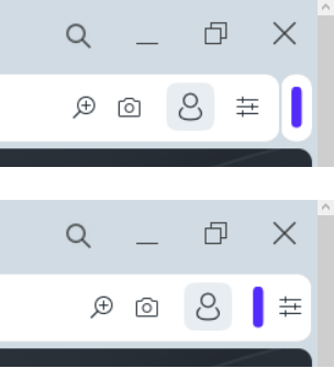
I think that extensions bar(island) should be placed inside the address bar like previously. EasySetup button should be always located far right on its usual place.

Also there should be separators for address field like in regular Opera.


-
cz4rek last edited by
Hello everybody!
Is it possible to have again dark address bar in Dark Mode in Private Window as it was in v.98?
Now we have nasty white one ...

-
burnout426 Volunteer last edited by
@andrew84 said in Opera unveils Opera One, an entirely redesigned browser:
EasySetup button should be always located far right on its usual place.
Indeed.
-
parduspars last edited by
When I try the screen capture, Opera crashes two times(click capture button, crashes).
-
leocg Moderator Volunteer last edited by
@vladbabinets Nope, but it doesn't mean that a new build will be released.
-
andrew84 last edited by
I can't check right now on win 10, but how does sidebar look in new design when in autohide mode?
It looks like border + narrow sidebar + border?
