Opera unveils Opera One, an entirely redesigned browser
-
andrew84 last edited by andrew84
@joannaczajka Ok. That was just a notice.
Personally, I usually don't use workspaces and hardly I will be using the islands.What really bothers me is that there's a frame around web page in new design. Posted also here https://forums.opera.com/post/307792
And the frame also persists for full screen videos. Posted by other user
https://forums.opera.com/post/307564What really surprised me is that there's still the old square context menus (from O58 era) with the high contrasting highlighted items in dark mode (from reborn 3), according to this post https://forums.opera.com/post/307427
-
oP2 last edited by
@joannaczajka Good to hear!

Please, also do not forget about Chromium updates since they also bring new stuff and security fixes. -
thelittlebrowserthatcould last edited by
@kened I think the sidebar is needlessly wider but, of course, it can be hidden -- but I prefer to have it visible most of the time. The sidebar's presence was a big turn-off for a longterm Firefox user I know, who'd deleted Opera before I had a chance to say it could be hidden.
Anyway, I want more choice in sizes, colours, icons etc. We had choice in the Presto days. These days I use an extension to force the active tab to the far left or right, because there's so little contrast in the design. There used to be a "BeOS" theme with a yellow active tab and the rest black. Vivaldi is catering better for my ageing eyes, at the moment. Are "hip" users Opera's actual market share?
-
A Former User last edited by A Former User
@nuiin: sheeesh, you clearly are overreacting a bit. Opera One is fresh and fits 2023 very much, while you obviously stuck in 2010. Use Vivaldi, if you want. You'll be back.
-
A Former User last edited by
@joannaczajka: Would it be possible to add some blur to Opera's interface, as we did in Opera Neon?
-
davidgould last edited by
@joannaczajka: Windows. https://prnt.sc/aD_5wCJTadXo
Whilst using less memory for the sleeping tabs (and I use Marvellous Suspender), Opera's main threads seem quite hungry and don't let go of memory quickly enough. I often find I can randomly kill threads in Task Manager (all but the top 2) to reclaim memory.
-
vladbabinets last edited by leocg
Today is Monday, but there is no new build. It looks like the lazy opera team
-
thelittlebrowserthatcould last edited by
@vladbabinets May Day is a public holiday in many countries.
-
A Former User last edited by
@thelittlebrowserthatcould: I agree that the active tab should be highlighted more. From my point of view, Vivaldi has the best alternative. They use the site's predominant color to highlight the active tab. This makes viewing the active tab very intuitive.
-
JoannaCzajka Opera last edited by
@kened, @thelittlebrowserthatcould We're still working on light/dark theme and contrasts. Low contrast in an active tab is a known issue, to be fixed soon.
-
andrew84 last edited by andrew84
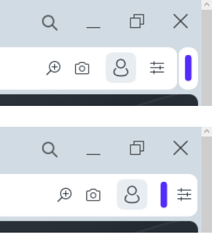
I think that extensions bar(island) should be placed inside the address bar like previously. EasySetup button should be always located far right on its usual place.

Also there should be separators for address field like in regular Opera.


-
cz4rek last edited by
Hello everybody!
Is it possible to have again dark address bar in Dark Mode in Private Window as it was in v.98?
Now we have nasty white one ...

-
burnout426 Volunteer last edited by
@andrew84 said in Opera unveils Opera One, an entirely redesigned browser:
EasySetup button should be always located far right on its usual place.
Indeed.
-
parduspars last edited by
When I try the screen capture, Opera crashes two times(click capture button, crashes).