Opera unveils Opera One, an entirely redesigned browser
-
davidgould last edited by
@joannaczajka: Windows. https://prnt.sc/aD_5wCJTadXo
Whilst using less memory for the sleeping tabs (and I use Marvellous Suspender), Opera's main threads seem quite hungry and don't let go of memory quickly enough. I often find I can randomly kill threads in Task Manager (all but the top 2) to reclaim memory.
-
vladbabinets last edited by leocg
Today is Monday, but there is no new build. It looks like the lazy opera team
-
thelittlebrowserthatcould last edited by
@vladbabinets May Day is a public holiday in many countries.
-
A Former User last edited by
@thelittlebrowserthatcould: I agree that the active tab should be highlighted more. From my point of view, Vivaldi has the best alternative. They use the site's predominant color to highlight the active tab. This makes viewing the active tab very intuitive.
-
JoannaCzajka Opera last edited by
@kened, @thelittlebrowserthatcould We're still working on light/dark theme and contrasts. Low contrast in an active tab is a known issue, to be fixed soon.
-
andrew84 last edited by andrew84
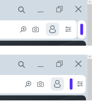
I think that extensions bar(island) should be placed inside the address bar like previously. EasySetup button should be always located far right on its usual place.

Also there should be separators for address field like in regular Opera.


-
cz4rek last edited by
Hello everybody!
Is it possible to have again dark address bar in Dark Mode in Private Window as it was in v.98?
Now we have nasty white one ...

-
burnout426 Volunteer last edited by
@andrew84 said in Opera unveils Opera One, an entirely redesigned browser:
EasySetup button should be always located far right on its usual place.
Indeed.
-
parduspars last edited by
When I try the screen capture, Opera crashes two times(click capture button, crashes).
-
leocg Moderator Volunteer last edited by
@vladbabinets Nope, but it doesn't mean that a new build will be released.
-
andrew84 last edited by
I can't check right now on win 10, but how does sidebar look in new design when in autohide mode?
It looks like border + narrow sidebar + border? -
DarthGTB last edited by
@generosus it seems they deleted my reply. So I'm removing the reason for controversy in my previous reply...
Try out Yandex Browser. It is a Russian fork from Chromium Opera. They made most features of Opera much better and I wish Opera to actually take a look into it as well.
- Sidebar custom pages aren't hidden under a flag
- Sidebar has unlimited custom pages instead of the 5 limit of Opera
- Sidebar custom pages can be opened as a separate window and be pinned on the taskbar and be used just as if it were a desktop app. Very useful for e-mail, WhatsApp, Telegram, Spotify, etc. These windows won't count to the saved tabs when closing the browser.
- Tab bar can be moved to the bottom
- Video popup can pause by clicking anywhere
- Video popup can go full-screen (useful when embedded videos can't be full screen)
- Smoother tab integration when moving between windows and not the struggle it is in Opera to move one tab from one window and put it on another already opened window for instance
- If you have more than one tab selected, you can detach all of them together to a new window
I'm moving back to Opera after a long time for reasons I would not like to discuss here, but I think Yandex Browser is a very good browser overall (I left Opera back when the original Opera was discontinued and started using Firefox. I tried the new Opera for a while, but it was basically just another Chromium. Then I found Yandex and have been using it for almost 10 years now. It's just better in almost every way)
