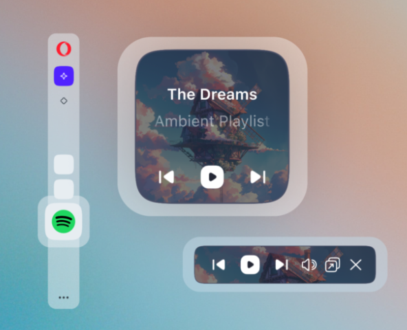
Opera launches Opera One R2 – the best Opera Browser to date
-
andrew84 last edited by andrew84
@ddvddv it's strange. Today I was complaining in Dev thread https://forums.opera.com/post/362948that there's no toggle in Settings (see screenshot). But now I see the switch.

-
andrew84 last edited by andrew84
@leocg for some reason I see it now in Settings without smth. editing.
Edit: I was able to reproduce the glitch. Enable Classic theme and select light mode in EasySetup, then open Settings page and select dark in 'Apereance' section so no 'force dark theme' toggle visible. After refreshing the Settings page the toggle appears.
-
mixchild last edited by leocg
@daria19: 1.Pip interface change could at least have left the option to reverse to previous PIP player
2.PIP should be in a separate window like it used to be so OBS can record the separate window
3.Live themes needs more personalization and adding a picture option would be great for this.
4.Opera developers has white O menu logo so we should be able to have the option to choose the red or white color, it would make the design more subtle instead of this one -
mixchild last edited by
@mixchild: And ofc about:blank flashing white light the issue know as "Content area flashes white when changing or re-opening tabs" at chromium site, tens of thousands of browser users have been asking this issue to be fixed so @daria19 is it confirmed that even Opera developers are powerless to replace this white flashbang issue while loading a suspended tab with a dark theme?
-
andrew84 last edited by
@mixchild said in Opera launches Opera One R2 – the best Opera Browser to date:
Pip interface change could at least have left the option to reverse to previous PIP player
As a temporary solution you can disable the #video-popout-redesign flag.
-
andrew84 last edited by
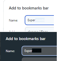
Like Dev version Stable version also has the buggy text selection in bookmarks adding dialog.
-
thelittlebrowserthatcould last edited by
Three Debian updates (114.0.5282.137/142/144) over the past couple of days, and startup became very sluggish. I have/had many pages, sleeping with The Marvellous Suspender extension for Chrome. I have temporarily removed them, giving me the chance to look again at an issue with Workspaces. I had 12 setup and there's still the bug of adding another and finding an earlier one has been deleted, with no warning. Right now, I can only have 9 Workspaces. I think when I first reported the bug I had found the tabs from the deleted Workspace transferred to another. Nevertheless, it's not the sort of behaviour I enjoy dealing with.
-
haired last edited by
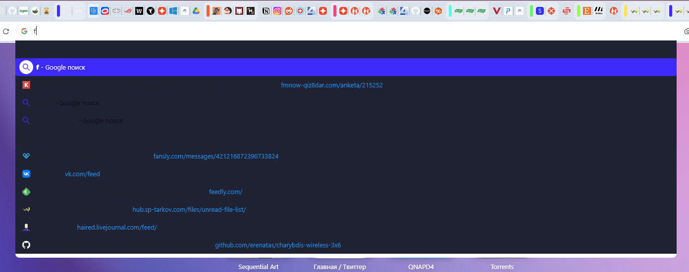
114.0.5282.115 update broke the address bar. When changing the theme from light to dark (and back) — the drop-down menu of the address bar does not change color.
-
KeivMS last edited by
Does anyone know where the setting is to use my current desktop wallpaper when i start Opera?
My daily changing desktop was always mirrored in my browser, now it's not.
did i miss a setting somewhere?
or did they just remove it to push their new themes?
-
HealingCross last edited by
@eharabien Deleting custom designs has been added to the recent update. Thank you very much for that.
-
daria19 Opera last edited by
@thelittlebrowserthatcould: Thank you for sharing your experience! Could you let us know if there are any specific steps you take when adding a new Workspace that might trigger the unexpected deletion of previous ones? Your feedback is valuable as we work to resolve these problems.
-
daria19 Opera last edited by
@mixchild: Thank you for your feedback! The changes to the PIP interface are in line with the current design, but we appreciate your suggestions. We also appreciate your input on adding a picture option for enhanced personalization! Regarding the 'Content area flashes white when changing or reopening tabs,' this is a known Chromium issue, and unfortunately we should wait for a resolution from their side.
-
andrew84 last edited by andrew84
@daria19 said in Opera launches Opera One R2 – the best Opera Browser to date:
The changes to the PIP interface are in line with the current design
Why the new design should mean worse user experience?
-
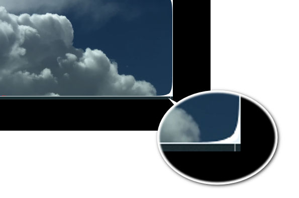
the radius of rounded corners is too big (it looks ok only if the PiP is stretched to be big enough). So the radius should be proportionally changed when increasing/decreasing the PiP. Currently I can't normally position the PiP in the bottom right corner without seeing the hole in the corner.
-
The dimmed area should be only on top and bottom (like previously) and the centered control should be moved to bottom.
-
Still unclear the reversed logic for the volume control (increasing from top to bottom). And even tooltip is reversed-shows 'mute' when already muted and 'unmute' when already unmuted. And the volume control should be on the same level as play/stop/next button.
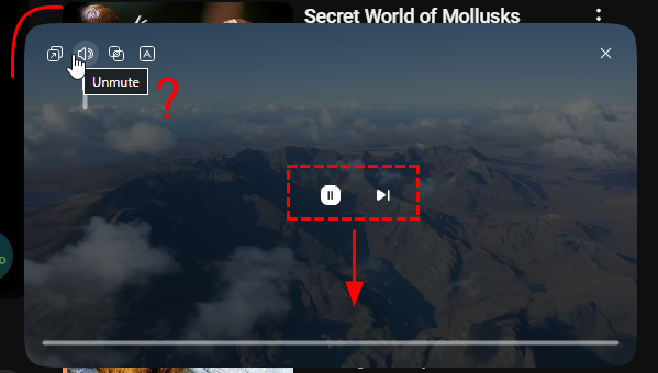
*And the multiple times mentioned removed timing.
And previously many times suggested video title. Instead of to be more advanced and handy the PiP degradated. -
