Help us create a better address bar experience
-
Opera Comments Bot last edited by
Hello there, You’re creating Opera together with us and your feedback is always very important. Today, we would like to ask you a question about our address bar dropdown. There’s room for improvement, so we’re very eager to hear what you think about it. We would like to add a ‘Shortcuts’ column to the address…
Read full blog post: Help us create a better address bar experience
-
andrew84 last edited by andrew84
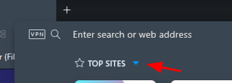
Make the 'top sites' pane optional (expand arrow or switchable off in Setting) and add 'quick action' buttons (Copy/Paste/Print/Find/Full screen/Save as PDF and similar)


*As for the shortcuts, it's better to make it customizable and offer users select what shortcuts each users want. 5-6 shortcuts for example, from the range of browser options (20 -30 most important options/elements/pages).
And my suggestion also is to focus more on options that directly refer to currently opened page and on address field/text, not on some global browsers features (that's why I'd like to see quick buttons).
-
jojo0587 last edited by
Shortcuts like "paste", "paste and go", "paste and go in a new tab". They used to exist at the Opera.
My proposals for changes in Opera (Google Document).
- There are not enough signs to put all the links here. -
A Former User last edited by
Let me turn the roulette table 180 degrees for a while:
"Help us" AND "create a better" working environment finishing unfinished issues and cleaning old dusty Opera corners!
-
Why you need to synchronize two windows and how?
Workspaces - synchronize windows' slides
Workspaces - desynchronize show/hide options
Workspaces - desynchronize icons -
Vertical lines in Sidebar windows are not movable
Bookmarks page has hidden movable border line
Some vertical division lines on setting pages are not movable -
Sidebar opening/closing windows is inconsistent
Sidebar - total mishmash
Changing website's order via drag'n'drop, failed. -
Up the ante of Opera effectiveness
Open thumbnails too in directory with images
Opera does not play playlists (*.pls) -
"Left shift" bugs
Snapshot makes screenshots with left shift
Opera 74.0.3870.0 developer update - Snapshot's left shift
Site panels from Sidebar opens windows wrongly
After the polishing phase you will turn the table to the original position and WE will move ahead together again.
-
-
JurajKovac last edited by
I for one would be psyched if the address bar pop-up would be touch-friendly. Right now, I can't tap on a URL suggestion to open the page.
If the new shortcuts updated seamlessly based on input, i.e. filtering as I type, that would be quite useful. -
kamil7165 last edited by kamil7165
Your idea is good if only it will be possible to disable these shortcuts in settings. With the URL there are other things to improve. 1) When I'm typing, it prompts random previous pages from history even though in history there are exact web pages' titles and addresses which are more relevant. 2) Maybe it would be better to list more results from history and google prompts or allow us to set limit of number of lines. 3) I'd love to see better prompts from google. At the moment google prompts whole passphrases even though many often times I want to enter single word. So prompting one word at a time (the first words of a whole google prompt) would be some relief when searching.
-
andrew84 last edited by
@kamil7165 said in Help us create a better address bar experience:
When I'm typing
You're talking about the address bar dropdown, I guess. Enhanced address bar and address bar dropdown are two different things. Dropdown appears when you type, enhanced address bar appears (optionally) when you click on the address field.
-
kamil7165 last edited by
I also think that the green padlock was way better as you could quickly check if given page is secure (I know that in fact that's simplification but still way better). And the protocol prefix (like http/https) displaying was also nice.
-
leocg Moderator Volunteer last edited by
@kamil7165 Many browsers are stop using the green padlock icon to avoid giving an unreal sensation of total security.

