Opera launches Opera One R2 – the best Opera Browser to date
-
lancealot last edited by
@daria19: Great post about how Opera handles the Chromium updates. I always find it interesting how quickly users criticize Opera for not being on the latest Chromium version, without realizing it takes work on your end in ensure it doesn't totally break things by rolling it out too quickly. I know based on previous posts on this same topic that Opera will also prioritize pushing Chromium updates out as quickly as possible when major security issues are involved. I applaud the work you and Opera are doing considering how complex web browser are.
-
max1c last edited by
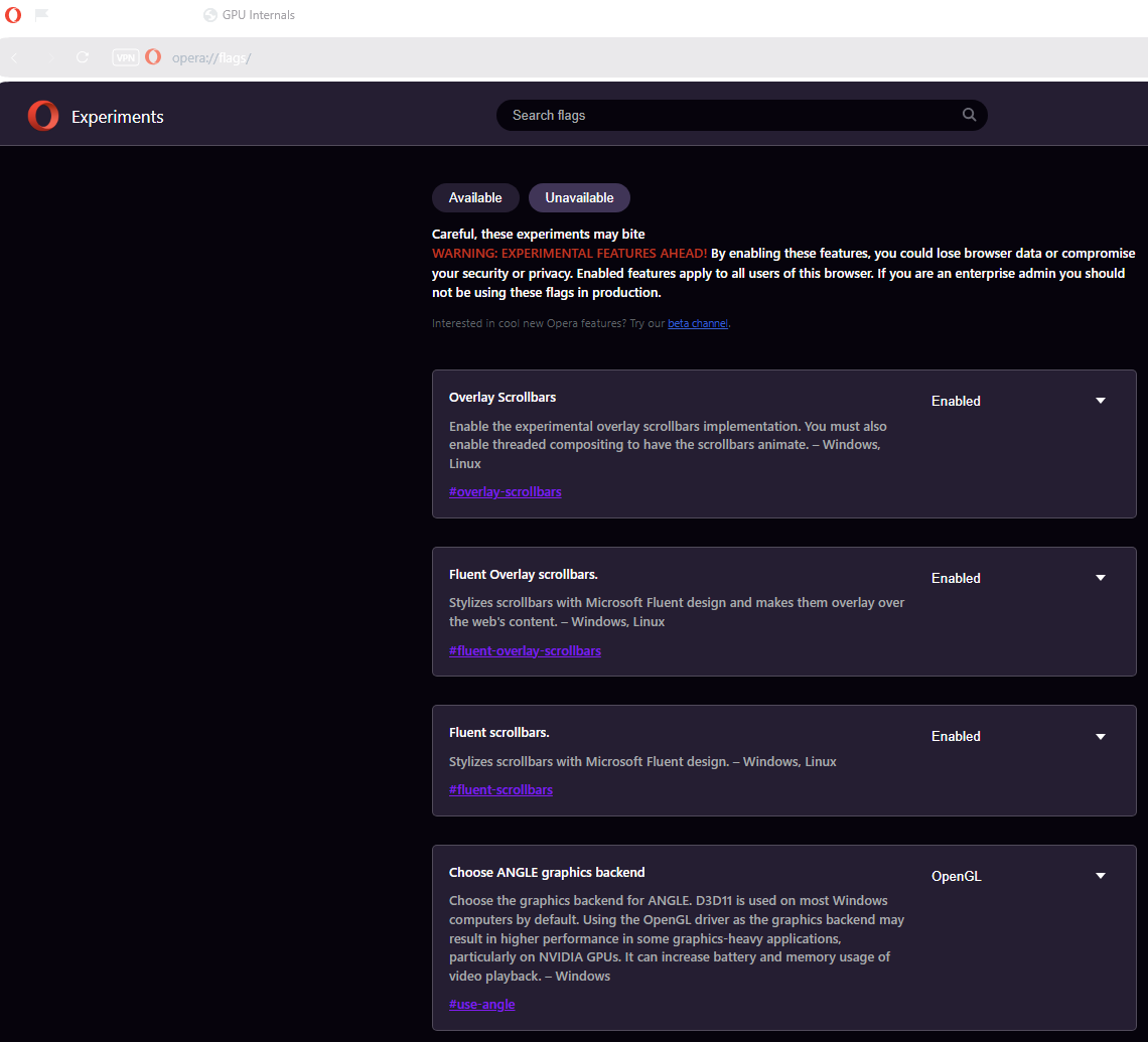
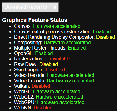
@burnout426 I doubt this has anything to do with Opera specifically. Pretty confident this is a Chromium issue that has been there for a while. Just tried again:


As you can see the whole browser is white with OpenGL. -
HealingCross last edited by HealingCross
@lancealot But it leaves the question: Are we open to exploitations because of the unfixed security holes? Shouldn‘t there at least be some backports in due time? I don’t see that really been done.
-
lancealot last edited by
@healingcross316: Actually I see the opposite, when they update Chromium in a Opera release it is not always the latest Chromium version, which means they are backporting the security fixes into a older version which they had more time to test. They have said before themselves they backport fixes, and mention such instances from time to time (https://blogs.opera.com/security/2024/08/update-your-browser-security-fixes-for-latest-chrome-zero-day-cve-2024-7971/). It takes time for the upstream fixes to make it into all the Chromium based browsers, even for a big company like Microsoft and their Edge browser (I read their changelogs so I see the lag). If your really worried about being open to exploitation then you probably shouldn't be on the Internet since I can tell you no software is 100% secure, and there are always exploitations waiting to be discovered. The point is Opera does roll out security fixes as soon as possible based on needing to test for reliability, it is not like they are ignoring them completely as your insinuating.
-
HealingCross last edited by
@lancealot That one didn’t come from me. It’s what they say on sites like this e.g.
https://www.pcworld.com/article/2498884/chrome-130-first-patch-fixes-three-high-risk-security-flaws.html
I was really asking then. -
HealingCross last edited by
Let me be honest: The new Opera One R2 is mostly about eye candy - isn't it? I mean, why should I change my themes with even having music in the background?
It really got bloated in my eyes with all of that new stuff. Isn't a web browser mainly for searching the web and getting out of the way?
Also, I when experimenting with themes I couldn't delete my customized ones, which leads me to having five Classic, two Midsommer and three Aurora in my gallery.
Still, even with a Aurora enabled I see the sites in my sidebar with just classic dark theme which is very unpleasant for my eyes.
I'm sorry to say, I would have expected something different from this update.
Unfortunately, my other appreciated browser Vivaldi also has come up with a new visual upgrade these days. And I don't like them either. Time to switch to Firefox or Brave again, I think. -
andrew84 last edited by
@HealingCross316 said in Opera launches Opera One R2 – the best Opera Browser to date:
I couldn't delete my customized ones
In near future it'll possible because there's a flag (in developer at least) #color-themes-delete-configs which allows to delete themes.
But I agree with your post that the themes feature is too hyped. -
HealingCross last edited by
@andrew84 Yes, I think so. I could change and edit themes with Vivaldi at least five years ago. Same goes with split screen, which in Vivaldi is not restricted to two sites. Although I have to admit the feature is better implemented in this new Opera version.
I don't know if this all is some Gen Z marketing with all this hype. I mean, maybe I'm just too old for such stuff.
I came back to Opera before Version 100 and I did like it how it was. I'm not sure what are the benefits of all these changes since then.
I'm trying out Brave for now. Let's see where this leads me to. Thank you, Opera, for more than two years now. I hope, you'll stay relevant even without these gimmicks. -
eharabien Opera last edited by
@HealingCross316 thank you for your feedback, we're really appreciate it. In this release we focused more on visual and creative features but also added some functional features like Split Screen or Tab Traces.
Regarding possibility to delete customized themes we're currently working on it and we will add this pretty soon. Sorry to hear that we didn't meet your expectations. Would you be so kind and share with us what exactly you expected from this update? This will help us to improve for feature updates.
-
eharabien Opera last edited by
@andrew84 thank you for your feedback. Aurora and Midsommar comes with built-in wallpaper and that's why you cannot upload your own wallpaper. However, you have this possibility in Classic Theme and you can also adjust colors and browser mode.
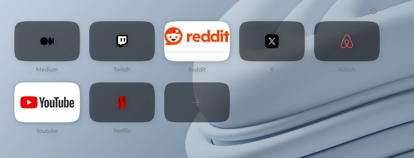
Regarding speed dials background - you're right, it should be semitransparent and this is a bug we're fixing as we speak, it should be done in several days. We really appreciate your feedback becasue it helps us improve our browser with every update.
-
eharabien Opera last edited by
@parduspars thank you for your message. Can you describe your problem with Twitter and Instagram video? This will help us to fix this issue for you. You can use this form to create your bug report: https://bugs.opera.com/wizard/
-
andrew84 last edited by andrew84
@eharabien said in Opera launches Opera One R2 – the best Opera Browser to date:
Aurora and Midsommar comes with built-in wallpaper
I understand this. It was just a notice regarding the design and why there's no possibility to upload own wallpaper and fit it to full screen under the UI modules
@eharabien said in Opera launches Opera One R2 – the best Opera Browser to date:
it should be semitransparent
Tiles are semitransparent but it's dark. Maybe it should be semitransparent white in light mode and semitransparent dark in dark theme.
Edit:
I'd also suggest also using semitransparent tiles if thumbnail has a full area picture. The thumbnail can be solid when hovered by cursor.

-
HealingCross last edited by
@eharabien You’re answer is appreciated as well. Maybe, I‘ll give the new Opera another week and see, if we‘re getting friends

But animated themes have not been on my wish list, actually. But maybe, I‘ll be convinced when there are more in the store. Otherwise to customize the classic one isn’t the worst option either. Maybe, it was almost my gallery flooded with themes, make me grumbling. -
mixchild last edited by
@eharabien why did you remove timer from the PIP player? also will we be able to add our pictures on live themes in future (i mean static picture with transparent background on top of the theme)
-
ThoGo last edited by
I still find it disappointing that Opera doesn’t adapt to the GNOME theme. Or that there’s no option to set it. For example, I’d prefer the minimize, maximize, etc. buttons on the left instead of the right.
-
tastodd last edited by
@eharabien And please make the classic theme the same as it was with all the previous shades and colors. It is clear that I can fine-tune it for myself in the future, but I would like the classic theme to be the classic one that we have become accustomed to since Opera 100
For example, the address bar in the classic theme used to be lighter and more harmonious

In subsequent versions, for some reason, you significantly darkened the same address bar in this same classic theme. The same as with selecting folders on the tab bar


