Opera 114.0.5263.0 developer update
-
ralf-brinkmann last edited by
I found another oddity:
If I want to minimize the Opera window, either by clicking on the icon at the top right or using the keyboard (ALT-Space, "N"), it first switches to a completely black window and only then shrinks down to the taskbar.
W11x64, Operax64 -
tastodd last edited by
And please make it possible to choose a classic theme with the colors in the color scheme that is now in Opera by default. Otherwise, it is not always possible to manually select exactly the color that you have become accustomed to over many years.
-
leocg Moderator Volunteer last edited by
@indiqazzz No crashes here on YouTube. Didn't check on Twitter.
-
andrew84 last edited by
Why you removed the themes flag? Currently the themes doesn't look like a ready to use feature.
-
andrew84 last edited by andrew84
Here all modules (its edges), (address bar, bookmarks bar, sidebar, extensions) don't look like round cornered rectangles. Don't look like tabs if shortly speaking.

but look like the rectangles were stretched so look like a 'sausage'. At least here on 13.3 display.

Also, there're still 'holes' in the UI when modules (sidebar or sidebar setup for example) are opened.
-
andrew84 last edited by
The sidebar (autohide mode) bug when exiting full screen video is still not fixed!
https://forums.opera.com/post/345012
https://forums.opera.com/post/342655 -
fan4eggg last edited by
Could you make HDR RTX work together with Lucid in Opera?
When I turn on Lucid, the RTX HDR effect is “turned off”.I've been asking for this since March and so far I've only been promised and promised.
-
kabir96 last edited by
The redesigned Video Popout doesn’t look appealing or useful. The rounded corners reduce video details in the corners. When you hover the mouse pointer over the popout, an unattractive gray overlay appears. The play/pause button is now in the middle instead of the bottom left corner. Additionally, the volume button is located at the top left, and the vertical volume bar only appears when you hover over the volume icon. The inverted volume bar (with 0% at the top and 100% at the bottom) is confusing. Furthermore, there’s no video timecode. Overall, this redesign isn’t helpful for users who frequently use the video pop-out feature, and it feels like a downgrade compared to the old design. Please reconsider and keep the old Video Popout design.
-
andrew84 last edited by
@kabir96 Hi, I wrote exactly the same things
https://forums.opera.com/post/354256
https://forums.opera.com/post/353363
https://forums.opera.com/post/354927@kabir96 said in Opera 114.0.5263.0 developer update:
The inverted volume bar (with 0% at the top and 100% at the bottom) is confusing.
it's just some kind of nonsense.
-
andrew84 last edited by
Also, when the video pop out appears I see a frame for a moment from the previously watched video.
https://forums.opera.com/post/355655 -
andrew84 last edited by
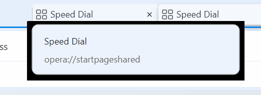
sometimes tab's tooltip has the ugly thickblack border and EasySetup has the thick edge's border.


*there are also bunch of other visual bugs, for example the partially hidden (+) button to add tabs in island and other issues (including still bad and not smooth tabs management on the tabstrip and other, don't wish to name the list again).
