Problem still not solved in version: 101.0.4843.25
K
Best posts made by kabir96
-
RE: [Opera One] white address bar in dark theme private modeAppearance
-
RE: Opera 114.0.5263.0 developer updateBlogs
The redesigned Video Popout doesn’t look appealing or useful. The rounded corners reduce video details in the corners. When you hover the mouse pointer over the popout, an unattractive gray overlay appears. The play/pause button is now in the middle instead of the bottom left corner. Additionally, the volume button is located at the top left, and the vertical volume bar only appears when you hover over the volume icon. The inverted volume bar (with 0% at the top and 100% at the bottom) is confusing. Furthermore, there’s no video timecode. Overall, this redesign isn’t helpful for users who frequently use the video pop-out feature, and it feels like a downgrade compared to the old design. Please reconsider and keep the old Video Popout design.
Latest posts made by kabir96
-
RE: Opera presents Early Bird mode in Opera One to test upcoming featuresBlogs
I use the stable version of Opera One installed in 'C:\Program Files\Opera' and a Opera Beta portable version in 'D:\Portableapps\Opera beta' when Open both of them together I Can distinguish them by looking their ICON on windows taskbar one is "classic red" another one is "black and white". Since the Opera Beta channel was discontinued in January 2026, I have replaced Opera Beta with portable installation of Opera One Stable at 'D:\Portableapps\Opera'. Now, the problem is when I use them together I Can't distinguish them by looking their ICON, both taskbar icons are red and identical. Please consider adding a feature to customize the browser's taskbar icon using .png or .ico files to help distinguish between multiple concurrent use.
-
Issues with Large O Menu, Bookmark Popup UI and Bookmark ThumbnailsOpera GX
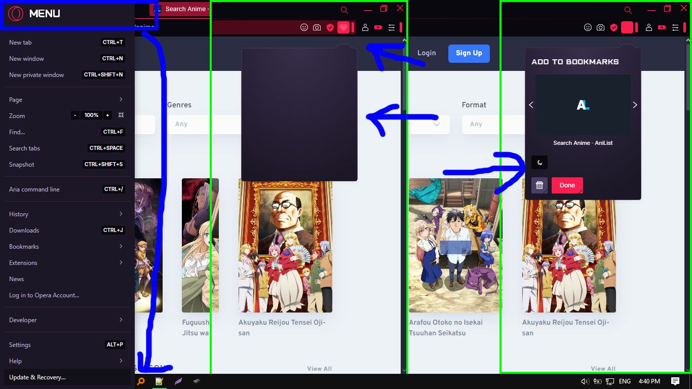
I've encountered several issues with Opera GX after the recent update 115.0.5322.142:
O Menu: The O menu takes up too much space, hiding the "Exit button" below "Update and Recovery button".
Bookmarking: when bookmarking webpage, The Bookmark popup UI takes a long time to load and glitches. When it finally loads, it displays a half-moon icon glitch and doesn't load properly.
Thumbnails: Bookmark thumbnails now appear as title strips rather than proper thumbnails.
The overall user experience has deteriorated significantly. For context, I'm using a 15.5-inch laptop with an i3 processor, 8GB RAM, and a 500GB SSD.
-
RE: Opera 114.0.5263.0 developer updateBlogs
The redesigned Video Popout doesn’t look appealing or useful. The rounded corners reduce video details in the corners. When you hover the mouse pointer over the popout, an unattractive gray overlay appears. The play/pause button is now in the middle instead of the bottom left corner. Additionally, the volume button is located at the top left, and the vertical volume bar only appears when you hover over the volume icon. The inverted volume bar (with 0% at the top and 100% at the bottom) is confusing. Furthermore, there’s no video timecode. Overall, this redesign isn’t helpful for users who frequently use the video pop-out feature, and it feels like a downgrade compared to the old design. Please reconsider and keep the old Video Popout design.
-
RE: Opera 103 developerBlogs
please change white address bar in dark theme private mode, make the white address bar purple/magenta in dark theme private mode.
-
RE: [Opera One] white address bar in dark theme private modeAppearance
Problem still not solved in version: 101.0.4843.25
- Opera for Windows
