Opera unveils Opera One, an entirely redesigned browser
-
DarthGTB last edited by
@weilan, I probably should have elaborated on my explanation. I've been using Yandex products for almost 10 years now. They are great and well made. They have about the same services Google has. I've been using Yandex Disk as a second backup from Google Photos, I've been using Yandex Browser for all the great features it delivers and I used Yandex Metro while visiting Moscow years ago and it's also great. Now with metro maps for many other places. Unfortunately Yandex Maps isn't great for my country, or else I would also use it. It used to have a less bright colour scheme than Google Maps.
The main reasons why I'm moving on back to Opera and uninstalled everything related to Yandex (and VK) is:
- I have a few issues with Yandex Browser UI starting to get a bit too bulky and the smallest size a window can get is over half a 1080p standard widescreen monitor
- Russia is currently under active war and countries under active war tend to ask private companies to join the war effort. Yandex software isn't key to my daily life and so isn't VK (or any social media for that matter), so I'm fine with not using it any more. I would get in trouble trying to get myself rid of Google or Microsoft, though.
My phone and my laptop are made by a Chinese company called Lenovo, although they are both built in my country (Brazil), which was the actual reason why I chose them. That would also be difficult for me to get rid myself of, because these items are expensive.
VK is much better made and more intuitive to use than the hell hole that Facebook is. VK was originally made by the same guys who made Telegram, so you get an idea. Telegram is hugely superior to WhatsApp in almost every way as well.
I tried several times to get into the Russian software development market because it looked like it has huge potential for being globally relevant in a market saturated by US American companies. But noooo, the strong man had to show how strong he is. Way to ruin decades of rebuilding a country and its reputation
So again, the main reason is the war itself and not "Russia bad".
-
JoannaCzajka Opera last edited by
@vladbabinets: Hi! Thanks for the info. To confirm: when you highlight a text on a page, you don't get the AI section in Search Tooltip with AI Prompts? Can you share the screenshot?
-
JoannaCzajka Opera last edited by
@kened: Thanks for the feedback. When you think having a tab bar on the left, do you still want tabs like they are today? Or bigger and visual?
-
JoannaCzajka Opera last edited by
@max1c: Thanks for the feedback.
 And yes - dragging a tab to open a new window is a bug, fix is coming!
 -
JoannaCzajka Opera last edited by
@brunnopleffken: Thanks for the feedback. We're still working on such details. Updates coming soon!
-
JoannaCzajka Opera last edited by
@op2: Thanks! In deed, redesign will gradually be continued in the next updates.
-
CryoNero last edited by
I'm really hoping you're going to let us put more web panel now.
Even edge let us do that. -
IAmTamal last edited by leocg

For God's Sake, Fix This
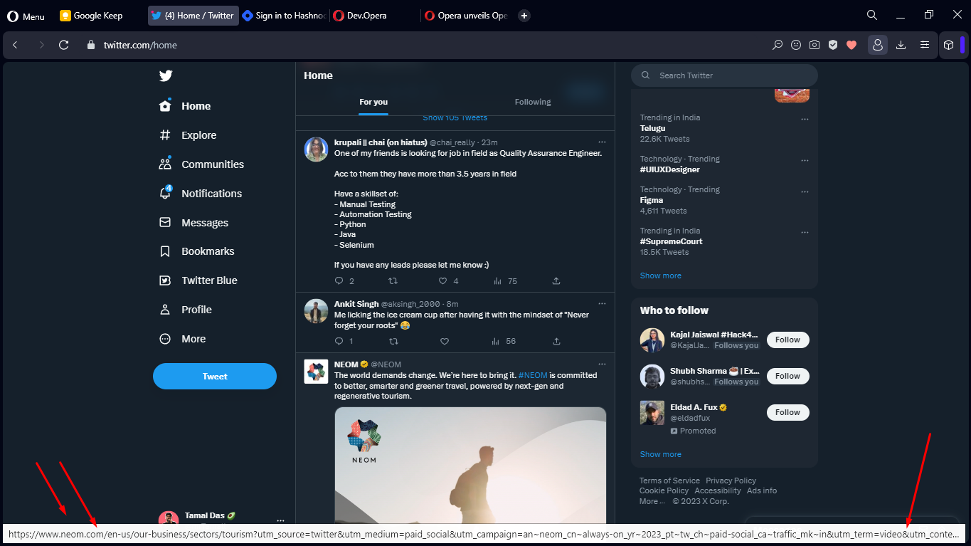
- It's a huge link preview, please please please optimize this.
- I can't drag any tab to a new monitor, why ?
-
hectormaciasa1979 last edited by
Still too many problems, it will import my bookmarks from my HTML file I created from classic Opera, but it won't copy them to the Speed Dial section, which is the sole purpose of that operation for me.
Also on a touch screen it ignores my pen and won't allow me to switch to a different tab, unles I use a mouse or the trackpad.
Other than that it looks cute.
-
hectormaciasa1979 last edited by
@hectormaciasa1979: Elements on side panel are at the bottom, we should be able to move them around or select top as an option.
-
davidgould last edited by
@ess-es-1868: I'm not a fan of the new look (liked the old a lot) but I can live with it. There may be a big improvement in the multi-tab/extensions memory usage of around 300MB, which would be a massive win for me and stop me going to Sidekick.
'Painting' seems a lot faster.. 50%?
We have tab grouping at long last. The "islands" are a little tall at the moment for me.There's a usability problem with tabs that play sound -- the 'x' to close them is no longer visible. I have ~25 tabs/islands.
Apart from the weird blobby look, it's all a big win for me.
-
andrew84 last edited by
If the Opera One is very early access version, maybe it should have a separate parallel branch I think (like gx and crypto). When it'll be ready then replace the current regular version.
I very doubt that all the issues will be fixed until it becomes Stable, taking into account that versions lifecycle become shorter recently.
I think it'll take months to 'stabilize' the One version like it happened with Reborn 3.