Opera 114.0.5278.0 developer update
-
tastodd last edited by
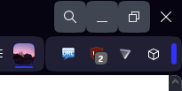
Why did you remove the darkening of the address bar when you hover over it with the mouse?
In the stable version it looks more stylishOpera stable 113

Opera dev 114

-
andrew84 last edited by
@tastodd most probably themes feature's influence. Tab itself and the (+) button (so barely visible) are not white.
In my opinion, only particular UI's parts should be affected by themes. So tabs should stay white in light mode for example.
Or there should be more customizing options instead of the simply color select. -
andrew84 last edited by
@SiMcarD78 not only in dark mode, in light mode the buttons block differs also.
-
daria19 Opera last edited by
@simcard78: Hello! This issue has already been reported under DNA-118340 and will be resolved shortly
-
explengineer last edited by leocg
@leocg OK. I can tell that I am not the only one that hates the fact that Opera now opens a lot of my pages in enormous type, adds emoji's I don't understand, never wanted nor did I ask for, etc. with this latest update. Makes me never want to update Opera again, or even to continue using it (it used to be my "Go To" Use it all the time browser until this latest update. Isn't there some way to give me simple instructions on how to fix these problems, not just tell me where to go to fix them. I cannot be the only one who uses Opera who hates these changes and is too stupid to figure out the instructions, I am clueless about "Stack Overflow", etc. to follow some of them. Just first tell me where the Tools stuff is and how to fix the giant fonts, hopefully without doing each one individually, when I get there, and how to do it on the keyboard, not just that it can be done on the keyboard? Really, I didn't (intentionally) cause this new problem, just like I didn't ask for emojis, half the time I don't know what they mean and I probably could just offend someone. Really, Opera used to be a great browser, and maybe will be one once again, when it learns to ask about major changes like this & not dump them on long-time users who don't want them anyway.
Again, if using caps for emphasis is the wrong thing to do, but nothing else seemed to work so I thought I might try it! -
Locked by
 leocg
leocg

