Opera 76.0.4009.0 developer update
-
andrew84 last edited by andrew84
What's this in Settings? and why no toggle button, I disabled it in flags

DNA-92339 Make #cashback flag visible
right decision
-
tspringer last edited by
When I want to use "Search Tabs" by either clicking on the icon or pressing CTRL+SPACE it forces Opera to restart.
-
A Former User last edited by
"DNA-92111 Windows release nightly builds fail compilation on net/net/sha3.obj"
What this means? Opera will have nightly builds as Chrome Canary and Firefox Nightly? -
jojo0587 last edited by
Opened tabs in tab search are given the name of the workspace in which they are located. Maybe this name can be changed into a workspace symbol? In my opinion it will be shorter and clearer.
My proposals for changes in Opera (Google Document).
- There are not enough signs to put all the links here. -
jojo0587 last edited by
@jojo0587: Additionally, the name of the text in the dark theme is too dark.
My proposals for changes in Opera (Google Document).
- There are not enough signs to put all the links here. -
A Former User last edited by
Are you talking about the dark theme in Opera://flags? If not search dark theme. There should be an option for enable dark theme on all websites. Try that option.
-
andrew84 last edited by andrew84
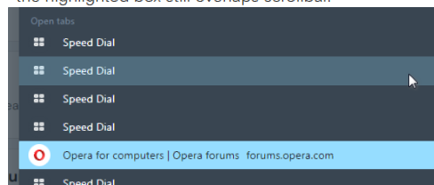
The bright light blue color (in dark mode) should be used only for currently active tab's highlighting (also, maybe currently active tab should be always on top in the list) in SearchTabs popup.
When simply hovering items by the cursor some less bright color can be used. *In light mode two grades of colors should be used too.
The post with suggestion > https://forums.opera.com/post/237699
-
andrew84 last edited by andrew84
The bright blue color (in dark mode) should be used only for currently active tab's highlighting (maybe active tab should be always on top in the list) in SearchTabs popup. When hovering items by the cursor some less bright color can be used.
suggestion here https://forums.opera.com/post/237699 -
dazung last edited by
@spike666: I can't access the following sites, unless I bypass the security warning:
- https://www.portaldasfinancas.gov.pt/
- https://app.seg-social.pt/
- https://portalcontraordenacoes.ansr.pt
- https://www.ctt.pt
They all use a certificate issued by MULTICERT SSL. The page information states the certificate is invalid, but the Certificate Status is "OK" in certificate properties states
-
olesiak Opera last edited by
@tspringer: check opera://crashes page, if you will be able to find the crash ID after the restart(maybe crash), please send it back to us.
-
lowlife9 last edited by
Opera Chrome and Edge all the same in a triumvirate of anti-contrast.
I can not use Stylus any more, what has happened?
All my speed dials have black bands for writing and pictures gone in "High Contrast"
I do not want to use stupid windows theme.
I need syntax highlight.
With windows I have to go high contrast.
Firefox only browser useable unless change windows theme.
Is this "The End" -
andrew84 last edited by andrew84
Sugestion:
Allow opening multiple recently closed tabs in new tab using middle click in SearchTabs popup (like it works for bookmarks bar dropdowns)
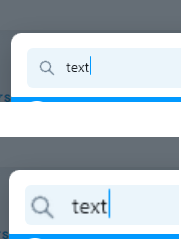
*Also, text size in the search field should be increased a bit.

-
andrew84 last edited by
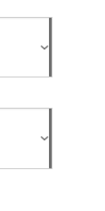
Opera still shows incorrectly looking 'select' on some sites when hardware acceleration is ON. At least here on Win 8.1 on all channels.
In other browsers looks fine,fro example here https://irata.org/members

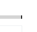
an another example from w3schools where the range control has some bold mark in the end
https://www.w3schools.com/bootstrap4/tryit.asp?filename=trybs_form-control-range&stacked=h

