Opera 68.0.3616.0 developer update
-
andrew84 last edited by andrew84
Is it an intended behavior that when I have only speed dial tab opened and I switch 'Workspaces' it recreates the speed dial tab again (with closing cross on it). I don't understand the logic.
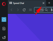
When I click the cross the current workspace is automatically switched to the last workspace.
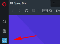
I'd like to switch workspaces and see the regular speed dial tab (which can't be closed) without that extra cross on it.
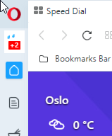
Currently if I click the 'home' icon workspace again for example, I won't see speed dial tab looking like this
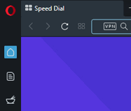
it will have cross on it and it will be a closeable tab.

-
johnston5129 last edited by
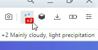
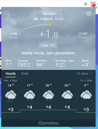
@leocg: oh lol ill just move to oslo/norway and ill have the right forecast lol at opera s expense of course lol
-
A Former User last edited by
Hey guys, where I can find tabs opened on other devices? Tabs search is good but I need opened tabs on other devices.
And second, can you please add possibility show sidebar ONLY on speed dial. I don't want see sidebar when I browsing sites. But I often open new tab for open news or settings or browser history etc in this case sidebar on speed dial will be very nice.
Thanks -
A Former User last edited by A Former User
@leocg: It's nice! But maybe you have button to this action? Like it was in previous version. And list of recent closed tabs was perfect feature!
-
A Former User last edited by A Former User
@xantares: personally i would simply use the ctrl + tab to look through all the tabs in a fast manner
-
A Former User last edited by
@simcard Not yet. The built-in "Aliexpress observer" extension from Opera only appeared in Opera 68.0.3616.0 developer. I think this is an experiment at the moment. To get more information, we need to wait for the next developer builds.
-
ralf-brinkmann last edited by
Connection to the Cloudflare DNS server:
The test took a little longer this time. But finally Opera lost the connection again. So it's not completely fixed yet.
W10x64, Operax64 -
andrew84 last edited by andrew84
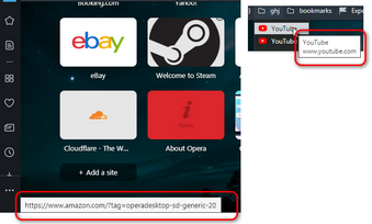
Bottom left and bookmarks bar folders tooltips still have the light background instead of dark.
-
andrew84 last edited by andrew84
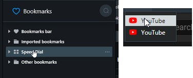
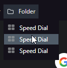
Interesting is that you use the lighter blue background for selected items in the sidebar's bookmarks/history panels in darkmode (that looks pleasant to eyes), but don't want using the same for bookmarks bar dropdowns (and menus/context menus)
-
burnout426 Volunteer last edited by
@andrew84 The former is probably implemented with web technologies (HTML, JS, CSS) while the latter is probably implemented with native platform widgets. If so, the latter probably takes more work and perhaps more patching of the Chromium UI to get things to match.
-
andrew84 last edited by andrew84
@burnout426 Maybe. But in GX it's possible to select any color for the highlighting (and this affects on both panel's items and bookmarks dropdown's items).
-
andrew84 last edited by andrew84
Some visual issues on Personal News page (in Stable version as well).
- Comparing to 58 version the sources expanding arrow position is weird here (it's located in upper position and too close )

- search section looks solid blue and not separated from the background.

- highlighting effect for the source's item has a weird section.

- page has invisible header (I can't scroll upper)

in 58 there's a separator line

- Comparing to 58 version the sources expanding arrow position is weird here (it's located in upper position and too close )
-
burnout426 Volunteer last edited by
@andrew84 Cool. Then perhaps it's something they can easily do in regular Opera then.
-
andrew84 last edited by andrew84
@burnout426: But it seems that they don't want to change it and think that the high contrasting items look great. At least during a ~ year there wasn't any feedback about impossibility to change it, so it means that this an intentional design.
-
beboss last edited by
When I open the heart icon(bookmarks) I have missing folders, but when I click on the link "Open full bookmarks view" folders are there...
