Opera 66.0.3487.0 developer update
-
kmielczarczyk Opera last edited by
@intek13x: Those are known issues, thank you. That's the advantages of using the developer stream - we're developing and facing issues together

-
andrew84 last edited by
It was not mentioned in the announcement, but extensions are in the sidebar now. But I think that extension must have an additional option now 'Hide from sidebar', similarly to the 'Hide from toolbar'.

-
red last edited by
I really don't like the reborn 3 dropdown. Especially the fact that it greys out the full page when you start typing.
Can it be made a permanent config option instead of just a flag? -
andrew84 last edited by andrew84
suggestions for the extensions in the sidebar:
- As already was mentioned, the ability to reorder extensions by dragging icons(like it works in toolbar)
- Some highlighting effect while hovering extensions icons
- If there are many extensions, only the extensions's part of the sidebar should be scrollable and Opera's selected internal icons should be always visible (currently all icons on the sidebar are scrollable). Or instead of scrolling the 'arrow' icon should appear(like on bookmarks bar if there are many bookmarks or like on toolbar if there are many extensions)
- Extension's right click context menu like in toolbar ('Options', 'Hide from sidebar', 'Manage extension')
Probably difficult to implement and not so important:
5. Dark mode for all panels
6. Ability to use more than 1 extension (3 maximum for example, with ability to change the height of each extension's window) in column if panel is pinned(for example youtube at the top and some translator at the bottom). If all conditions are met (panel is pinned and in panel there are less than 3 extensions already opened), in extension's context menu could be active option 'open in active panel'. -
red last edited by
The reborn bar replacing the extension bar poses a problem.
Whereas the extension bar lived below the address bar, the reborn bar lays on top of everything and when expanded to show an extension panel, it would steal quite a bit of space from the tabs and address bar.This is particularly egregious at lower resolutions, such as the typical 1366x768 of most run off the mill, cheap-ish Notebooks.
Also it messes with your muscle memory, because it moves around the navigation controls every time you switch.
I would really, really, like an option to confine the reborn bar below the address bar.
I tend to keep my (V7 extension) bookmarks visible and while real estate is at a premium, this new layout messes up my work-flow.
This is my browser window right now, in Opera 53:
*(I still use Opera 53 due to a longstanding bug that disables subpixel font rendering in opera internal pages and interface.)

This is what it would be reduced to, with the reborn bar:

And there are only 22 Tabs. Imagine with 100+... -
amatczak Opera last edited by
@andrew84 said in Opera 66.0.3487.0 developer update:
*But that posting text form should open right under the comment that is being replied, not on top like for the new independent comment.
Added to our backlog of improvements.
-
A Former User last edited by
Hi,
pdf viewer is broken in this and last snapshot. No scrolling possible, pdf bar broken. -
A Former User last edited by
there is a problem with detaching the video window. In the detached window, the video sometimes freezes.
-
A Former User last edited by
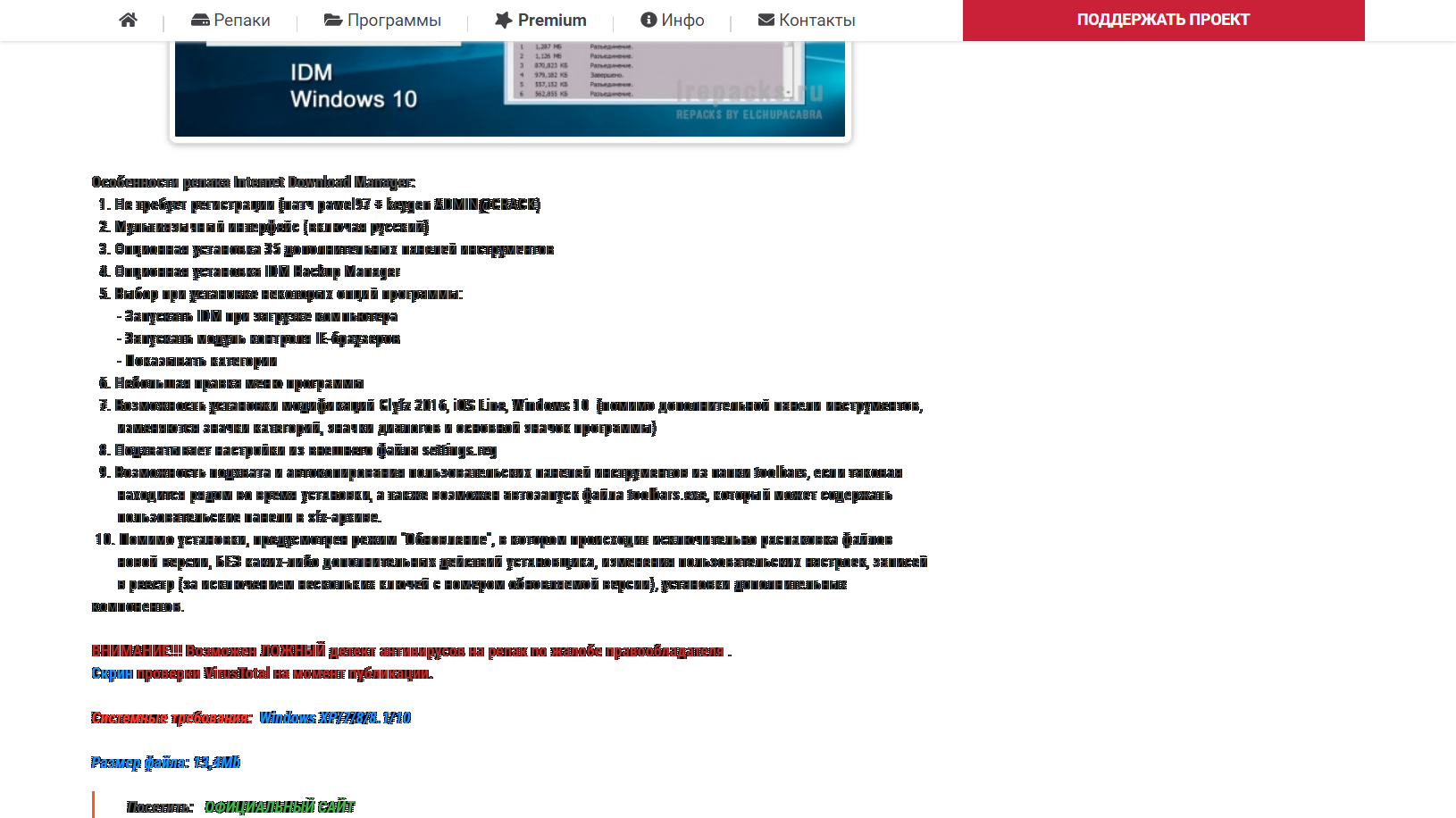
- Go to this page: https://lrepacks.ru/repaki-programm-dlya-interneta/56-internet-download-manager-repack.html
- Ctrl+Shift+5
- Click to "Capture All Sreen"
- Screenshot of the site looks weird (especially the fonts)
Could anyone confirm that?
-
A Former User last edited by
@temkem: Thanks! Font on your screen are also looks broken. Then it's a bug.

