Opera 131.0.5868.0 developer update
-
 Opera-QA-Team Opera last edited by
@vladbabinets: Hello! It’s usually just the VPN adding an extra stop for your internet traffic. Your data gets encrypted and sent through another server first, so it naturally takes a bit longer. Also, if that VPN server is far away or busy, things can feel even slower. If you want it faster, try a different server (closer ones usually help) or turn it off when you don’t really need it.
-
-
andrew84 last edited by andrew84
@SiMcarD78 I just don't understand who redesign this and who approves this.
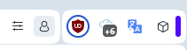
The new search popup is ugly also imho (both looking and working)Btw, the icons are buggy.
- After pinning/unpinning the icon can change to black randomly.
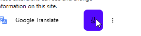
*After opening the 3 dots menu and then clicking outside on the icon's area, the icon disappears and then appears after moving cursor.
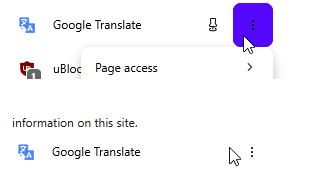
- After pinning/unpinning the icon can change to black randomly.
-
Opera-QA-Team Opera last edited by
@andrew84: Hello, it is not fixed yet, this was added by mistake. I removed it from changelog.
-
andrew84 last edited by
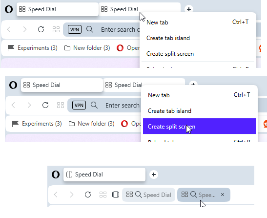
I select two (or more) tabs by holding Ctrl key.
Right click and select 'create split screen'
I click on the tab in the address bar
Crash happens here.
Also, in additon to the previously reported random blue borders for the minimize and EasySetup buttons
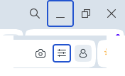
Now there's a border (circle) for the extension icon
-
burnout426 Volunteer last edited by
@andrew84 CrashID=bp-5416c845-c6c3-49c2-8350-169a60260417 for the crash.
-
andrew84 last edited by
There are still no improvements regarding the tab island naming and management.
- there's still no option to quickly ungroup islands (nonsense)
- there's still the both 'pill' + name
- 'new tab in island' should be on the tooltip (can replace the small + circle appearing which need to be caught by user)
- no popup appearing on first island creation
- islands still can't be pinned
- still no highlighting in island's dropdown
- still no color indication for tabs in the dropdown pointing the reference to the island.
suggestions with pictures here
https://forums.opera.com/post/395109
https://forums.opera.com/post/395122 -
-
andrew84 last edited by andrew84
@Opera-QA-Team the icon should be changed to smth more pleasant and informative to the eyes.
like in Edge or similar

Even the simple radio checkboxes (like in sidebar setup) would look better

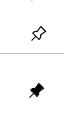
The old ones (its logic) were very nice (outlined icon means unpinned and filled means pinned). Maybe the fill color can be changed to black (or according to the theme)