Opera 116.0.5356.0 developer update
-
Opera Comments Bot last edited by
Hello! The latest Opera Developer update (116.0.5356.0) is here to improve stability, usability, and design. Here are the highlights: Try out the Developer version to explore these updates! You can find the full list of fixes in the changelog. Installation links:
Read full blog post: Opera 116.0.5356.0 developer update
-
andrew84 last edited by andrew84
Return the force dark page in EasySetup and put it on its place if theme is dark by default or theme has a dark mode.
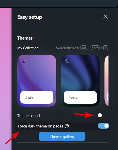
*Btw, inactive toggles are invisible (only the white dot is visible) in dark mode.
Correct would be.

I still think that the themes feature has spoiled the classic theme and there should be an option to disable the color themes feature completely to have only the classic theme available by default. -
andrew84 last edited by
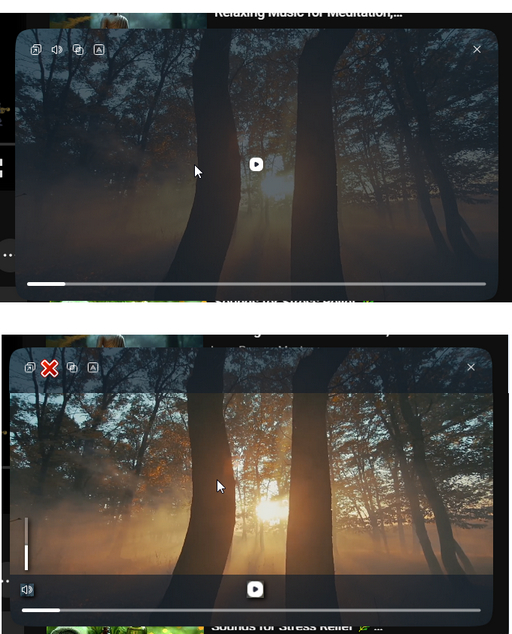
Pls., 'redesign' the redesigned video pop-out to look similar to the previous one. I mean the not fully dimmed area, controls at the bottom and timer. Also many times suggested mouse's clicks on a video. One click = pause/play, double click = full screen/exit from full screen. And, of course, the adequate volume control (horizontal or vertical) where increasing happens from bottom to top (or from left to right) instead of the ridiculous from top to bottom.
-
andrew84 last edited by
@daria19 said in Opera 116.0.5356.0 developer update:
Currently, the "Force dark theme on pages" is available exclusively in the settings
And this is bad, that was the point of my post.
-
andrew84 last edited by andrew84
@andrew84 If this is technically possible, I would suggest using the same more advanced dark mode's options as in Opera mobile.
So not only returning the 'force dark pages' toggle back but also implementing the 'dimming' toggle switch + intensity scale.
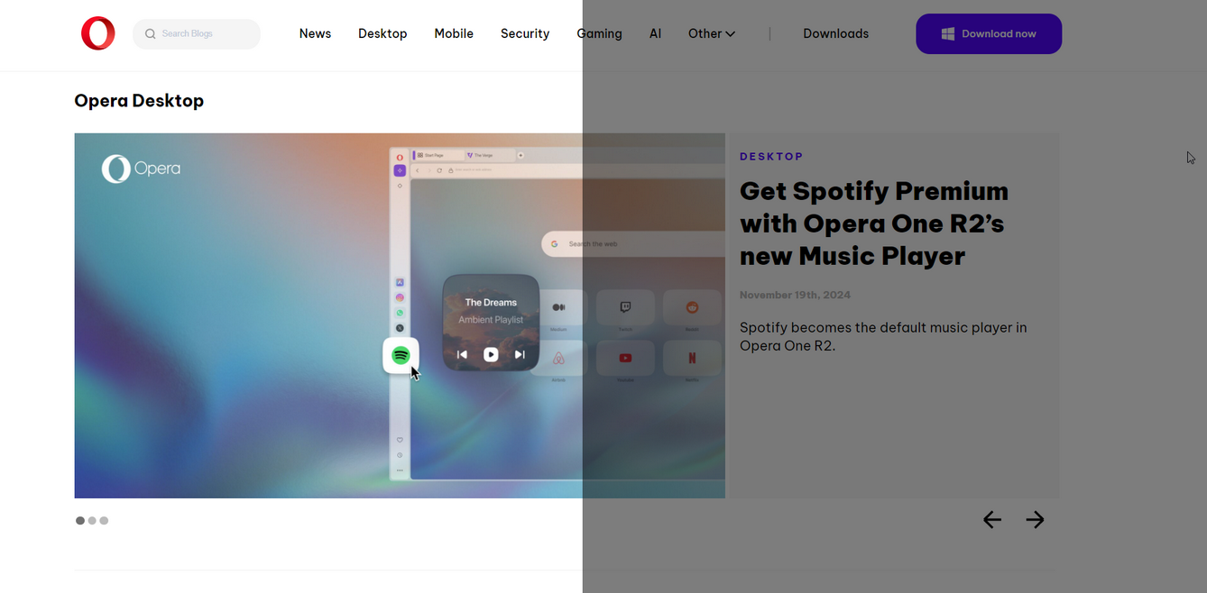
In this case the dimming effect will work also if 'force dark pages' is disabled. In this case if some web site looks bad in 'forced dark' mode, the 'dimming' will help my eyes. Or the both options can work together (again like in mobile version) depending on user preference and web page view.
I'm sure that this will be a really useful feature for Desktop version also.Example. Original vs dimmed page
Another one example. The blog / forum page view looks ok with the 'forced dark' enabled. But the bright white text and big bright pictures still disturbing eyes a bit. So with 'forced dark' + 'dimming' it will look more pleasant to eyes.
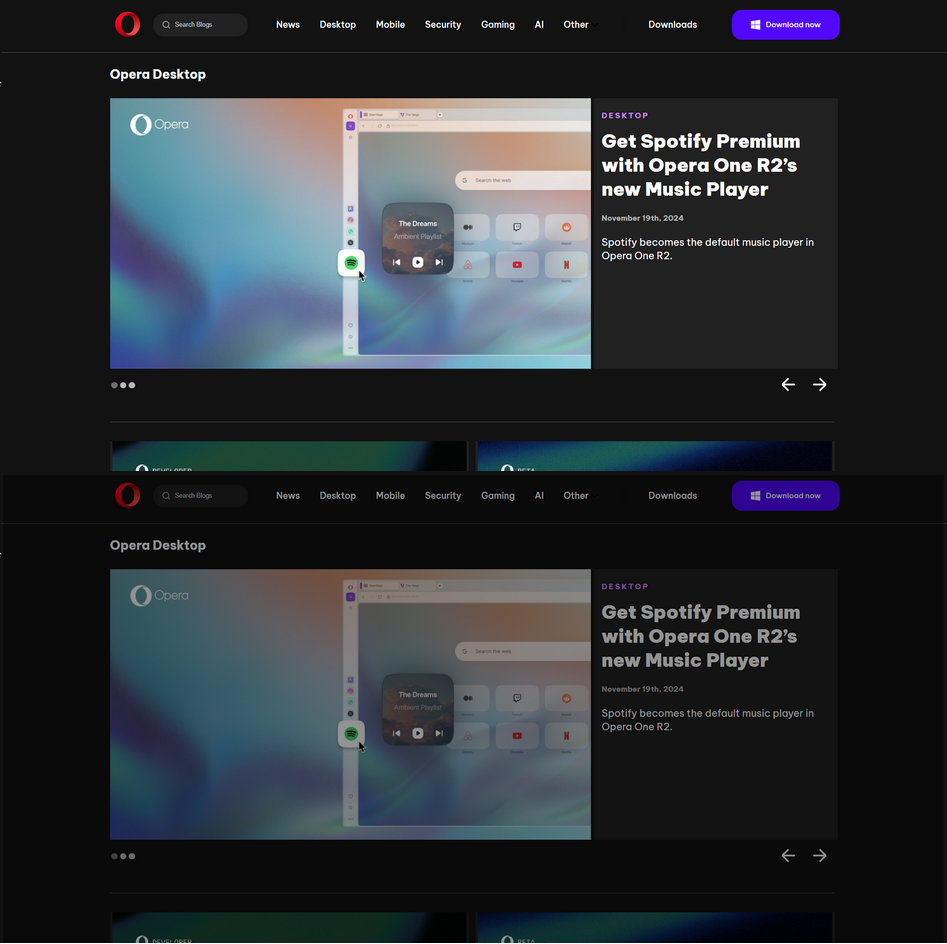
*Additionally can be added the color temperature and dark theme schedule. But this is secondary.
-
indiqazzz last edited by
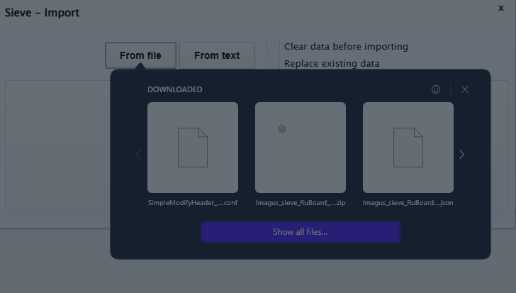
I don't even remember for how many builds ago this starts to happening, but it's very annoying. -
leocg Moderator Volunteer last edited by
@indiqazzz As said, disable the option to autohide sidebar for now.
-
ralf-brinkmann last edited by
I still have a problem with the translation tool:
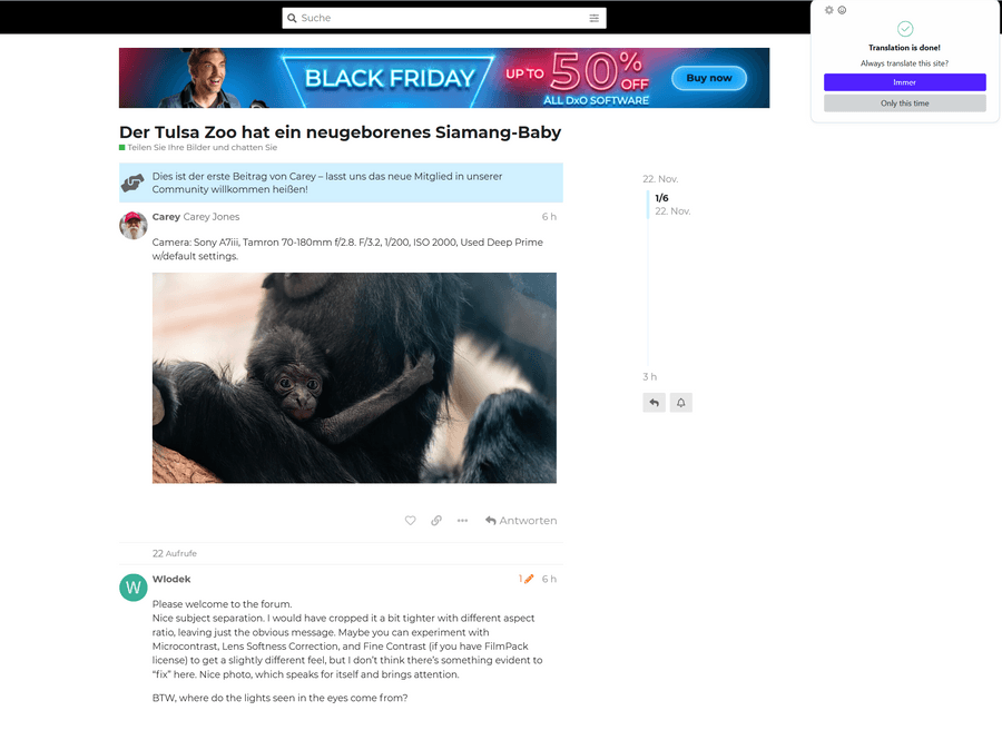
The tool tells me, that the translation is done. But it is not done, it is still English, not German.
Sometimes the translation tool does not recognize the language of the text on a page. In the older versions I could then change "Erkannte Sprache" ("recognized language") to the language on this page, for example English or French, and then start the translation.
But in this new build I don't see a button for such a choice.
Please improve the translation tool!And please try your luck yourself: https://forum.dxo.com/t/tulsa-zoo-has-a-newborn-baby-siamang/40996
-
andrew84 last edited by andrew84
Some sections in Setting look broken.
VPN for example
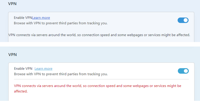
On start up

*Also, now the section's background is affected by theme in a different way. Instead of the previous almost white it's light blue now and not so contrast. And the same is with the EasySetup's background. The old UI's colors (before Opera One) look a way better and more modern to me. Allow to disable the theme feature completely.
-
LovePS last edited by LovePS
@daria19
I agree that this needs to go back to the easy setup, but today is worse. I just updated my browser and the toggle has gone unstable. Sometimes the toggle is in the main settings and other times it is missing completely. Even when it is there, there are now pages that stay bright. There are extensions that can provide similar functionality but none of them can darken every page and most of them make the pages really ugly. -
andrew84 last edited by andrew84
@LovePS they promised to restore the toggle in EasySetup in near future. https://forums.opera.com/post/364620
@LovePS said in Opera 116.0.5356.0 developer update:
Sometimes the toggle is in the main settings and other times it is missing completely
I reported the same here. https://forums.opera.com/post/362987
In my case it was enough to refresh the Settings page. Just a bug. -
Locked by
 leocg
leocg

