Opera 115 developer
-
UserSolo last edited by
@Opera-Comments-Bot
Opera One(version: 115.0.5285.0) does not sync to server.
First time it happensthank you
-
daria19 Opera last edited by
@tspringer: Hello! Could you kindly check if there's any crash ID recorded in opera://crashes and let us know?
-
tspringer last edited by
@daria19: I have a few CrashID's.. but I guess the ones you are interested in, are the one's that comes in sets of 4.. here are one of those sets:
Crash from Tuesday, September 10, 2024 at 12:45:02 PM
Uploaded Crash Report ID: CrashID=bp-cdfb7cc3-96de-4146-9998-f84370240910
Crash from Tuesday, September 10, 2024 at 12:44:56 PM
Uploaded Crash Report ID: CrashID=bp-24ce539f-cf3c-4a6a-afb0-e16db0240910
Crash from Tuesday, September 10, 2024 at 12:44:49 PM
Uploaded Crash Report ID: CrashID=bp-e6dcc0e1-00e3-44a2-816f-00d9f0240910
Crash from Tuesday, September 10, 2024 at 12:44:42 PM
Uploaded Crash Report ID: CrashID=bp-f26ea679-06cb-4321-bc39-bc04e0240910 -
daria19 Opera last edited by
@simcard78: The sync issue has been resolved in DNA-118532 and will be included in the next release.
-
daria19 Opera last edited by
@tspringer: Thank you for bringing this to our attention. The issue will be resolved as part of DNA-118506.
-
tastodd last edited by
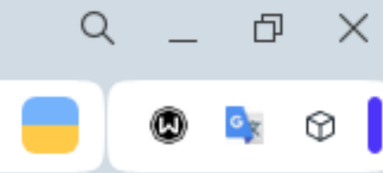
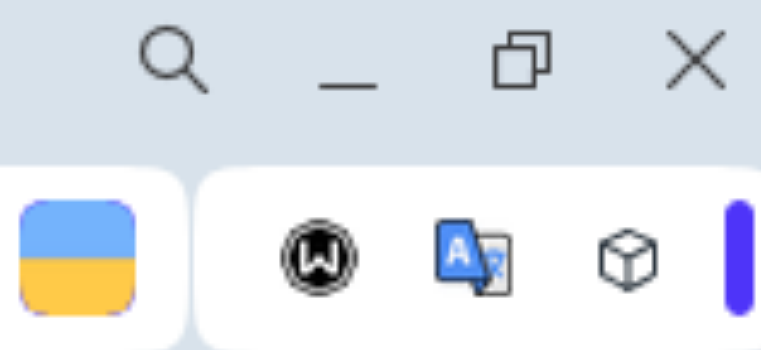
@daria19 Pay attention to the visual image of the Account icon (in my case it is a flag icon)
Previously the icon was perfectly clear, but in the latest stable and developer versions it has strange artifacts on the edgesWindows 11 23H2, the drivers for the video card were stable and have not changed since then
Previously

Now

-
ranger375 last edited by
Lastest opera dev with the new theme feature is having performance issues. sometimes works, sometimes frozen even using classic theme.
-
ranger375 last edited by
@ranger375 said:
Lastest opera dev with the new theme feature is having performance issues. sometimes works, sometimes frozen even using classic theme.
Update: The Sync issue is the cause why opera runs laggy
-
andrew84 last edited by andrew84
Return the 'themes' flag to disable the feature since this too raw yet.
Also, why themes selection in EasySetup takes so much space? Why is need to use so huge tiles? It seems that themes takes more than 1/3 of the whole EasySetup.
I think it should look like previously, but instead wallpapers tiles should be themes tiles in a row. The current partially hidden tiles look weird (need to click on edge and theme's name is not visible).*Personally, I'd suggest implementing a switch to enable/disable themes. When disabled the EasySetup should look like previously (with only dark/light mode selection) and default theme should be used.
-
koimark last edited by
I kind of like tab island but after arrangement it exploded immediately. I would suggest feature to "Arrange duplicates to tab island" - meaning that every urls of certain domains moved to same tab island. Or maybe some other way to arrange things. Maybe there would be need of Tab Island Organiser -addon or something.
And maybe also option to define urls (using wildcards etc) to guide where links will be opened. For example I would like to have Tab island containing IG-pages - and when I click Threads -link in IG it would be nice that this link would be opened as a tab in Threads Island. Etc. That way clutters stay away.
Pseudocode
IF link url contains instagram -> IG Tab Island
else if link url contains facebook -> FB Tab Island
else if link url contains youtube or "other streaming service" -> Media Tab Island.
(This could be mayba part of bookmarks property - so you could arragne all kind of addresses that belongs to -> Humor Tab Island etc. )
if link base url is found in bookmarks - find Tab Island information from there.Those are my principles, and if you don't like them... well, I have others. ...
-
daria19 Opera last edited by
@ranger375: Thank you for your feedback! We're actively working to optimize the new theme feature and make it as smooth as possible. However, this feature can sometimes impact system performance, especially on certain setups. We appreciate your patience as we continue to improve it.
-
daria19 Opera last edited by
@andrew84: Thank you for sharing your thoughts! Your feedback is really important to us. We’re still working on refining the new theme feature, and we understand your concerns about its implementation and the layout in EasySetup. Thanks for your patience as we continue to enhance this feature.
-
daria19 Opera last edited by
@koimark: Thank you for your detailed feedback! We’re glad to hear that you’re enjoying the Tab Islands feature. We understand that organizing tabs effectively is crucial, and your suggestions for arranging duplicates and creating specific Tab Islands for different domains are very insightful. Your input is invaluable as we strive to make the browsing experience better for everyone. Thanks for taking the time to share your ideas!
