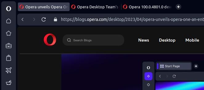
Opera 100.0.4801.0 developer update
-
thelittlebrowserthatcould last edited by
@leocg it's only in Easy Setup in the Debian builds for the current Stable and Beta, also. I didn't use Easy Setup much, but it's right that it should be there, in case there's a problem reading a page. Before I noticed it was there, I was using an extension and/or user script with TamperMonkey.
-
thelittlebrowserthatcould last edited by
@thelittlebrowserthatcould here are tabs with no Tab Island controls in Linux (and what I take to be the control shown in the page).

The screenshot also shows that the active tab has not been moved to the rightmost position in this workspace (but works OK in the first workspace), as desired by my use of the Most Recent Used Tab Stack extension (for Chromium). There have been problems in the recent past with the functionality of this and the Tab Slider extension being affected in Opera Beta (which was the only version I had installed at the time).
The last version would not start maximized, and I've just now caught this version doing it for the first time.
-
andrew84 last edited by
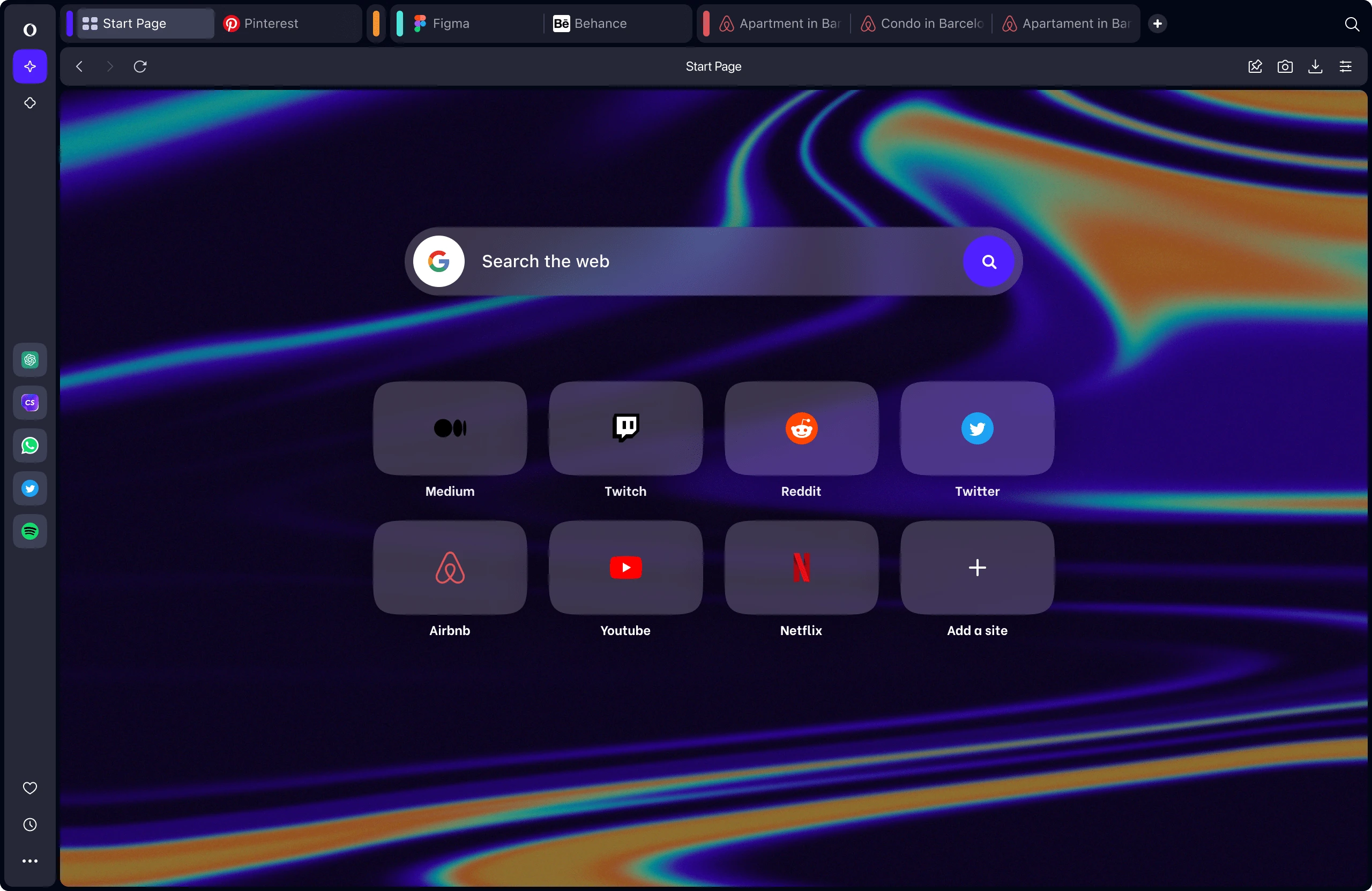
Still don't get the idea of how the modules are visually presented..
Why do I need these bold borders and spaces around and between elements?
The current representation could be as an option in the form of theme or like interface tuning similar to Vivaldi's 'corner rounding' themes editing option. But not forced as the main design. -
andrew84 last edited by
@leocg It seems they don't learn from their mistakes. The option was implemented after multiple complaints after reborn3 release where the SD tiles size was decreased.
Unless they are planning smth. valuable regarding the start page customization, there will be a bunch of complaints again. -
andrew84 last edited by
During the short time I checked Opera One on borrowed Win 10 PC I understood that the new 'reborned' version is not for me at all.
Without taking into account multiple visual bugs and caught crash during this short period, the interface is totally spoiled after it was more or less fine (excepting menus) and tuned after corrections in 'Reborn3'.
The continuous borders around modules, especially when sidebar and bookmarks bar are enabled, look just ugly to me. Along with the border around opened web page (I'm not a sailor or aircraft pilot to like the 'porthole' windows). So maybe most of users will like the 'bubble' design, but I won't.
-
adam1709 last edited by
Will this new browser, when it enters a stable phase, replace the existing browser? or will it be something else, on the side?
-
DarthGTB last edited by DarthGTB
@adam1709 that got me as well. It's a rebranding of sorts. It's the same browser with a new name. It's kinda weird because even the bigger, fundamental change from Presto engine to Chromium back in Opera 12 or 13 didn't grant a rebranding like this...
Still, I think this time, if modularity for them means the same as it means for me, this change will actually open the opportunity for more features to come instead of less features like what happened back then.
To be honest though, Opera back then was like a bazooka for killing ants for most people... The possibility of stripping it of features and letting people install extensions made for other browsers was indeed a good idea, looking back to it...
-
DarthGTB last edited by
@andrew84 I agree. There should be a
Compactcheckbox in the theming choice menu:- Off
- Basically current Opera One UI
- Default option
- On
- Less wasted space
- No rounded borders (like just a pixel or two wide line, sort of what it's in the current stable channel Opera)
- Thinner tab bar
- Thinner sidebar
- Etc.
- Off
-
erebfraen last edited by
The context menu in the address bar of the browser is overlaid with tooltips.
The mouse cursor disappears in the browser if you switch between multiple windows (at least, when Opera is running Youtube)
