Opera 74.0.3876.0 developer update
-
A Former User last edited by
@andrew84 Many thanks for your insightfullness and warning.
Opera is developing, no doubt, but what aims are the most important to us, common users? Players? It depends etc
Apart from all what was published here I have problems discerning the heavily intertwined mentioned issues - once they look like bugs, once as requests. The same problem appears with my suggestions.
For example, I am all for the tiles function(s) similar to those found in Vivaldi, but I do not want a carbon copy of Vivaldi team solutions. I see you, Opera dev team, may and are able to apply users' ideas without much efforts.
Tell me please then, where I should place the necessary options (for tiles) I asked for to have a shadow of hope they would be read by the right people from Opera dev circles? Here are the "tile necessities" and more:
Why you need to synchronize two windows and how?
Workspaces - synchronize windows' slides
Workspaces - desynchronize show/hide options
Workspaces - desynchronize iconsVertical lines in Sidebar windows are not movable
Bookmarks page has hidden movable border line
Some vertical division lines on setting pages are not
movableSidebar opening/closing windows is inconsistent
Sidebar - total mishmashUp the ante of Opera effectiveness
Open thumbnails too in directory with images
Opera does not play playlists (*.pls) -
A Former User last edited by A Former User
@andrew84 Many thanks for your insightful attitude and warning. BTW Isn't this forum thread present there in part only? As I know the first posts are visible only, then readers are being sent to the forum for full list.
-
A Former User last edited by
@andrew84 Damn it, I'm still novitchok as far as the using of this Opera forums is concerned.
 Is it OK now?
 -
A Former User last edited by A Former User
-
I'm logged in, I see both my posts.
-
That's what I'm concerned of. I always try to document and illustrate my bugs and requests, but all the efforts may be washed down with all other requests from and on that prolific arena of "Suggestions and feature requests" page.
-
-
andrew84 last edited by
@pavelopdev said in Opera 74.0.3876.0 developer update:
I see both my posts
In the blog (here https://blogs.opera.com/desktop/2020/11/opera-74-0-3876-0-developer-update/#feedback-container)? I don't see.
-
A Former User last edited by A Former User
@andrew84 Ok, Ok. I got it. There're no next posts. I am/was publishing from forum:
https://forums.opera.com/topic/45110/opera-74-0-3876-0-developer-update/24Definitively I need to delete one of my posts.
Tough! Too late!

-
andrew84 last edited by
@pavelopdev comparing to the previous commenting system (disqus) it's very inconvenient now because they publish changelogs and announcement in the blog, but it's impossible to post pictures/gifs from the blog comments form. Also, in the blog there is a tree view in contrast to this forum. And posts editing time limit is very short (30min).
-
A Former User last edited by
@leocg Firstly, thank you for helping in deleting my post's copy.
Secondly, how to switch to the tree view? -
andrew84 last edited by andrew84
- Improve the video pop-out. Make it like in the yandex browser currently and like it worked previously in Opera (before Chromium's popup implementation) https://forums.opera.com/post/225402
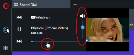
- New Player popup should be improved too, add volume control (click icon to mute/unmute) and allow fast forwarding by clicking the progress line.

*also, the big problem for me on youtube music is the ads are not blocked in the player panel. In the main window the block is working fine.
-
andrew84 last edited by andrew84
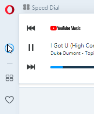
@andrew84 and in light mode the control buttons and progress line don't look great being the simply black. I guess some gray or light blue should be used (maybe the color of sidebar icons can be used)

*also, in dark mode youtube icon is white for some reason, in light mode the icon is correct red.