Opera 73 developer
-
andrew84 last edited by
@kened said in Opera 73 developer:
It's useful mainly in big screens
Maybe.
But the same can be said about the current Ctrl+Tab tabs cycling popup -
andrew84 last edited by
@kened said in Opera 73 developer:
Vivaldi has this feature
I checked it in Vivaldi, but it works in a different way, tabs (tiles) are still reduced in width.

-
andrew84 last edited by andrew84
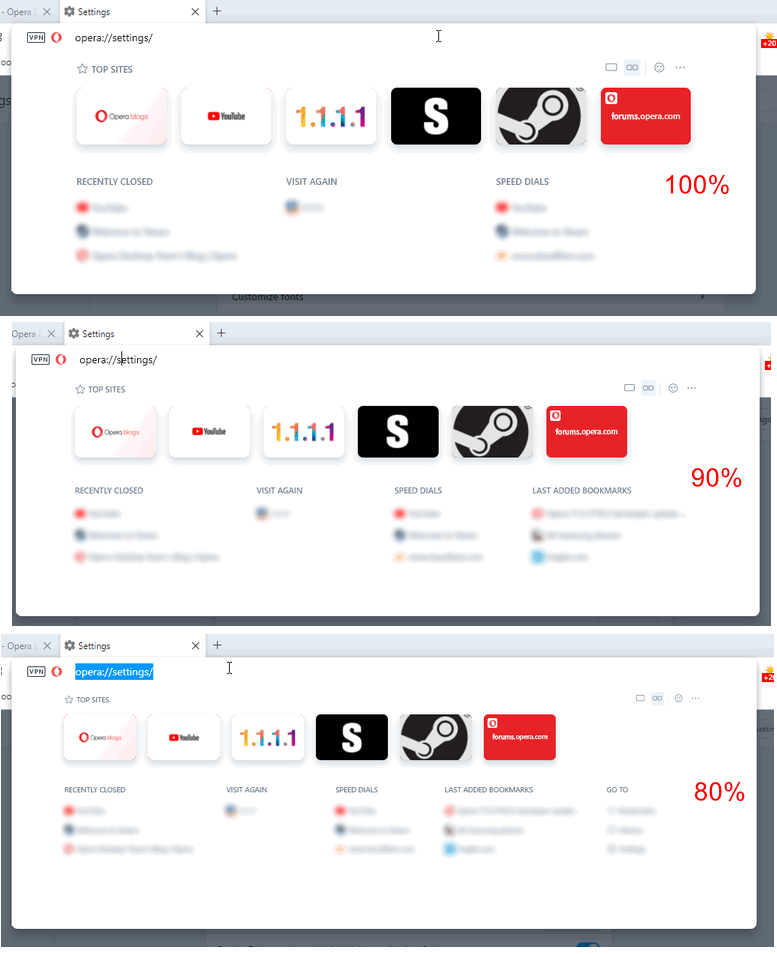
On 1366x768 display, 100% page zoom in browser settings, I still can't see all the section of the BABE.
100% = 3 sections, 90% = 4 sections, 80% = 5 sections.
-
A Former User last edited by
Analysing the .css code of the enhanced address bar, it seems easy to let users choose the BABE background color.
-
burnout426 Volunteer last edited by
Haven't tried to check out BABE until now. Silly question. How do you get BABE to show up? The address field drop-down looks old and doesn't show what
opera://enhanced-address-barshows. It's on in settings and the flag is set to the default of enabled. Explicitly setting the flag to on doesn't make a difference.73.0.3820.0 64-bit on Windows 10 OS Version 2004 (Build 19041.508). Fresh profile. No extensions, no Opera Sync or anything.
-
andrew84 last edited by
@burnout426 You need to wait some time (while your top sites will be gathered), open sites, bookmarks and similar. I don't know if it's a bug or not.
-
burnout426 Volunteer last edited by
@andrew84 Thanks. Finally got it. Took a lot to trigger it, but I got it. Thanks.
-
andrew84 last edited by andrew84
@burnout426: I've found by chance that the BABE can be forced using address
opera://enhanced-address-barhttps://forums.opera.com/post/224835
*I didn't expect that this is a web page, I thought this is a pane/popup.
-
andrew84 last edited by
@kened:
But the recent Opera's features (tabs cycling popup, workspaces, search in tabs) are aimed at so many tabs opened at the same time and they continue promoting it. -
A Former User last edited by
Thinking about the future and considering that the BABE is a "web page", we could have the BABE floating along with the address bar, perhaps in the center of the browser window. It could be triggered by a keyboard shortcut or it could have a button on the sidebar. With that, we would gain space on the screen and have a cleaner look.
-
avl Opera last edited by
@andrew84 said in Opera 73 developer:
@andrew84 it seems that Opera on Presto had this feature since 10th version. Far better solution than the Ctrl+Tab cycler.

They are for different purposes (note that Presto also had a tab cycler). Disclaimer: I've worked on all these features, both the historical ones in Presto and the current ones in Opera.
The tab cycler allows you to switch between recently used tabs. The general idea is that you find the tab you're looking for either immediately (last tab used) or by scanning the first 2-3 items. You can go further if it turns out it's longer ago, but this is the exception, not the rule. Similar to the application switcher in macOS (Cmd+Tab) or Windows (Alt+Tab).
You might not be the type of user that often switches between recently used tabs. That's fine, then Tab Cycler is not for you. It doesn't mean it's not useful for others that do work this way.
Showing thumbnails of tabs on the tab strip allows you to contextually find a tab, especially if you haven't seen it for a while but you have a visual memory of either what it looks like or where in the tab strip it was located. It doesn't help at all to switch quickly between recently used tabs, especially when there are many, but it helps if you're looking for a tab you know is somewhere. Similar to the Dock on macOS or the task bar on Windows, or maybe Expose on macOS.
Opera doesn't have a way to see a thumbnail overview of the whole tab strip right now, but it does have a contextual overview of tabs in Search Tabs. The feature we had in Presto for sure was handy for some people, but the effort needed in making it appear meant that it was tragically underused, and a new effort to bring a tab strip visualization would have to improve on that.
-
andrew84 last edited by andrew84
@avl Thanks for the info.
*Yes, I didn't mean the recently used tabs, I meant only a more pleasant view of opened tabs when they don't fit into the tab bar and titles are cut.
As for the 'recently used tabs' it depends on option in Settings (Cycle tabs in most recently used order) if I don't mistake. If I turn it off, the new tabs cycling popup also will show opened tabs in the same order as they're on the tabs bar.
Previous Tab menu also shows opened tabs in 'recently used' order (if the option is enabled in Settings) when using Ctrl+Tab shortcut, but the page preview in the center is much bigger and clearer to view and thus more preferable.Edit:
The new enhanced address bar (BABE) could show tiles of opened tabs, user could have a choice to see 'opened tabs' or 'top sites' tiles https://forums.opera.com/post/226538 -
davidgould last edited by
Quick note to say the author of RevertSite has found a workaround and I have my blue Facebook back in Opera again: http://prntscr.com/ure4jm
Thank God, other browsers suck. No VPN, no picture in picture, no gestures, lose unpublished comments all the time...
-
A Former User last edited by
Fullscreen video on MacOS 10.15.7 is still broken. The toolbar shows up, even when Opera is maximized, in all fullscreen videos (ex: youtube). It has been present since the Opera 71 update.
This is an example:
