Opera 73 developer
-
andrew84 last edited by andrew84
The #unified-popups flag is enabled by default in this build
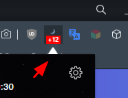
As I mentioned earlier (https://forums.opera.com/post/220985) some popups look ugly now (white triangle), for example extensions popup that have dark background
-
andrew84 last edited by andrew84
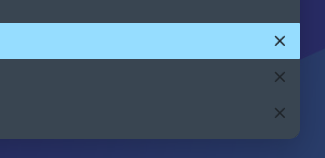
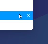
DNA-88670 [Search Tabs] Add close tab button
This is a very welcome implementation
*But in dark mode the closing cross is visible for each row, not only on hover.
-
A Former User last edited by A Former User
@andrew84 said in Opera 73 developer:
The #unified-popups flag is enabled by default in this build
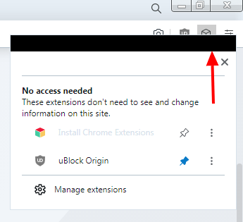
It looks like this for me: black "Artifacts" in each popup, if a theme without "Aero" is selected. Win7x64
-
andrew84 last edited by andrew84
@johnd78 said in Opera 73 developer:
"Artifacts" in each popup, if a theme without "Aero" is selected. Win7x64
In this case it's not acceptable.
If the flag is not from Chromium, it means that it was poorly tested before enabling.*I remember there were similar triangles in the past, but those were tiny and good looking. Current implementation looks ugly to me, too big triangles.
-
andrew84 last edited by
@leocg Reasonable statement.
Unfortunately, quite often (especially lately) known bugs can reach Stable channel. So the sooner the better bugs are fixed (including Dev stage)*All the bugs (known) from the 72 Developer will be in 72 Beta now, I guess (and there's high probability that some of them will reach Stable channel)
-
A Former User last edited by A Former User
@andrew84 said in Opera 73 developer:
If the flag is not from Chromium
This is the flag of the Opera, it is not in the Chromium.
The way to reproduce this bug in Win 7: Turn off DWM in Windows 7 (Choosing the Windows 7 Basic theme will be sufficient)@andrew84 said in Opera 73 developer:
it means that it was poorly tested before enabling.
I partially agree. Now this flag is also in Beta 72, although it is turned off there.
-
A Former User last edited by A Former User
@thededar It looks to be known issue - please read this comment.
-
ralf-brinkmann last edited by
The focus in the pop-up window "Clear browser data" (STRL-SHIFT-DEL) is still not on the blue button to clear the data.
Is this such a big problem to fix this bug? -
ralf-brinkmann last edited by
I forgot to mention that the same thing happens when you switch any page in Opera to full screen mode and back again (F11).
-
A Former User last edited by
Opera could let users choose the color of the interface, such as the sidebar and the address bar. This grayish blue color is very strange. I prefer the black color of Opera GX.
-
A Former User last edited by
@davidgould: if your biggest concern is returning to an old version/design, maybe an alpha testing channel is not the right place to be

-
nadie-nada-nunca last edited by
@ralf-brinkmann: This is how it's supposed to be. Destructive behaviour is never the default in a sane UI. Too easy to make a mistake and delete what you didn't intend.
In any case, the focus IS in the blue button for me, so both your complaint and Opera's behaviour are incorrect.

-
spiryts last edited by
FB on opera is broken https://youtu.be/vX-41S3kT-o background is flickering when forced dark mode is on.