Opera 73 developer
-
andrew84 last edited by
@leocg Reasonable statement.
Unfortunately, quite often (especially lately) known bugs can reach Stable channel. So the sooner the better bugs are fixed (including Dev stage)*All the bugs (known) from the 72 Developer will be in 72 Beta now, I guess (and there's high probability that some of them will reach Stable channel)
-
A Former User last edited by A Former User
@andrew84 said in Opera 73 developer:
If the flag is not from Chromium
This is the flag of the Opera, it is not in the Chromium.
The way to reproduce this bug in Win 7: Turn off DWM in Windows 7 (Choosing the Windows 7 Basic theme will be sufficient)@andrew84 said in Opera 73 developer:
it means that it was poorly tested before enabling.
I partially agree. Now this flag is also in Beta 72, although it is turned off there.
-
A Former User last edited by A Former User
@thededar It looks to be known issue - please read this comment.
-
ralf-brinkmann last edited by
The focus in the pop-up window "Clear browser data" (STRL-SHIFT-DEL) is still not on the blue button to clear the data.
Is this such a big problem to fix this bug? -
ralf-brinkmann last edited by
I forgot to mention that the same thing happens when you switch any page in Opera to full screen mode and back again (F11).
-
A Former User last edited by
Opera could let users choose the color of the interface, such as the sidebar and the address bar. This grayish blue color is very strange. I prefer the black color of Opera GX.
-
A Former User last edited by
@davidgould: if your biggest concern is returning to an old version/design, maybe an alpha testing channel is not the right place to be

-
nadie-nada-nunca last edited by
@ralf-brinkmann: This is how it's supposed to be. Destructive behaviour is never the default in a sane UI. Too easy to make a mistake and delete what you didn't intend.
In any case, the focus IS in the blue button for me, so both your complaint and Opera's behaviour are incorrect.

-
spiryts last edited by
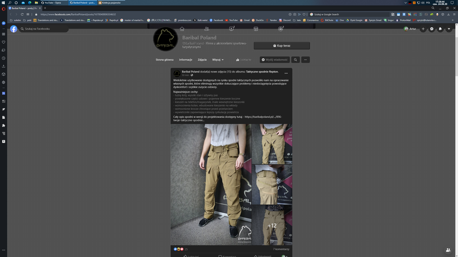
FB on opera is broken https://youtu.be/vX-41S3kT-o background is flickering when forced dark mode is on.
-
andrew84 last edited by
When opening Search tabs popup an active tab should be selected, not simply the first item in the list. I think it's obvious.
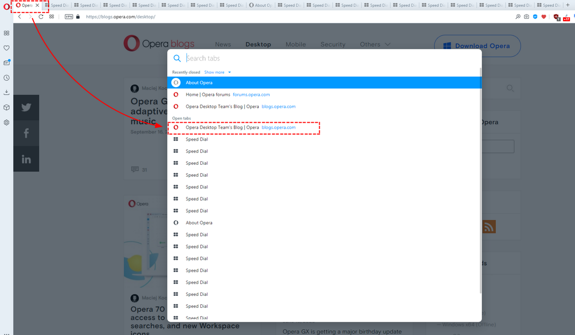
And currently active tab should stay highlighted, for the hovered items another color should be used (like it worked in previous TabMenu)
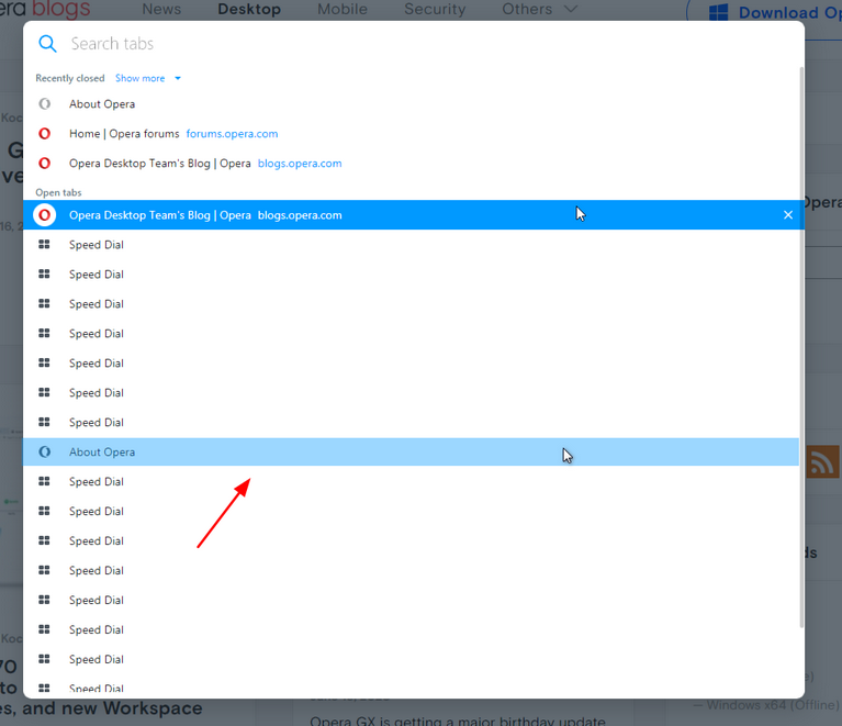
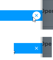
*Also, the highlighting still overlaps the scrollbar (closing cross in the circle too)
-
andrew84 last edited by
Suggestion:
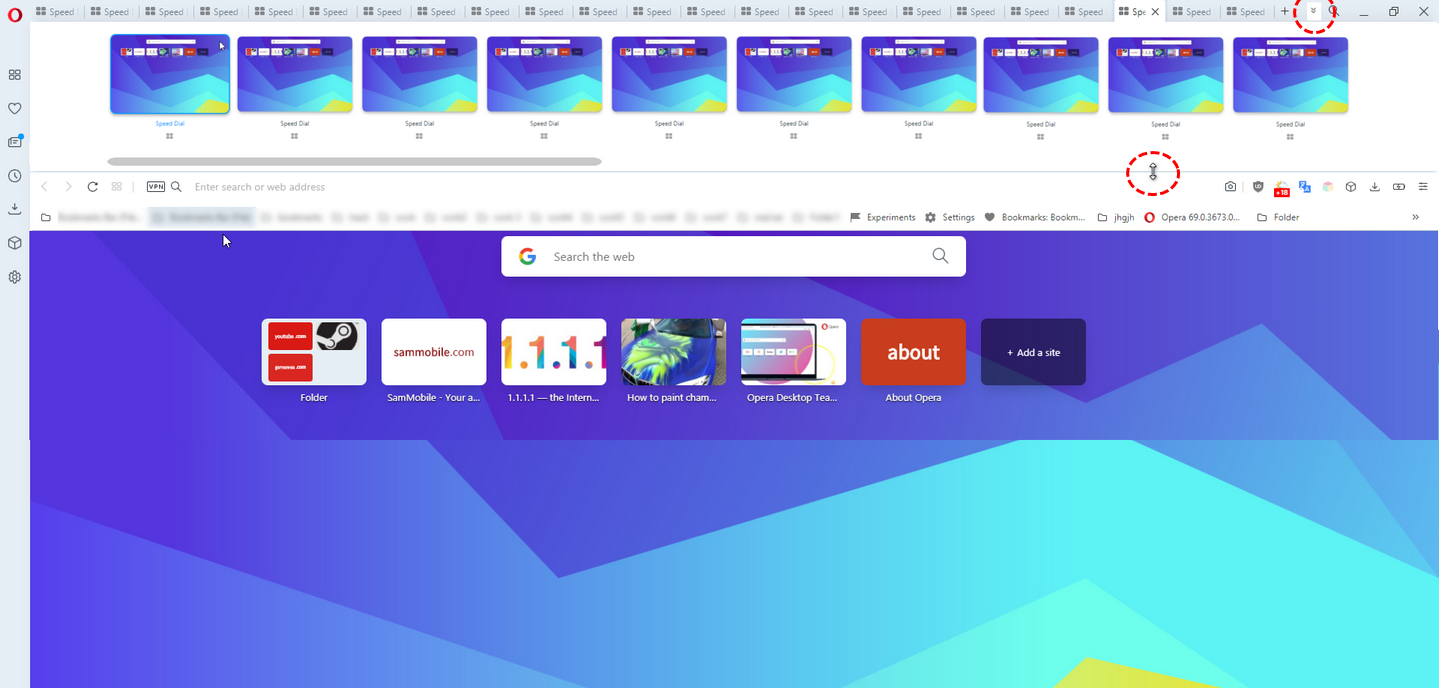
Instead of the tabs cycling popup (Ctrl+Tab) add option to expand the toolbar if there are enough tabs (a button next to the magnifying icon in the top right corner or pull down cursor), And allow to scroll horizontally using mouse wheel too.
