Opera 114.0.5282.222 Stable update
-
Opera Comments Bot last edited by
Hello! The latest Opera update is here (114.0.5282.222) and brings important fixes: Update now to enjoy these improvements! Feedback is always welcome. For a complete rundown, take a look at the changelog. Installation links:
Read full blog post: Opera 114.0.5282.222 Stable update
-
ironbone last edited by
It is not possible to use the mini player on Ubuntu (and other Gnome) when the application dock is on the left. When the mini player appears, it automatically opens the dock and then the mini player diaper. You should open the mini player more to the right.
-
thelittlebrowserthatcould last edited by
Editing workspace names, after they've been set up, still isn't possible. Debian release.
-
hectormaciasa1979 last edited by leocg
I really never understood why I get 2 workspaces as default, one marked with a "home" icon and the other is a "star" but I can't move anything between them, and I have to enable a third workspace. which is a suitcase, then I can move tabs between "home" and "suitcase" but not the "star".
Not intuitive at all and very frustrating the first time, kind of scares people willing to give workspaces a shot, hopefully it'll be solved one day. You've never fixed anything I reported, and some problems have been going on for years, but as we say in Mexico, dreaming comes at no cost.
Windows 11.
-
thelittlebrowserthatcould last edited by
@hectormaciasa1979 I use many workspaces, and move tabs by right-clicking on the tab and then using the option half-way down the dialog.
-
whisperer last edited by
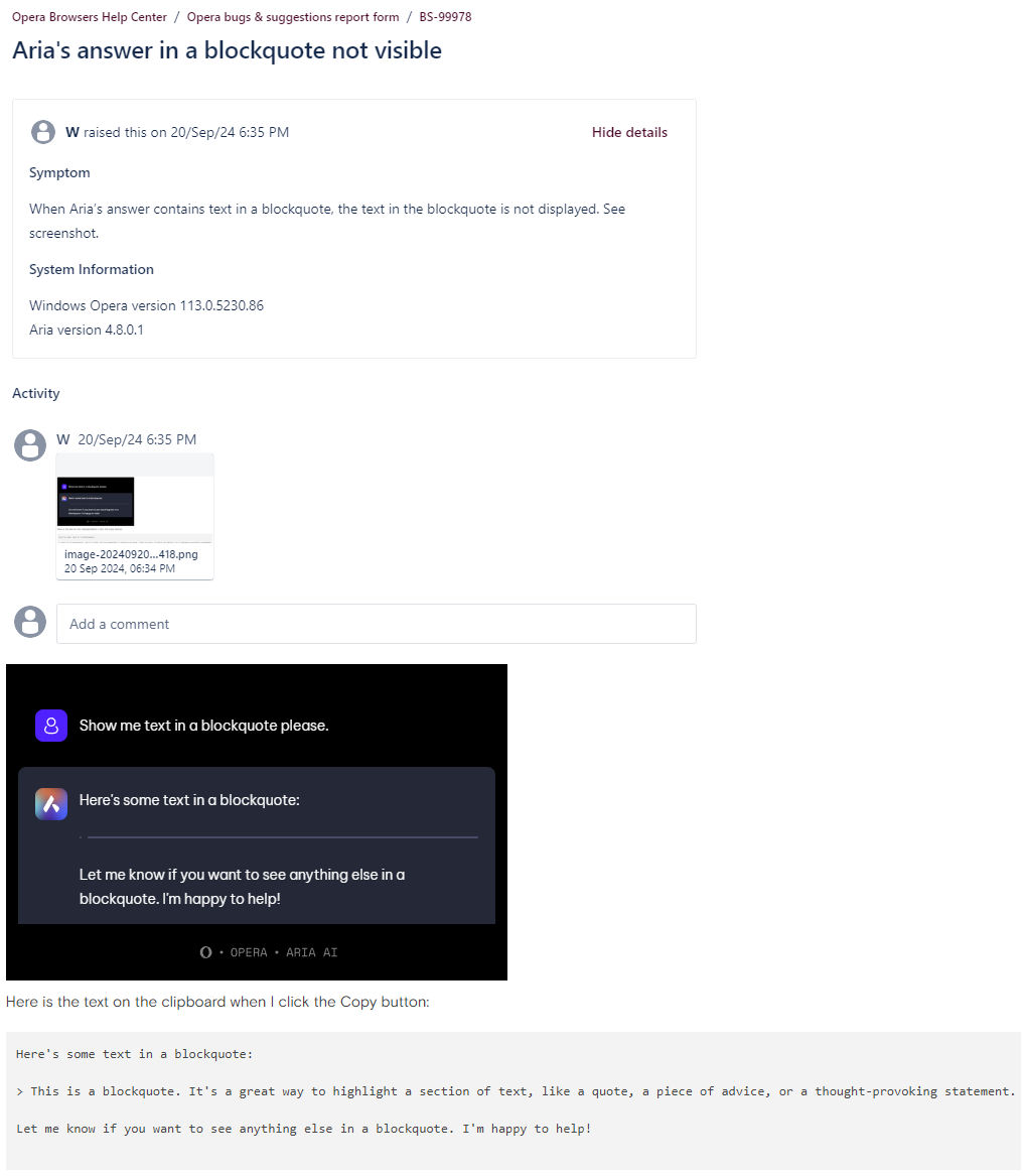
Aria still not showing text in blockquote.
https://forums.opera.com/topic/73976/aria-s-answer-in-a-blockquote-not-visible
-
burnout426 Volunteer last edited by burnout426
@hectormaciasa1979 said in Opera 114.0.5282.222 Stable update:
I really never understood why I get 2 workspaces as default, one marked with a "home" icon and the other is a "star"
Workspace 1 (the Home icon) is the default/main workspace. It's the same as if you didn't have workspaces on. The reason there's a second workspace (Workspace 2, the star icon) by default is so there's more than just the single/main workspace so you have a workspace to move to without having to create an extra one first. Makes things more discoverable that way. As why for the 2nd is a start and the 3rd is a suitcase etc., Opera just chooses the next icon by default when you create a new workspace. You can pick another icon when creating a workspace.
but I can't move anything between them, and I have to enable a third workspace.
No issue here moving between the 2 default workspaces. on Windows 11 23H2. Perhaps you've encountered a bug or your workspace settings are corrupted and you need to start with a fresh profile. Or, maybe it has something to do with the language you have set in Opera's UI if it's not English.
-
daria19 Opera last edited by
@whisperer: Thank you for bringing this to our attention! We’ll make sure to pass this information along to the Aria team so they can investigate and address the issue with the blockquote. Your detailed explanation and findings are incredibly helpful. Thank you for your patience!
-
daria19 Opera last edited by
@hectormaciasa1979: Thank you for sharing your feedback! Workspace 1 (Home) is the default, while Workspace 2 (Star) is included to make exploring workspaces easier without needing to create one manually. All workspace icons can be customized to suit your preference. You should be able to move tabs between the default workspaces, so if that’s not working, it might be a bug. Could you share more details about the issue? We truly appreciate your patience and input—it helps us improve!
-
whisperer last edited by
@daria19 said in Opera 114.0.5282.222 Stable update:
@whisperer: Thank you for bringing this to our attention! We’ll make sure to pass this information along to the Aria team so they can investigate and address the issue with the blockquote. Your detailed explanation and findings are incredibly helpful. Thank you for your patience!
I see.
I used the Feedback button in Aria's settings which leads you to the forum where you can report bugs in Aria. So I reported the bug there.
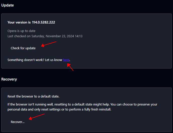
I also reported the bug via the Opera Help Center which can be reached via opera://update/. Here's the bug report:

But you are saying you also need to post a reply to the general announcement of a new Opera version, and then the information will be passed along to the Aria team so they can investigate and address the issue. That is what you are saying right?
-
anidais 0 last edited by
Tooltips (that appear on the bottom left corner when hovering a link) are still white when using dark mode. Is this a known issue that is going to be fixed? I would expect it to be dark when in dark mode.
-
whisperer last edited by
@anidais-0 said in Opera 114.0.5282.222 Stable update:
Tooltips (that appear on the bottom left corner when hovering a link) are still white when using dark mode. Is this a known issue that is going to be fixed? I would expect it to be dark when in dark mode.
There are more things that ain't right. Dark mode doesn't get enough attention and things change for the worse because of that. Take opera://update/ for example, the link color is poorly chosen and the button are not visible as buttons (they are in normal mode).

-
anidais 0 last edited by
@whisperer Yeah, I agree. In the case of the tooltips it is too distracting when the browser is in dark mode and the white pop up appears every time I hover over a link.
-
andrew84 last edited by
@anidais-0 I suggested the same yet 4 years ago.
https://forums.opera.com/post/234994 -
andrew84 last edited by
@anidais-0 I don't know.
But I forgot to mention that I meant the tooltip should be dark not in dark theme but if the 'force dark theme on pages' is active. -
burnout426 Volunteer last edited by
@anidais-0 My guess is that the link tooltip is a native OS tooltip. While still customizable, devs would have to dig into platform code and add some hooks for mode change. Might be better in the long run to implement a non-native, web-based version so that it can more easily be controlled and work across platforms easier. I imagine that not being a simple, quick fix at least, but definitely possible. My guesses at least.
-
SnowCrush last edited by
Gest updated to Opera 114.0.5282.222 . I like it. butt I don't like the rectangle profile of the bookmarks I prefer the full square style so that I can see my bookmarks better.
-
daria19 Opera last edited by
@snowcrush: Hello! It's great to hear you’re enjoying Opera. Thanks for your suggestion, we appreciate your input!
-
daria19 Opera last edited by
@anidais-0: We understand that there are currently some UI issues. We’re actively working on restoring the UI to a state that feels familiar and user-friendly. Thank you for your patience and for sharing your feedback—it’s invaluable to us!