Opera launches Opera One R2 – the best Opera Browser to date
-
daria19 Opera last edited by
@mixchild: Thank you for your feedback! The changes to the PIP interface are in line with the current design, but we appreciate your suggestions. We also appreciate your input on adding a picture option for enhanced personalization! Regarding the 'Content area flashes white when changing or reopening tabs,' this is a known Chromium issue, and unfortunately we should wait for a resolution from their side.
-
andrew84 last edited by andrew84
@daria19 said in Opera launches Opera One R2 – the best Opera Browser to date:
The changes to the PIP interface are in line with the current design
Why the new design should mean worse user experience?
-
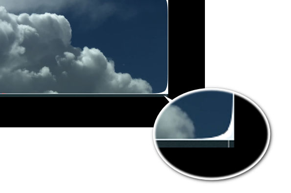
the radius of rounded corners is too big (it looks ok only if the PiP is stretched to be big enough). So the radius should be proportionally changed when increasing/decreasing the PiP. Currently I can't normally position the PiP in the bottom right corner without seeing the hole in the corner.

-
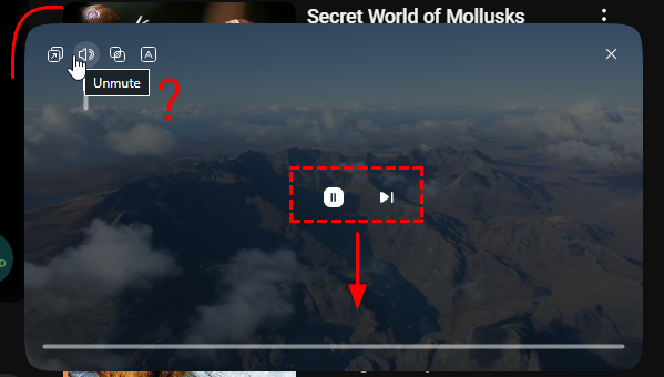
The dimmed area should be only on top and bottom (like previously) and the centered control should be moved to bottom.
-
Still unclear the reversed logic for the volume control (increasing from top to bottom). And even tooltip is reversed-shows 'mute' when already muted and 'unmute' when already unmuted. And the volume control should be on the same level as play/stop/next button.

*And the multiple times mentioned removed timing.
And previously many times suggested video title. Instead of to be more advanced and handy the PiP degradated. -
-
thelittlebrowserthatcould last edited by
@daria19: I've just looked in, with today's 114.0.5282.154 release. I wondered if the Sidebar being quite full of other stuff might cause the issue, so I disabled all the Opera Tools, leaving just two of the Services, and can now set up all 24 Workspaces available (more than I need, but they could be useful if a greater selection of icons was available). I'll check later, to see whether populating the Sidebar with Opera Tools again causes the problem. Thanks!
-
thelittlebrowserthatcould last edited by
@daria19: An immediate problem with today's (Debian) release is that the Workspace names cannot be edited, once they've been set up.
-
thelittlebrowserthatcould last edited by
There's no longer a right-click option to copy the URL from the address bar.
114.0.5282.154 Debian -
daria19 Opera last edited by
@thelittlebrowserthatcould: Thank you for pointing that out! Please let us know if the option is completely missing from the context menu, or if copying the URL still doesn't work even when using the keyboard shortcut. We're here to help!
-
thelittlebrowserthatcould last edited by
@daria19: thanks, maybe my mistake: the Enhanced Address Bar was the problem. Esc to cancel it, and the right-click context menu re-appears. The Ctrl+C keyboard shortcut copies the highlighted URL both with and without the Enhanced Address bar present.
-
burnout426 Volunteer last edited by
@andrew84 Would be nice, but they were intentionally removed, so...
-
ironbone last edited by
It is not possible to use the mini player on Ubuntu (and other Gnome) when the application dock is on the left. When the mini player appears, it automatically opens the dock and then the mini player diaper. You should open the mini player more to the right.
-
HelloThere123 last edited by
oh hey, the dynamic themes you introduced are awesome, however, there are a few things that i want changed.
first, keep the colors and intensity stuff separate. if i wanna make my aurora theme blue, i don’t want to make my background calmer.
second, treat your themes fairly. i really like the background music and keyboard sounds of midsommar, but why doesn’t aurora have them?
third, the basic theme’s background should be consistent with the animated themes, like making the ui blurred and making the background image span the entire screen.
fourth, make us add our own dynamic themes. i’ve seen opera gx have them, so why cant opera?
anyway, thanks for reading my ideas, and i hope they’ll be added soon.
ty :3 -
raphaelbm last edited by
@HelloThere123 Hi. I admire your optimism. R2 was released a long time ago. I'll be interested to see how long you will wait to have your ideas adopted. Do write back when you see progress.
I will not be holding my breath. Raphael
-
Locked by
 leocg
leocg
