Opera 115.0.5320.0 developer update
-
Opera Comments Bot last edited by
Hello Opera Users, We’re excited to announce a new developer update – 115.0.5320.0! This release brings important visual improvements, addressing two key issues: Other highlights of this update: For more changes find out our full changelog. Thank you for your valuable input and feedback – your comments help us improve with every release! Stay tuned […]
Read full blog post: Opera 115.0.5320.0 developer update
-
indiqazzz last edited by
https://imgur.com/a/YnHZEai
There's no background in address bar right after creating new tab but after clicking inside of it theme's background will appear. -
daria19 Opera last edited by
@indiqazzz: Hi! Thank you for your comment. The behavior you're seeing is actually expected. What you're noticing in the attached GIF is that when a new tab is opened, the address bar becomes active. When it's active, it changes color to indicate that.
-
andrew84 last edited by
Red Hover Effect in Popus
Why is so hard to make it look like previously. Now the extensions popup look spoiled because of the black text on dark blue background (if by default)

In my case it is bright blue but still bad.
*Also, comparing to pre One version (left picture) the 'pin' and 3 dots icons are still too big.

-
andrew84 last edited by andrew84
Personally, I'd prefer that menus, dropdowns and context menus items were not exactly the same color as in the theme editing dialog.
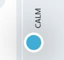
I like how the bright toggles/buttons (like in pre One version) look but I'd like the menu's hovered items shouldn't be so bright (especially in dark mode). So if some color is selected (bright blue for example), the menu's hovered items should be x2 or x3 times more pale.
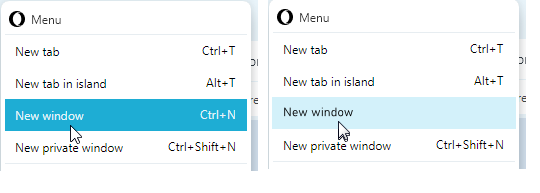
*I'd suggest using in menus the same color that is used for hovered bookmarks bar folder or the color which is in use for buttons in EasySetup.
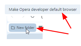
-
daria19 Opera last edited by
@andrew84: Thanks for your feedback! The color you're seeing is the same one used for extension handles and other hover effects throughout the interface, aimed at keeping things consistent. We appreciate your thoughts on the readability and icon sizes—they'll help us improve further. We'll definitely keep this in mind as we continue refining the interface.
-
andrew84 last edited by
@daria19 said in Opera 115.0.5320.0 developer update:
aimed at keeping things consistent
That's why I suggested using similar color tones for hovered folders/buttons and menu items. And also to eliminate too bright colors in dark mode.
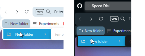
*And the simple grey tabs also doesn't look great in dark mode -
daria19 Opera last edited by
@tspringer: We've logged this bug as DNA-119301, and we truly appreciate your help in improving the browser.
-
Locked by
 leocg
leocg