Opera 103.0.4899.0 developer update
-
andrew84 last edited by
The bugs mentioned in the previous blog post:
https://forums.opera.com/post/322746
https://forums.opera.com/post/322743
https://forums.opera.com/post/322831look fixed in this build.
-
leocg Moderator Volunteer last edited by
@multiwebinc The border is part of the design, as the changelog says:
DNA-110127 [Mac] 1-pixel edge design in full-screen mode
DNA-110126 [Win] 1-pixel edge design in maximized modeThe interaction issues are being worked on.
-
andrew84 last edited by
@leocg
Only the left and right border have 1px, top and bottom still have the previous thick border.And what's the point of this 1px border if it makes the web page module not so obvious anymore (in dark mode almost invisible)? I hope the border will be remover completely finally.
-
andrew84 last edited by
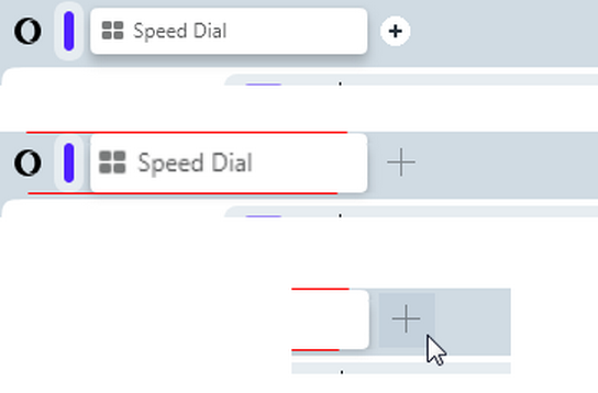
I'm pretty sure that tabs should be higher and tab's height should be equal to island's height (with slighlty bigger text). The current tab's height should be used only inside islands.
Instead of the circle, the previous new tab cross should be used (with highlighted box on hover).
*And the 'tab islands' feature should be optional and there should be toggle in Setting to turn it completely off.
-
Argarth last edited by
@andrew84: And of course once again, a tab can no longer be selected with a simple click by sliding the mouse along the top edge of the screen. This was broken and then fixed several versions ago in Dev, and even with the gap present for aesthetic reasons, it was still coded to allow selection of a tab by just sliding and clicking. But here we are again. Every browser I've used has this "feature". Some may even remember older versions of Opera standard that had a toggle setting to remove the "gap" between the tabs and the top of the screen.
-
andrew84 last edited by andrew84
@argarth I don't use Opera One daily, so I can't say when it was fixed.
But I checked right now and it seems working here in this Dev build.
Edit: but unlike pre One version, I can't create new tabs by clicking on top of the 'new tab' button.
As was already mentioned, it's need to be quite precise in One version when clicking the cross. -
tastodd last edited by
Tell me, what is this gray frame when playing any video in full screen mode? It has been observed since the previous dev versions. Is it possible to somehow get rid of it?
Installation profile is absolutely clean, no extensions, all default settings, default flags

-
stolis last edited by stolis
@andrew84: personally I'd prefer the opposite. Tab bar become shorter, as it was prior to 100 ver. There's no reason to be that high with so much space getting lost.
Totally agree about the new tab cross and I'd also like the close tab (X) become visible as it was before.
As for the disable islands setting, no question about it. Though I don't think it'll ever exist. They're used on removing, than offering options. -
andrew84 last edited by andrew84
@stolis said in Opera 103.0.4899.0 developer update:
Tab bar become shorter, as it was prior to 100 ver
Yes, I had the same suggestion also > https://forums.opera.com/post/321811
*I think the main reason why they made TabBar higher is the tab island implementation. Another question is why I'd need the higher TabBar if I don't use the 'tab islands'.
Ideally the TabBar should be higher only if the 'tab islands' feature is active. But I doubt they'll implement the 'dynamic' TabBar. So the higher tabs for current enlarged TabBar can be not the best solution but compromise one. At least there won't be such big gaps above and below tabs and maybe slightly enlarged text on tabs also gives some advantages. I also think that tabs enlarging is the simplest way to improve the current view, because they won't revert it back in near feature, I guess. -
ralf-brinkmann last edited by
There it is: Opera 103.0.4906.0 Developer (currently I only see Mac and WIN).
-
Locked by
 leocg
leocg