Opera 74.0.3911.107 Stable update
-
A Former User last edited by A Former User
@shion-san Scratch that. Opera crashes randomly again. Started with YouTube. And I've already removed profile backup I had.
-
A Former User last edited by A Former User
BS-748.. Weird ID for an issue. I hope it'll get fixed soon. Had to downgrade. Again.
I wonder if Vivaldi is good now? -
acryion last edited by
Thank you Opera for finally allowing touch input to select Search Results in the address bar! Finally works properly on a Surface Pro device. Encouraging me slightly to return to Opera from Edge.
About:GPU page is also now on full green aside from Vulkan (which is still disabled, identical to Edge)
We now need to work on Battery Efficiency, get hardware acceleration par with Edge and implement DRM for 1080p/4K content on streaming services and implement the amazing smooth scrolling Edge has.
-
andrew84 last edited by andrew84
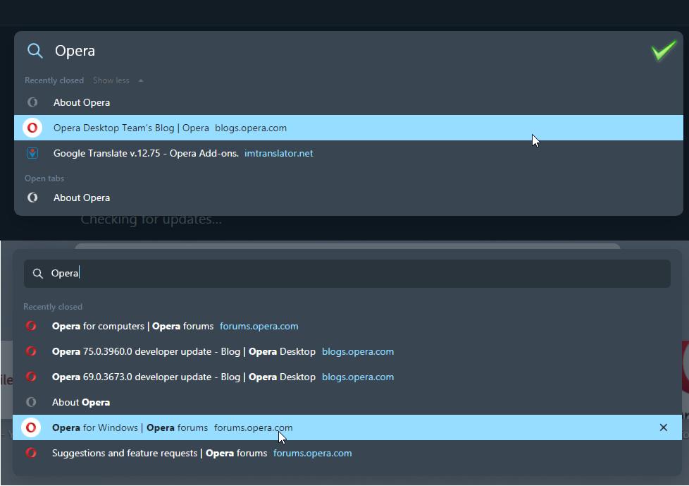
In my opinion the SearchTabs popup in 74 version looks a lot better than in 75.
The 'flat' design (without the rectangular textfield ) and bigger and more clear text look modern. Now we have the tiny text inside textfield
I don't know why it was changed in 75.
-
sgrandin last edited by
I'm finding in restoring closed tabs that they aren't going back where they were, as they did before. Is that intended?
-
A Former User last edited by A Former User
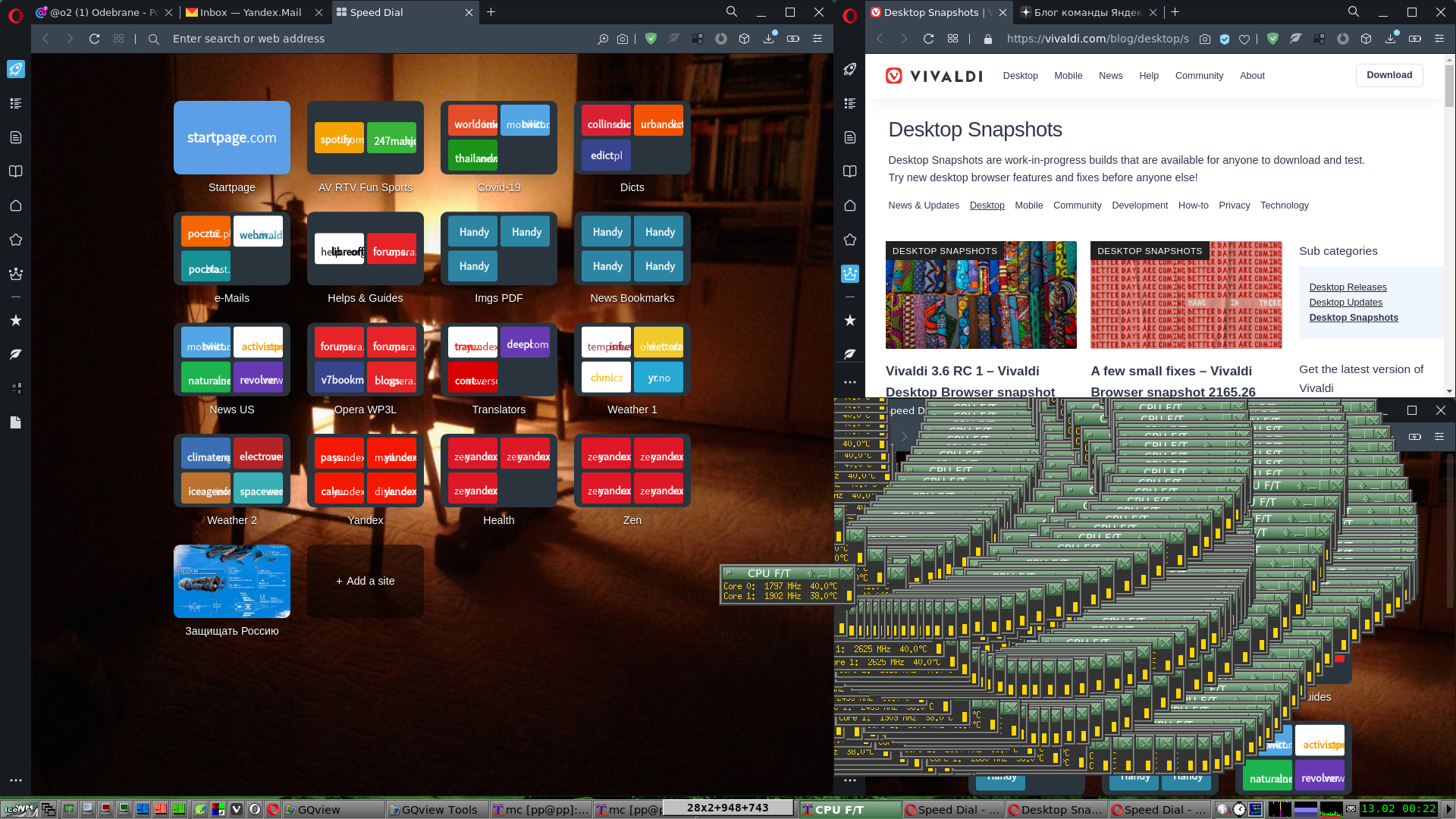
Why smudge effect appears using three Opera windows?
-
First way - very bad one - open 1st window, then second and the third one from the first (primary) window! The 3 windows is smudged by other windows.
(Click for good vision)
-
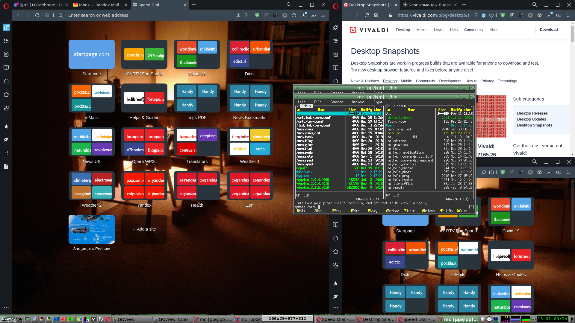
Second way - the only one (good) - first window then second one and next third one must be opened from the second window!
That time I was moving Midnight Commander very quickly making circles and I wasn't able to recreate smudging!
Summing up
You must open windows in sequential order 1 -> 2 -> 3
not using tree order 1 -> 2 and 1 -> 3.The question is - why the order is so crucial?
Similar effect was described by me in
Opera 75.0.3939.0 developer update -
-
hectormaciasa1979 last edited by
@chas4: Well Mozilla was never a browser and version 5.0 was released like a decade ago. Opera don't concern with such things.
-
hectormaciasa1979 last edited by leocg
In the Bookmarks Manager full version you get your current Speed Dial listed as a separate thing from what it calls "other Speed Dials", but in the simplified pop up Bookmark Manager you get from the Side Panel, you get all Speed Dials listed in one single section.
After some reinstalls and some time you don't know for sure what's your current PC name, so it's a bit confusing even for You , as I've realized (in this is my real problem with you) that upon new installs the browser configures new Speed Dials with those annoying and horrible big letters which I so hate, then you open them and click on the small heart icon in the address bar, hoping to change it but it won't happen no matter what you do as Opera will insist in giving you the big horrible white letters, and then you open the drop down list, mostly to find out what the hell is going on and then you realize Opera isn't using the thumbnail you want to use, not from the webpage you're looking at, from the page you just opened, no, it's getting the pic from one of the older Speed Dials from past installs, why? I don't think even you know why.
Then you have to browse in that list back to your real Speed Dial for that machine and set it alright, but some times Opera simply refuses to use the new thumbnail you want it to use, no matter what you do, no matter how hard you try, Opera will insist in showing those huge vomitive white letters, so I've ended copying and pasting old entries from those older Speed Dials to the new one, using the Bookmark Manager, in order to have a useful thumbnail, but God Forbid I get to use an updated thumbnail, namely one from the freaking Web Page I'm looking at in that moment, I can only settle with something I opened a year ago or something like that.
So my choices are:
-
Scratch all the Speed Dials I've used before and set it up all over again, which renders sync somewhat useless, if I want to have updated thumbnails, and understand that in the future it'll be the same thing.
-
Use older thumbnails that're still useful but sometimes reflect very old pics I'd like to change. This is my regular choice.
-
Stick with the horrible big white letters (not really an option).
Another option is to copy all the entries as bookmark entries and then export them as a HTML file, then import it back after you did whatever you had to to your PC... you get the Big White Letters again, you want a thumbnail? repeat step 1 or 2. Your HTML file was good for nothing.
I don't understand why is it so hard for you to get it right.
Windows 10, and this has been going for some years now.
-
-
palx last edited by
The Spellcheck is problematic.
I have three Languages set.
English as Opera DUI, English(United States) and my Native language(Greek).When I have it set to spellcheck all the languages it doesn't work at all.
When I have it set to spellcheck two out of three languages, it does not work all the time, it does not find all the mistakes and gives dumb suggestions most of the time.When I have two languages installed, English or English(United States), set as Opera Dui and my Native Language, it still acts the same as above.
I have to have, spellcheck set to only one language, in order for it to work, like it should be.
First I thought that it had something to do with my Computer or the integrity of my Windows, because they had started being problematic, but I have just done a clean Windows and System installation and the spellcheck acts the same.
-
palx last edited by palx
@olesiak Ok, this demonstration is on Facebook Messenger. I do the simplest and least traceable mistake of not putting intonations on the words (as I am writing I had to change to only English, so it could detect the mistakes in English and it could only suggest "tracible" as a solution for traceable)…. This time it behaved differently I had to first correct the "εκεί" word and then change the language settings to only Greek or else it would not find the rest of the mistakes. The same thing happens to all Chromium based browsers (Opera, Chrome, Edge, Vivaldi).
-
A Former User last edited by A Former User
@olesiak Ma'am, there's no ultimate procedure you could follow up to repeat the phenomenon . either it'll appear on your GNU/Linux PC, or not.
I must revoke my remarks that opening window Opera has a meaning - that 1 -> 2 -> 3 order will bring correct results e.g. without smudging and 1 -> 2 & 1 -> 3 is leading to smudging third window. Rubbish.
I strongly underestimated the might of the "Smudging Imp"!
The bug is unpredictable and emerge from the void at random. No procedure exists which might repeat the effects. No matter how many Opera windows you open, reopen and no matter in what order - one, or two (at random) or all opened Opera windows can be "erased" from the screen - exactly writing - they are being painted with a "brush" represented by any other window application. All new/old screenshots support my words.
You'll find them in my Yandex Disk:
Opera.Forum
in directories - .../reply.74.74.0.3911.107.stable/Forum.2021-02-15 (new) or .../Forum.2021-02-13 (old one containing images from this thread).I'm working on PC comprising (from Sun, 14 Feb 2021)
- Opera 74.0.3911.107 Stable - 2 windows (1160x760) with 8 Workspaces each
- Debian Bullseye 5.10.13-1 (2021-02-06)
- IceWM
- Pentium G645 @ 2.90GHz 2C/2T
- 8 GB DDR3
- Nvidia GeForce GTX 650 2 GB DRAM (driver 460.39-1)
- ⤢21.5"" Dell P2211H (1920x1080 TN)
I've checked the smudging in another PC (old professional HP), running latest Debian too, but with nvidia-legacy-390xx (390.141-2) driver for older graphics cards. The same history.
The hellish ingredients amassed by the "Smudging Imp" - latest releases of Debian, Nvidia and Opera applications drives me nut. I tried 1,2,3 and 4 window Opera layouts. No chance. It always happens - one or two or all of them are being painted (aka smudged) by whatever app window (big or small).
Finishing the pitty train of events, I must emphasize - there is no starting point of the "bug". I cannot film my screen and show you - make this or that step first, repeat exactly the next ones and you will see the horrible painting in the making.
Second finishing point to this litany of bad luck - I do not use any sort of Windonized GNU/Linux systems - Ubuntu, Dupundu, Super-Duper-undo, Mintu, Mandravundo and all the other shit trying to emulate/reproduce MS Windows XYZ environments. I do prefer small apps and a lot of Bash scripts (quasi UNIX way of life).
I hope I presented everything I was able to impart here and has put forward broader picture of the Imp's battlefields.
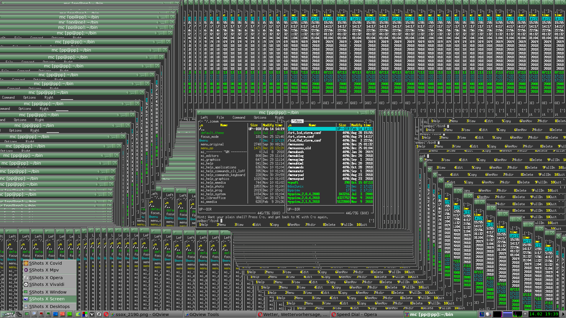
Let me tip you to what it's all about with this one screenshot.
[Fig. 1] One Opera window painted by Midnight Commander window (xterm console)
BTW
The small menu window at the left bottom corner represents Opera Snapshot Syndrome. It looks as if it was screenshotted/snapshotted by Opera itself (not its Snapshot feature). -
A Former User last edited by A Former User
BABE cries up to heaven from hopeless grief and rage.
The Opera window in my FHD screen layout has 1162 pixels width.
Ladies and Gentlemen from Opera Team, look at the screenshot below what you have created.
Click the image to view in full mode.
Shame! Shame! Shame!
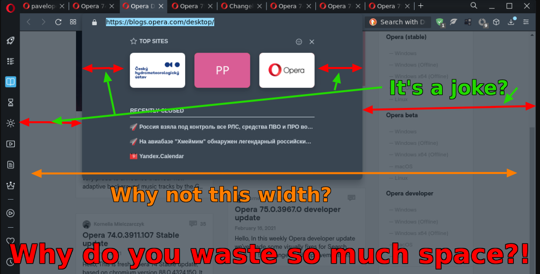
-
andrew84 last edited by
@pavelopdev it's enhanced address bar so its width = address bar width. It worked the same way previously too.
-
A Former User last edited by A Former User
@andrew84 Thank you for the explanation.
Here I deleted former remarks, it was enough to remove the search box and hide extension icons.
Well. a man learns all the time...

New screenshot as a remission of my sin...

-
andrew84 last edited by leocg
@pavelopdev I have no complaints regarding how it opens (its width) because yes, I don't use the search box and have only few extensions visible and it looks acceptable even on 1366x768 laptop's screen.
But.. the BABE pane's layout/design/components alignment that's the another question.
Previously there was a separate section in Settings where it was possible to select what to show on the pane. The modern BABE has a zero customization, only the on/off toggle button.
Maybe I'm wrong, but it seems there some dumb dependency now: if there are small count of 'recently closed' or 'visit again' items, then 'top sites' tiles count are also limited by the width of a single 'recently closed' section for example (and there's a wasted space on the left and right sides). Also 'top sites' section is not horizontally scrollable.
Edit: and even the full pane on your screenshot has the wasted spaces because of poor design.

-
A Former User last edited by A Former User
@andrew84 Well, I got bad bedtime and decidedly woke up inflated with bad temper, but Opera..., well, I stopped paying attention to Opera for Linux and Suggestions and feature requests forums. Opera Blog is better place to ask/request/beg or point the places which need polishing/correction/improvement (from my impertinent guy's point of view). Opera Team select from such "new news" what they like and then few of them are being copied accordingly to the Bug Report and with attached DNA signature. It's not a feedback.
I have a lot of admiration to you for your endless efforts to improve Opera browser. There were times I thought BABE is paternalistic term for "user" (I'm joking of course.) Now I see, Opera dev people as a secret sect behind sorta Chinese Wall of Internal Tranquility. I'm ditching the baby BABE (and her issues - the style's intentional) from now on. Your all actions proved it's pointless to make baby BABE something I'd like to love.
Thanks for your kind words.
