Opera 73 developer
-
nadie-nada-nunca last edited by
@ralf-brinkmann: This is how it's supposed to be. Destructive behaviour is never the default in a sane UI. Too easy to make a mistake and delete what you didn't intend.
In any case, the focus IS in the blue button for me, so both your complaint and Opera's behaviour are incorrect.

-
spiryts last edited by
FB on opera is broken https://youtu.be/vX-41S3kT-o background is flickering when forced dark mode is on.
-
andrew84 last edited by
When opening Search tabs popup an active tab should be selected, not simply the first item in the list. I think it's obvious.
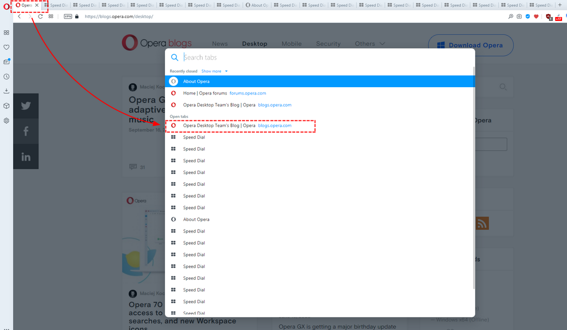
And currently active tab should stay highlighted, for the hovered items another color should be used (like it worked in previous TabMenu)
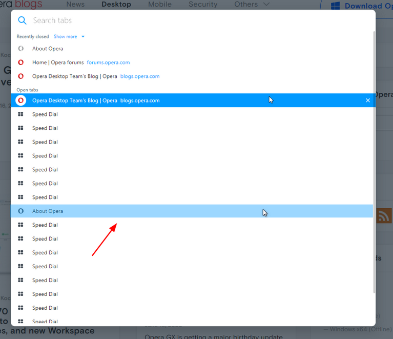
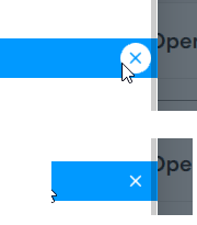
*Also, the highlighting still overlaps the scrollbar (closing cross in the circle too)
-
andrew84 last edited by
Suggestion:
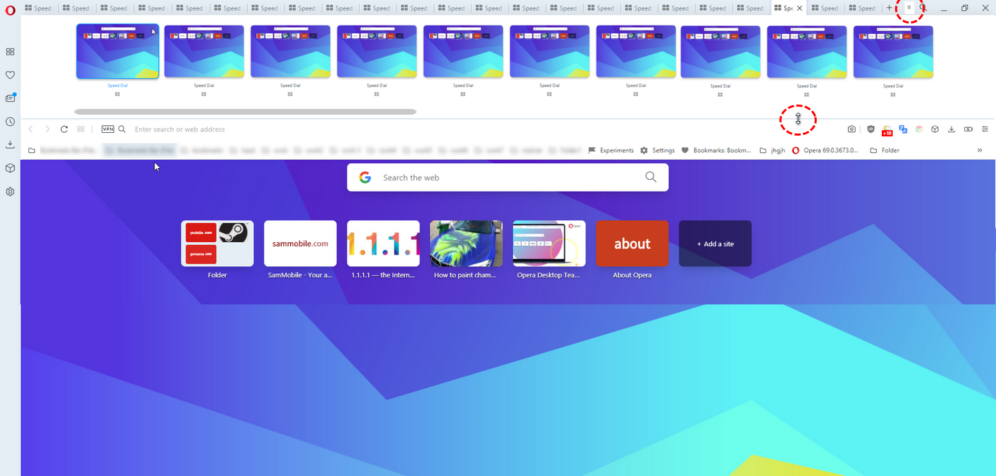
Instead of the tabs cycling popup (Ctrl+Tab) add option to expand the toolbar if there are enough tabs (a button next to the magnifying icon in the top right corner or pull down cursor), And allow to scroll horizontally using mouse wheel too.
-
A Former User last edited by
@kmielczarczyk: I always use dark theme (it's my default). But I would like it to be darker, as in Opera GX.
-
A Former User last edited by
What are "Renderer" processes in Opera's Task Manager? There is no such thing in chrome.
If you turn off the chrome://flags/#enhanced-address-bar flag, there will be one less process in the Opera task manager. -
andrew84 last edited by
@nadie-nada-nunca The current cycling popup would be acceptable too if it had an option to stay opened (no need to hold down the Ctrl key) and where I can cycle tabs using my mouse wheel. Also, it should open by clicking some button in the tabs bar area.
-
A Former User last edited by
@andrew84: I remember this feature. It's useful mainly in big screens. Nowadays, Vivaldi has this feature.
-
andrew84 last edited by
@kened said in Opera 73 developer:
It's useful mainly in big screens
Maybe.
But the same can be said about the current Ctrl+Tab tabs cycling popup -
andrew84 last edited by
@kened said in Opera 73 developer:
Vivaldi has this feature
I checked it in Vivaldi, but it works in a different way, tabs (tiles) are still reduced in width.

-
andrew84 last edited by andrew84
On 1366x768 display, 100% page zoom in browser settings, I still can't see all the section of the BABE.
100% = 3 sections, 90% = 4 sections, 80% = 5 sections.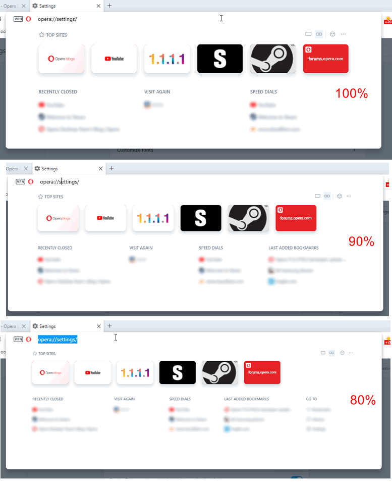
-
A Former User last edited by
Analysing the .css code of the enhanced address bar, it seems easy to let users choose the BABE background color.
