Opera 69.0.3673.0 developer update
-
synk2015 last edited by
@ralf-brinkmann
First choose any other value, then the default value and the color will become correct. -
andrew84 last edited by
@ralf-brinkmann: First it didn't work yes, I just reset all flags by clicking 'reset all'.
-
andrew84 last edited by
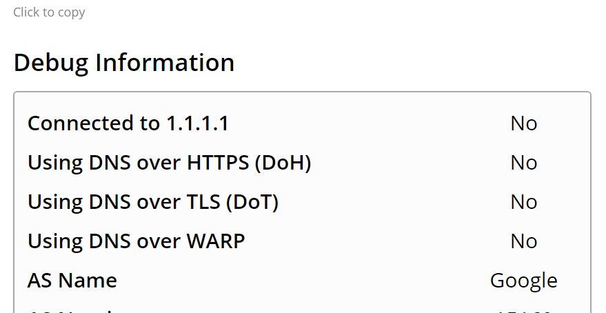
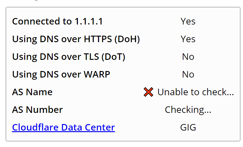
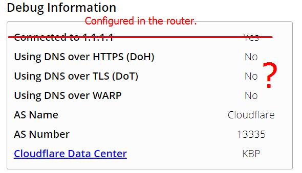
DNS-over-HTTPS is still broken and doesn't work without Chrome's flag enabled.
-
andrew84 last edited by
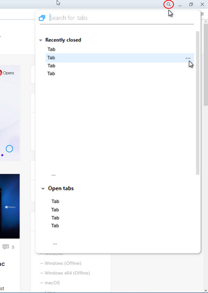
Return the TabMenu.
There was some(weak) explanation regarding the InstantSearch, but there wasn't a word about the unpopularity of the TabMenu. Rework the Search in tabs popup, add switches 'recently closed' and 'open tabs' onto it or whatever.
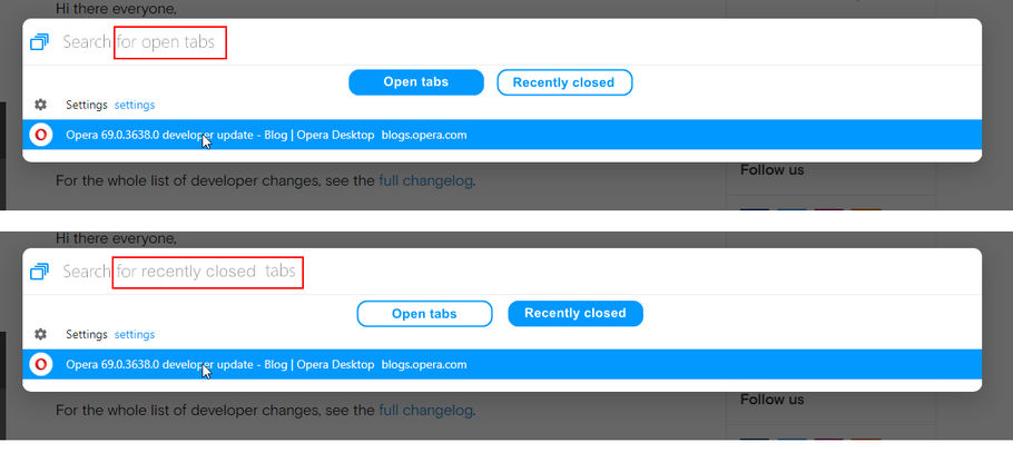
Or make it more compact to be opened in the top right corner like previous tabMenu, but add your 'innovative' search there.
-
andrew84 last edited by
@tina It shows no connection. Disabling/Enabling the dns-over-https toggle in Setting helps, but only until the browser restart.
With the enabled Chromium's flag #dns-over-https works even after browser restart.
More info in previous Dev thread
https://forums.opera.com/post/207143
the tree of comments in the blog https://blogs.opera.com/desktop/2020/04/opera-69-0-3665-0-developer-update/#comment-207056 -
burnout426 Volunteer last edited by
I enabled
opera://flags/#sidebar-site-panel, but don't see any UI to add a site to the sidebar yet. Am I missing it or is it not enabled yet? -
A Former User last edited by
It crashes instantly! It cannot be opened at all, I'm posting using another browser!
-
A Former User last edited by
I re-installed the previous version from the FTP and, luckily, the browser started normally and I'm posting from Opera again. It seems I have to let this release pass!
-
adam1709 last edited by
@leocg: please look:
https://blogs.opera.com/mobile/2020/03/introducing-new-features-in-opera-for-android-57/#comment-207793 -
andrew84 last edited by andrew84
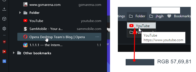
Make the bookmarks bar dropdown's items (and menus/context menus) similar to the sidebar Bookmarks/History panels. I mean the same dark navy background and the light navy selected items instead of that white in dark mode, To keep the uniformity the recent toolbar's lighter navy color can be used for selected items in bookmarks dropdowns (also dark tooltips like in panels)
-
A Former User last edited by
Workspaces drag and drop is really useful: opera://flags/#workspaces-dnd

