@darthgtb said in General Opera One Appearance Feedback Topic:
@hucker ah yes, true. I forgot you decided to stick to v99. That explains the confusion. There are no vertical lines here. These divisions is what they call "tab islands"
They are vertical lines, I see vertical bars of colour. Those cannot look differrnt on your end, it's a picture attachment, we both see the same.
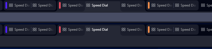
You see, since version 100, now it's possible to group tabs.
Why on earth would you want to do that? Extra complications.
What @andrew84 and I were discussing is the fact that on current version, their choice for pseudo-modularization forced them to make the interface have floating buttons instead of actual tabs like the ones you showed in your picture.
And what I see on your example has faded out text, why?
This is what the tab grouping looks like right now on version 104:
Here are 3 groups, two of them with 2 tabs and one with three. There is also another tab that is alone, without a group. The center one in the group with 3 tabs is the selected tab.
It just looks like a vague mess. One tab is wider for no reason, the lettering fades out, and I can't see any divider between each one.
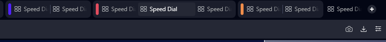
The discussion was about making the connection of the selected tab to the tab's content more visible even if inside a group, so my proposal for fixing that, would be to connect the group with rounded outwards corners and the selected tab, which coincidentally has the same colour as the address bar, then connect to the address bar. This would make it much more visual than what we have now and still maintain the grouping functionality available. Groups that are not selected can stay floating
Nothing should float, that's a silly gimmick.