Opera launches Opera One R2 – the best Opera Browser to date
-
daria19 Opera last edited by
@max1c: Thank you for your report! It seems the issue you're experiencing could be related to a known problem, DNA-119145, where the Aurora and Midsommar dynamic themes aren't working correctly with OpenGL or D3D9. This might explain why you're only seeing Classic themes and "Coming Soon" for the rest after the update. We appreciate your patience while we work on resolving this.
-
daria19 Opera last edited by
@keivms: Hello! As mentioned in the comment above, you can still set your desktop wallpaper as the background in Opera. Once you've selected the Classic Theme, you should see an option to pick your desktop wallpaper from a list of available wallpapers. Does that work for you or is the option missing entirely?
-
daria19 Opera last edited by
@andres85961234: We're sad to hear that the Midsommar and Aurora Themes aren’t displaying animations or backgrounds properly for you. Are you sure that the option in the Theme editor to show animations is enabled? Additionally, could you provide more details about your device and its specifications? This information might help in troubleshooting the issue further.
-
daria19 Opera last edited by
@tastodd: @HealingCross316: Thank you for sharing your thoughts! It's great to hear you’re willing to give the new Opera another chance, and we appreciate your feedback about the Classic theme; we’ll definitely take your suggestions regarding its colors and design into consideration to maintain the experience our users love.
-
daria19 Opera last edited by
@mixchild: Thank you for your questions! The removal of the timer from the PIP player was part of a design decision to streamline the interface, but we’re always open to feedback on usability. As for live themes, adding custom images with transparent backgrounds is not currently available, but it's an interesting idea. Regarding the red Opera "O" menu logo, it will remain red as it’s a core part of our branding.
-
andrew84 last edited by andrew84
@max1c said in Opera launches Opera One R2 – the best Opera Browser to date:
because you are in full screen
You're right. Didn't pay attention because I don't use Opera One versions daily.
In Edge it's thick even in full screen but thankfully the border can be turned off (and thus I believe technically it's possible to remove the border in Opera as well)
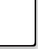
*So when not maximized the window have the bold white border + tiny black one + shadow. I can't call it as a good 'design'.
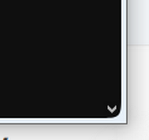
Edit:
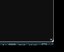
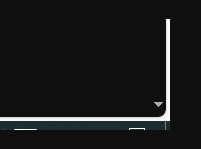
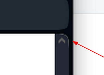
and in dark mode it looks uglier, especially when there are scrolling bars because in this case some corners look square and some are rounded.
Also, in dark mode is noticeable that the space between scrollbar and the border is roughly pixelated in corners and thus there are 'holes'.
-
max1c last edited by
@daria19: I understand that this is intended. But it breaks immersion when using the browser and even in full screen the border is larger than other browsers. It's also taking up a significant amount of space when you have multiple windows opened side by side. I believe this was introduced with Opera 100. Before 100 it was significantly smaller.
-
HealingCross last edited by
@daria19 As I'm getting used to the new version, I really appreciate it. It's the best looking browser with the most handy features for me. Thank you very much.
-
andrew84 last edited by
@max1c said in Opera launches Opera One R2 – the best Opera Browser to date:
turn it off in Edge?
by turning off 'Try the new look and feel of Microsoft Edge' toggle in Settings.
-
andrew84 last edited by andrew84
The thick border (central) also looks bad in split screen mode.
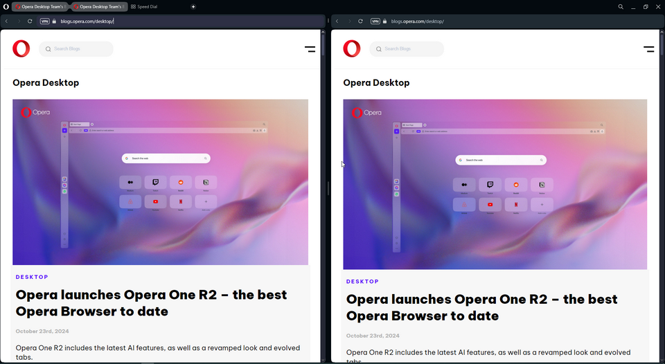
Also, when trying the split screen feature I discovered that there's almost no progress regarding the usability and still far behind the Edge's split screen mode.
- why there's no bookmarks bar visible?
- creating split screen by dragging is still bad and is need to be very precise to not create the screen accidentally (so need to keep the setting off)
- why the 3 dots menu has no indication on hover?

- why the auto-hide sidebar is not of the same height like in regular mode and overlaps the toolbar?

- why the auto-hide appears each time I touch the separating vertical border?
- why I can't simply click somewhere 'x' to exit split screen mode.
- why the highlighting box shape is different while in split mode and looks stretched vertically?

-
ddvddv last edited by
Bring back the 'Force dark theme on pages' button in 'Easy setup' ... as it was .
-
andrew84 last edited by
@andrew84 can add more
8. how active 'split group' looks vs active tab. Split tabs have no shadow effect.
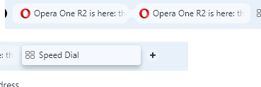
- For example I'm on 1st split screen. After right clicking inside the address field on the second screen and selecting 'paste and go' the web site will open in the 1st screen. So split screen doesn't get focus when clicking on the address field.
