Opera 110.0.5111.0 developer update
-
Madric last edited by
Hi, since the last update, no one of my extensions (about 15) is visible. The bar is just empty and the extensions are not working.
But from the menu, the extensions are still installed. -
andrew84 last edited by
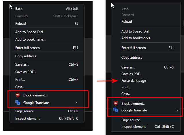
It seems that extensions icons are not well aligned in context menu (left) vs usual view (right). Also in Stable.
And the sections horizontal dividers (lines) are hardly visible.

*Also, I don't see the option to disable/enable dark page forcing anymore.
-
andrew84 last edited by andrew84
@leocg said in Opera 110.0.5111.0 developer update:
What would be usual view?
The statement referred to the extensions icons alignment only.
@leocg said in Opera 110.0.5111.0 developer update:
Here I still see the Force Dark Pages option when I right click on a page.
Here on Win10 I don't see it anymore. But still see in Stable (Portable).
-
andrew84 last edited by andrew84
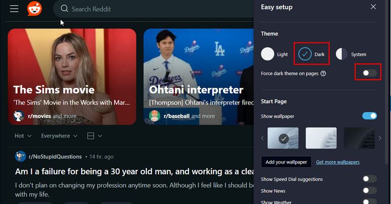
@leocg Was my bad partially. Accidentally the 'force dark theme pages' toggle was switched off in EasySetup and I tested it on Reddit site.
So the problem is that even the switch is disabled in EasySetup, after activating the dark theme reddit site is still forced by dark theme.

The same is with twitter site and Opera help web page. Mby there are more webpages.
So could you check it on reddit for example, to figure out if this my system specific issue or not?
-
A Former User last edited by
@burnout426: You are right. I adjusted the window width and the volume control appeared again. Thanks!
-
oP2 last edited by
Bring back the dark mode flag where you can choose different inversion versions. This one looks very gaudy and is pointless. Chrome 125 has it and it works fine.
-
parduspars last edited by
Updated but again I can' t watch Twitter and Instagram videos. I don't want to use Opera just for this reason. I'm tired of this problem.

-
andrew84 last edited by andrew84
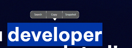
search popup looks broken here.

I wonder if there are left basic and habitual things which are not broken yet? The recent few developer builds look terrible.
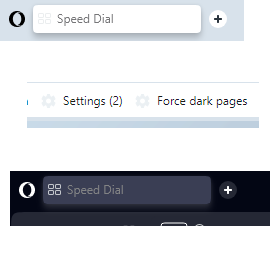
Also, there a few more dark/light theme switching issues.
for example the pale icons after switching dark theme off and hardly visible text on dark tabs after switching dark theme on.

-
Locked by
leocg