Opera introduces Lucid Mode to improve video quality
-
fuaim last edited by
@himmelssheriff I did what you told.
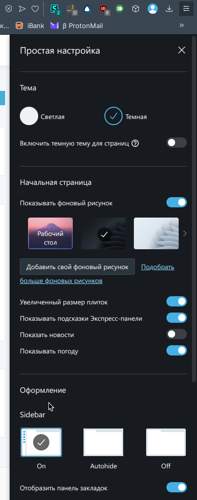
Quick Settings:
(it's in Russian, but could be understood by the cursor)Video @ YT:

I don't see any blue button, only "Deattach video".
Where else could find it?
-
A Former User last edited by A Former User
@fuaim
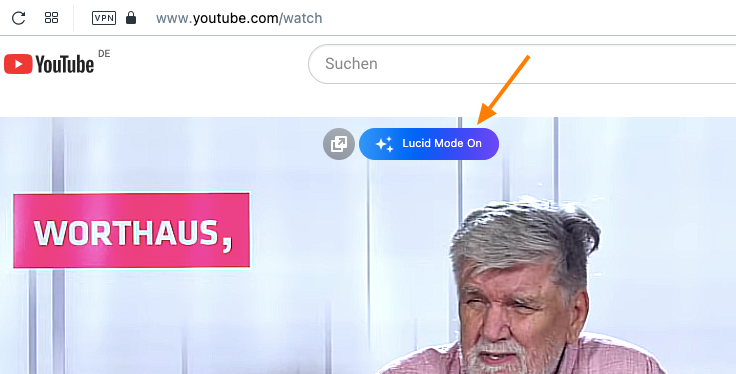
When I open a video on let's say YT like this, hovering with the cursor I'll get this big blue button which is not to be overlooked.
I had this already with the last update of Version 93 and now on the latest version of Version 94 - but I'm on the stable channel. Maybe this might give me other results than you.

-
thgrmsd last edited by
@himmelssheriff This is precisely my issue & what I need to be able to disable/toggle off.
 It's annoying as heck, also I don't need Lucid Mode, so...please Opera Dev's.
Let us be able to remove that pop up button!!
Thanks. -
A Former User last edited by
@thgrmsd It seems that by now there's no way to disable the appearance of this button. So, when disabled you'll see a grey button instead.
I myself think, it's an improvement. The videos are sharper and clearer than before. You also get the button for pop-out-video the same way. I'm not sure, if this could be disabled..
Maybe as this feature is only introduced recently they let this happen to make people aware and will turn it off completely for those who want that, when it is well established.
It might be of some consolation that it disappears after not longer than maybe 2s. So not too intrusive anyway.
BTW - it doesn't behave the same in the case of images. -
andrew84 last edited by
The logic is quite simple and Lucid button should work in the same way as video pop-out button does.
If general switch is disabled in Settings/EasySetup, then we shouldn't see the button at all on videos.
If general switch is enabled, we'll see the greyed Lucid button but enabling/disabling the Lucid button won't affect the general toggle in Settings. -
QuestionMarc last edited by
The Lucid Mode pop up is in the way in the beginning of every video and it is super annoying and it doesn't seem like y'all thought to include a way to disable to popup. Please fix asap!
-
lehuspohus last edited by
OMG, another fail of the Opera UX designers.. If you're adding a new feature that shows up everywhere, make the button disable it completely!
Better work on performance, which drops down with each update.. -
A Former User last edited by
So many critical comments by people who have registered only recently or have only contributed once or twice. Are you actual users or are you only coming over from Brave to downvote here?
Actually, if you don‘t like Lucid Mode or Opera generally why are you not ignoring Opera? Why bother registering here and logging in when you're thus dissatisfied?
It‘s a mystery. -
adamsebire last edited by leocg
@himmelssheriff: It's also My first post but I've used Opera as my primary browser for years and I, like many others, am solely motivated by the fact that there's no way to disable this tool tip or popup or whatever it's called. It's visual clutter.
(And as a filmmaker, if I wanted people to watch my films in a mode that would be better termed "lurid" I'd colour grade them like that... it's like Samsung turning every setting up to 11 on their TVs!)
-
vladaart last edited by
@himmelssheriff Same thing here. I've been using Opera as my primary browser for years. I've never commented here before and I wouldn't do it this time either, but I got an invitation so I decided to join the discussion and leave my observations. Obviously that is important to someone here, and it should be, considering that it's always good to have as much as possible direct feedbacks from users.
-
thgrmsd last edited by
@vladaart @Himmelssheriff @adamsebire
same here, been using opera for yearrsssss...this is by far the most annoying thing they've come up with so far.


-
A Former User last edited by
@vladaart @adamsebire Thank you for your replies, so that I understand better. I'm also new to this forum, although I've known about Opera for quite a while.
I was mystified from the diverse reactions in it. I've also been over there at Vivaldi's forum and it's quite different there. There is more of a lively discussion by users and volunteers with more experience.I get your point though. The new feature isn't quite ready in a way. But at the moment I appreciate it. Turning on and of for any video without hassle by showing up this new button seems handy for me, but need not evoke the same feelings with others.
So cheers and have a nice day!
-
stolis last edited by
@lehuspohus: this is happening for quit some time now. Instead of having as their first priority fixing older bugs and chromium vulnerabilities (without any delays), they just keep adding new "features", creating new bugs-problems and without (most of the times) disabling options. Just by reading comments, you can easily understand how sloppy they've become.
They don't seem to realize that there's also a large number of users which have no need of such stuff and they just want a simple, light and (above all), "safe" browser to do their work.
I keep wonder if they even read users posts anymore.
So don't bother. It's a "take it or leave it" situation. -
andrew84 last edited by andrew84
@himmelssheriff said in Opera introduces Lucid Mode to improve video quality:
The new feature isn't quite ready in a way
So it would be logical first implement it in Developer version, hear the feedback and then add in Stable, like it usually happens with other new features.
-
andrew84 last edited by
Maybe I'm missing smth. but it seems that Lucid mode doesn't work in video pop-ut window.
-
lehuspohus last edited by lehuspohus
@stolis at least, someone respond me that the Opera team has already been notified about this:
https://forums.opera.com/topic/59330/opera-introduces-lucid-mode-to-improve-video-quality/3


