Opera introduces Lucid Mode to improve video quality
-
A Former User last edited by
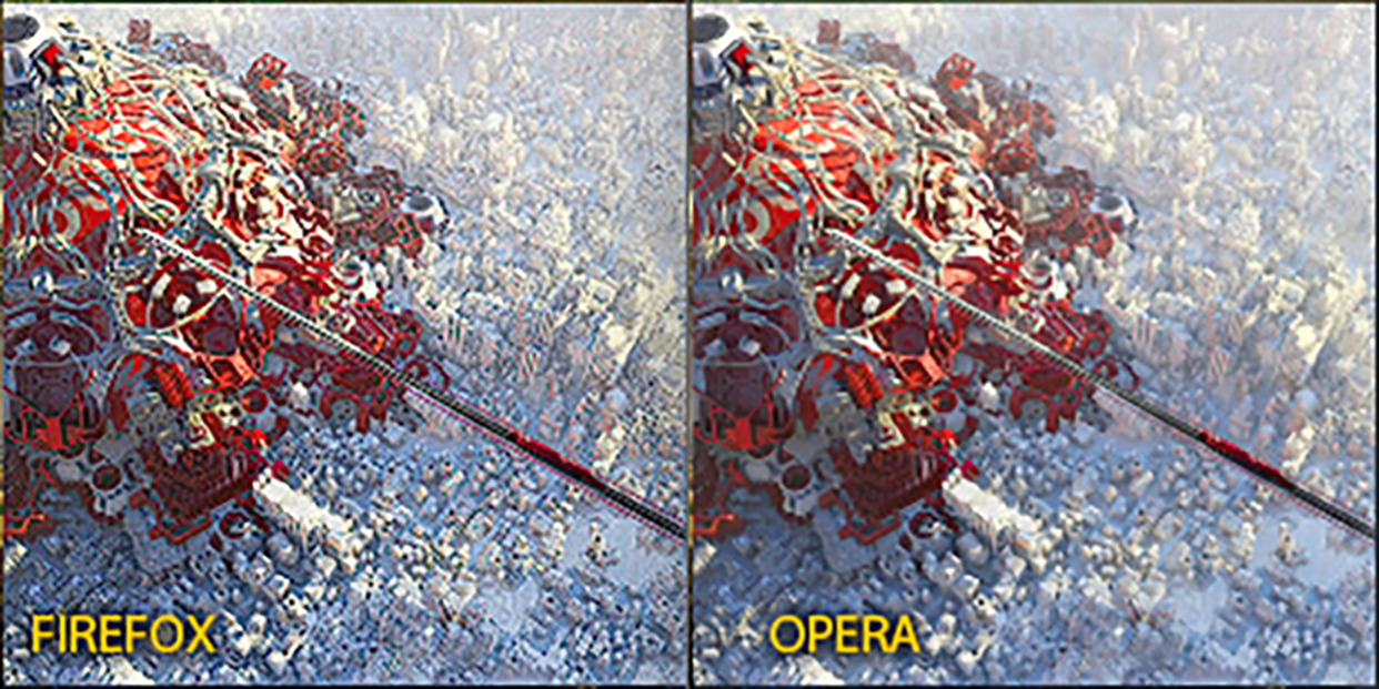
@andrew84 Well, maybe that is not obvious on 1080p, but on 2k monitor it is. Here is a comparison example extracted by ShareX app (3x zoomed) from which you can clearly see what is going on. It is subtle change (as it should be in my opinion) but it is there.

-
andrew84 last edited by andrew84
@kened I wonder what's problem to implement this, it's obvious feature.
Also, I'm missing the ability to pause/play by clicking on a video. Both features were in the original Opera's popup before the migration to chromium's one.
*And it'd nice to go to full screen and back by double clicking on a video -
thgrmsd last edited by
No, it's horrible. Fine for those who wanna use it but you Must also give an option to diable the popups (or buttons) that says "Lusid mode on/off" IT's Frikken' annoying to be polite about it!!
 How did you even Not make this an option i the first place? crying
 -
A Former User last edited by
@adam1709 Ok, I understand. But I took a look at Brave's community. There aren't even localized forums as for Opera (Polish in your case and German in my one).
But you're totally right: Anyone should try out, what is offered to him and stick to the one, that pleases him most.
I've used Brave once in a while, but to me it was more of a Chrome look-alike with strong adblocking and tracking protection. I didn't really like the interface though and I always got the impression that their security feature come for a reason. They should lure you into their Rewards system (crypto!) by blackmailing publishers through their strong protection.
I myself would definitely go for Firefox and Vivaldi instead. But I'm giving Opera a try for some time to see, if it fits my needs. So far, it's ok for me. It looks quite good, has some handy features and is as snappy as I need it. -
olesiak Opera last edited by
@adam1709: Hey, could you please share a few more details with us? The screenshots from your opera://settings/?search=cashback and chrome://flags/#cashback pages, your OS and Opera exact version and pages where you get the badge? If you also have screenshots of the action will be great. Thank you in advance!
-
fuaim last edited by
@fuaim said in Opera introduces Lucid Mode to improve video quality:
Really cool feature!

But... I don't see it anywhere in Opera 95.0.4632.0 dev on Ubuntu 22.10.
Why so?
How do I turn it on?So where can I find the setting to turn this on/off?
StillOpera 95.0.4632.0 dev on Ubuntu 22.10.Anybody can answer me?

-
A Former User last edited by
@fuaim I'm on 94 Stable Release.
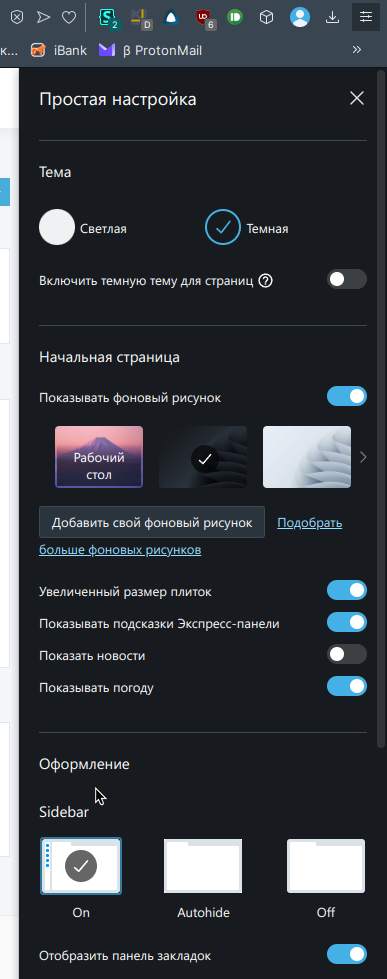
There you'll find it on the Quick Settings panel on the right. Click on the three lines in the right corner of the browser. Then you have access to Quick Settings.
It's immediately under the settings for the start page and just above the settings for the side panel. At least here, but I'm on a MacBook at the moment.
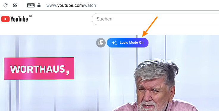
Alternatively go to YouTube and turn on any video as you like. You'll see a big blue button on the middle top of the video when you hover your mouse over it. Just click turn on or out as you like.
I hope this works for you. -
tastodd last edited by
I would really like to see the ability to disable the Lucid Mode pop-up menu for those who do not need this feature
-
fuaim last edited by
@himmelssheriff I did what you told.
Quick Settings:
(it's in Russian, but could be understood by the cursor)Video @ YT:

I don't see any blue button, only "Deattach video".
Where else could find it?
-
A Former User last edited by A Former User
@fuaim
When I open a video on let's say YT like this, hovering with the cursor I'll get this big blue button which is not to be overlooked.
I had this already with the last update of Version 93 and now on the latest version of Version 94 - but I'm on the stable channel. Maybe this might give me other results than you.

-
thgrmsd last edited by
@himmelssheriff This is precisely my issue & what I need to be able to disable/toggle off.
 It's annoying as heck, also I don't need Lucid Mode, so...please Opera Dev's.
Let us be able to remove that pop up button!!
Thanks. -
A Former User last edited by
@thgrmsd It seems that by now there's no way to disable the appearance of this button. So, when disabled you'll see a grey button instead.
I myself think, it's an improvement. The videos are sharper and clearer than before. You also get the button for pop-out-video the same way. I'm not sure, if this could be disabled..
Maybe as this feature is only introduced recently they let this happen to make people aware and will turn it off completely for those who want that, when it is well established.
It might be of some consolation that it disappears after not longer than maybe 2s. So not too intrusive anyway.
BTW - it doesn't behave the same in the case of images. -
andrew84 last edited by
The logic is quite simple and Lucid button should work in the same way as video pop-out button does.
If general switch is disabled in Settings/EasySetup, then we shouldn't see the button at all on videos.
If general switch is enabled, we'll see the greyed Lucid button but enabling/disabling the Lucid button won't affect the general toggle in Settings. -
QuestionMarc last edited by
The Lucid Mode pop up is in the way in the beginning of every video and it is super annoying and it doesn't seem like y'all thought to include a way to disable to popup. Please fix asap!
-
lehuspohus last edited by
OMG, another fail of the Opera UX designers.. If you're adding a new feature that shows up everywhere, make the button disable it completely!
Better work on performance, which drops down with each update.. -
A Former User last edited by
So many critical comments by people who have registered only recently or have only contributed once or twice. Are you actual users or are you only coming over from Brave to downvote here?
Actually, if you don‘t like Lucid Mode or Opera generally why are you not ignoring Opera? Why bother registering here and logging in when you're thus dissatisfied?
It‘s a mystery. -
adamsebire last edited by leocg
@himmelssheriff: It's also My first post but I've used Opera as my primary browser for years and I, like many others, am solely motivated by the fact that there's no way to disable this tool tip or popup or whatever it's called. It's visual clutter.
(And as a filmmaker, if I wanted people to watch my films in a mode that would be better termed "lurid" I'd colour grade them like that... it's like Samsung turning every setting up to 11 on their TVs!)
-
A Former User last edited by
@himmelssheriff Same thing here. I've been using Opera as my primary browser for years. I've never commented here before and I wouldn't do it this time either, but I got an invitation so I decided to join the discussion and leave my observations. Obviously that is important to someone here, and it should be, considering that it's always good to have as much as possible direct feedbacks from users.
-
thgrmsd last edited by
@vladaart @Himmelssheriff @adamsebire
same here, been using opera for yearrsssss...this is by far the most annoying thing they've come up with so far.

