Opera 74.0.3883.0 developer update
-
chas4 last edited by
Not on the auto update server yet
Why Open the Web?
Despite the connecting purpose of the Web, it is not entirely open to all of its users.
When used correctly, HTML documents can be displayed across platforms and devices.
However, many devices are excluded access to Web content. -
andrew84 last edited by
DNA-89940 Babe shouldn’t react on Zoom from Settings
Finally, thanks!I think the same should be done with Bookmarks and History sidebar panels.
-
A Former User last edited by
I asked to change few windows' layouts opened from Sidebar recently:
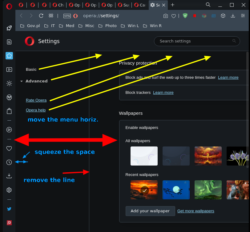
Vertical lines in Sidebar windows are not movable
Bookmarks page has hidden movable border line
Some vertical division lines on setting pages are not movableLet me suggest other way to improve Opera setting pages instead of movable vertical divisive line.
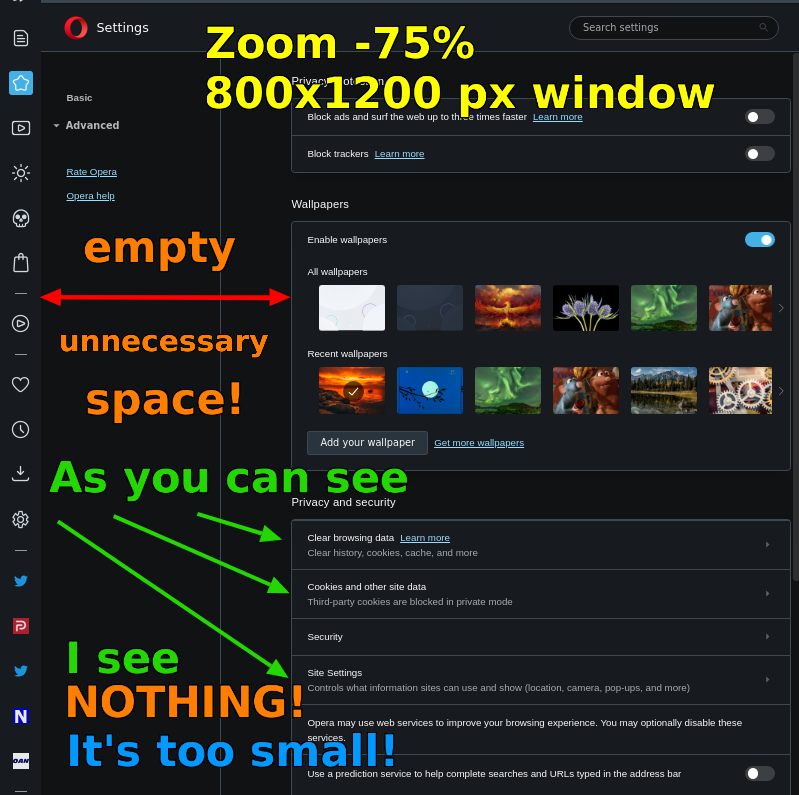
I keep Opera left window with 800x1200 size. The window is too small to see Settings page. Zoom is not the remedy. Both screenshots below are explaining everything. Many pages which I open in such narrow widows are transforming layout to use the visible area sizes in full, so it's no problem to code this feature.
[Fig. 1] First move left part to the top of important part of Settings page (right). Other things to do are explained in the screenshot.
[Fig. 2] This screenshot explains why the Zoom option is useless there.
-
andrew84 last edited by andrew84
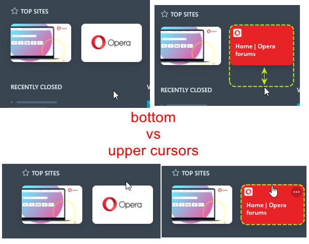
- BABE's top site tiles still react too early on the bottom's cursor (so when moving the cursor upwards it looks like tiles have some invisible area)
- allow to open link on the BABE using middle click without closing the BABE itself after click (like it work is bookmarks bar dropdowns)
- allow to collapse top sites.
*When I hover the star there's a hand cursor appears but when I click on it nothing happens. For example, it could be: outlined start icon = no top sites, when I click the star icon becomes solid and top sites do appear. But I'd better prefer a simple up/down arrow next to top sites title (like 'show more' button).

- BABE's top site tiles still react too early on the bottom's cursor (so when moving the cursor upwards it looks like tiles have some invisible area)
-
andrew84 last edited by
- SearchTabs popup still closes after an active tab was removed.
https://forums.opera.com/post/233481
- SearchTabs popup still closes after an active tab was removed.
-
chas4 last edited by
@leocg: The update is on the ftp (including the auto update), not sure why this update is not on the auto update servers
Stuck at (rather not run install the update manually as multiple times in the past that has reset settings or screwed up settings):
Version:74.0.3876.0 (on macOS)
Opera is up to dateWhy Open the Web?
Despite the connecting purpose of the Web, it is not entirely open to all of its users.
When used correctly, HTML documents can be displayed across platforms and devices.
However, many devices are excluded access to Web content. -
A Former User last edited by A Former User
/sarcasm, irony, sadness/
The voice of despair.

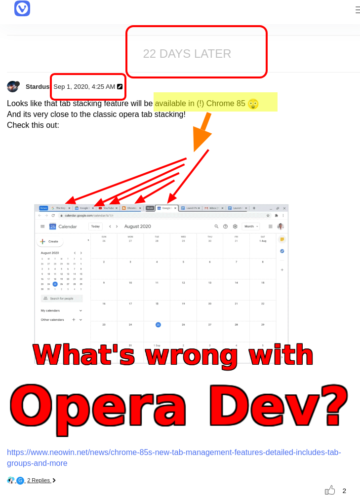
There are two siblings which sprang up from Opera 12 root. I keep an eye on Vivaldi Snapshots and Opera Developers browsers. I knew for sure one side answers to users' requests in identical way as the other and vice versa. That's why I'm using this time a thread from Vivaldi forum. When you feel offended, change the V icon for the O icon in your mind, please.
My "cry" for more information from Opera Team is the more obvious in that context.
[Fig. 1] How Vivaldi is deceiving it's users.
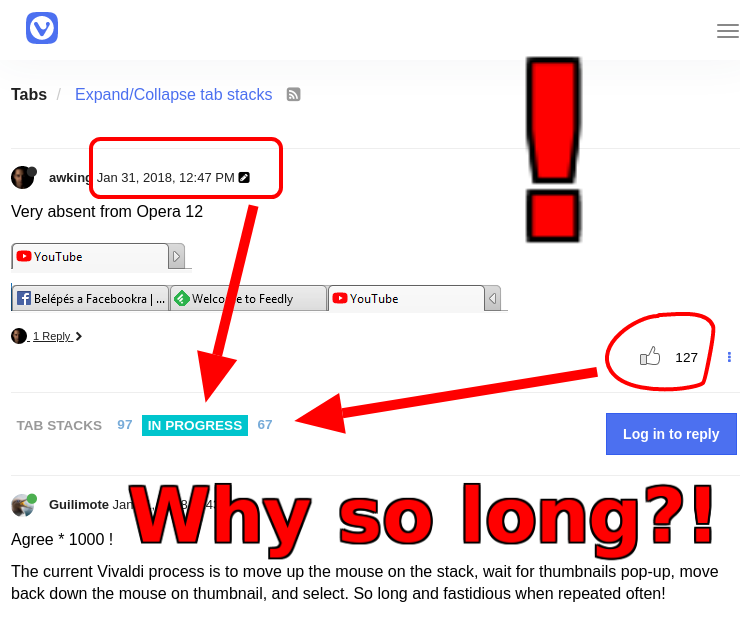
[Fig. 2] When Opera Team will answer to its users requesting and asking nicely for the same feature as Vivaldi users?
-
andrew84 last edited by
@pavelopdev It seems that 'Workspaces' feature in Opera does replace the tabs grouping/stacking.
-
A Former User last edited by A Former User
@andrew84 Hmmm, both yes, and no. I'm searching possibilities on this topic yet. Look at the tiers:
Tier 0 (top down scheme)
Operating System level (Win & Lin) - a lot of Desktops.Tier 1
Opera windows on one or many screens (e.g. many monitors)Tier 2
Opera Workspaces in every Opera window.Tier 4
Many Bookmarks bars tied with Workspaces (requested)Tier 5
a) Speed Dial folders (via Save all tabs as Speed Dial folder)
b) Session Manager via extensions or embedded (as in Vivaldi)
c) Folders in Bookmarks bar with drop down tree structures (or lists)Here comes Tier 3
Stacked tabsEverything you turn into your advantage is limited by 1) your resources, 2) your imagination, 3) your experience or abilities to create efficient work environment.
That's why I still have mixed feelings about implementing Opera 12 stack tabs feature, having ready at hand the wonderful workspaces and the broader/deeper look into the semi/quasi stack tools I described above.
Staked tabs are old/new hype in this world of prevailing IT fads. For me most of the web browsers' users have no skill to make the most of what they have already at their fingertips, but I may be wrong.
P.S. Where is the (in)famous Tags field? I cannot find it.
-
A Former User last edited by
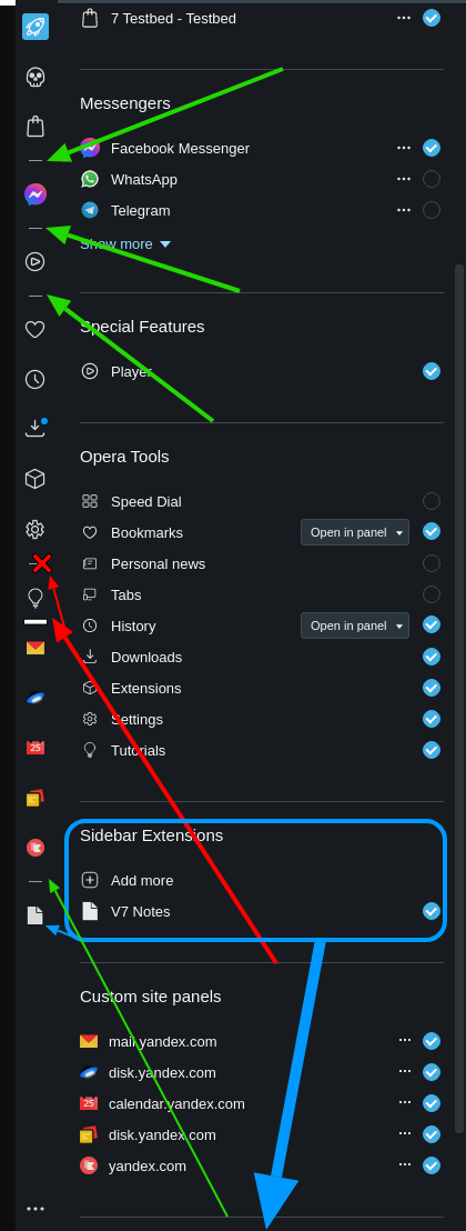
Wrong layout of Sidebar Setup window
-
After entering Tutorials the Sidebar separator is placed over Tutorial icon, but it should be moved below.
-
Sidebar Extensions part needs to be after Custom site panels.
See the Fig.1.
[Fig. 1] This picture has a trifle omission - moving the blue contents where the blue arrow points will leave two separators.
 Pay attention to that.
-
-
A Former User last edited by
Re: Site panels from Sidebar opens windows wrongly
It suffices to reload the pages opened from Sidebar's Custom Site panels to correct those errors - the right icons will start to represent corresponding pages.
-
andrew84 last edited by
*Suggestion (this will save space on the sidebar and will improve the custom sites feature's functionality significantly):
Instead of 5 custom sites in the sidebar I'd prefer 1 predefined custom panel (a web panel, similarly to this extension https://addons.opera.com/en/extensions/details/web-panel/)
The panel has bookmarks bar dropdown.

Of course, in Opera there also can be quickly accessible bookmarks (aka mini bookmarks bar)
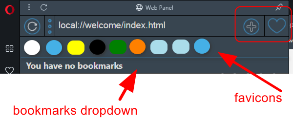
This panel also has the following buttons at the bottom (open web panel page in new browser tab and open current browser tab in web panel)

+previous suggestion regarding the context menu 'search in panel' feature like in Edge chromium -> https://forums.opera.com/post/228116 -
andrew84 last edited by andrew84
DNA-89954 [Bookmarks bar] tooltips inside the folder have wrong mode
Finally. Tooltips in bookmarks bar folders are dark now (reported many times).
I still hope too see an adequate highlighting effect instead of the bright white, in dark mode. Taking into account that bookmarks items in the sidebar panel have this.

*also, I guess that link's tooltip (bottom left corner) should be dark too in dark mode (like in Chrome/Edge)

-
andrew84 last edited by
I still have suggestion regarding the 2 user defined wallpapers for auto-switching when turning the dark theme on/off.
Currently it works only with the Reborn3's circles wallpapers

For example I want to select these 2 wallpapers for 'auto-switching' instead of the circles.

-
A Former User last edited by
It would be really, really nice if the latest version of Opera can fix https://forums.opera.com/topic/37582/bug-opera-won-t-check-for-updates-invalid-params-and-unable-to-prepare-update-checker-runtime/76?_=1606766168901
 :
: